WFH Spaces that Inspire Great Work
February 12, 2021In the last year our homes have become more multi-functional than ever, becoming the spaces many people work and even go to school. Creating a space that can serve as an office or study area can be a challenge – especially if you don’t have an extra room just sitting empty and waiting for a makeover. But with a little creativity and the power of primer, you can create a gorgeous WFH (or study at home) area in just about any size space. Read on to see how we took two drab, uninspiring spaces and transformed them into attractive, design-forward offices and study areas that would motivate anyone to do their best work.
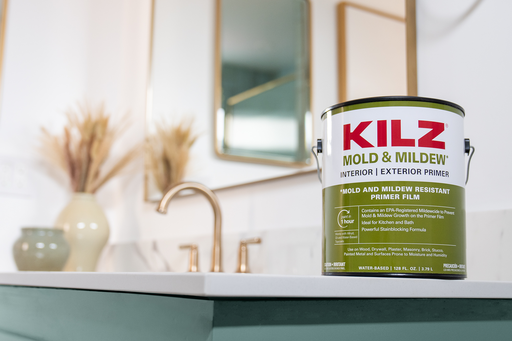
The key to our success? A layer of KILZ® Primer and a coat of fresh paint — once again proving that hard-working primer and quality paint are cost-effective tools in any type of interior makeover. Along the way, we added on-trend and functional furniture and a few eye-catching accessories. Here’s exactly what we did, and how we achieved these much-needed transformations.
From a Neglected Nook to a Happy Home Office
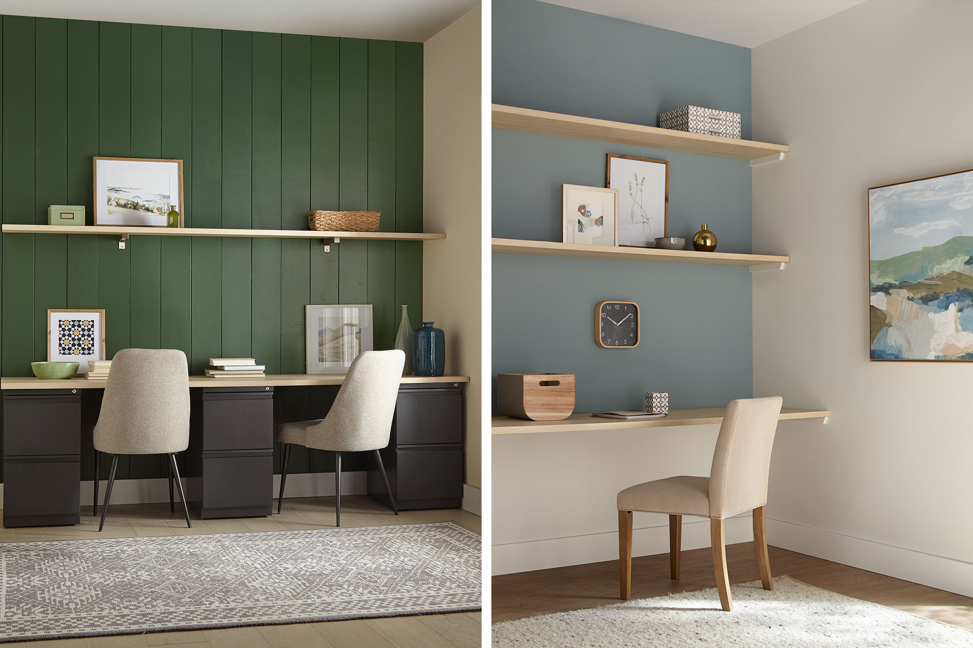
For our first transformation, a peaceful office was converted from an unused corner in a larger room. Given the limited dimensions, the space called for colors that would visually enlarge the area. Our first job was to open it up so you could feel like you’re working in a pleasant room, not a closet. Toward that end, we opted for light, airy shades that would add a subtle touch of color, while opening up the room to make it feel less confining. We also resorted to a tried-and-true designer’s trick—installing wall-to-wall shelving to create a space-saving recessed work area.
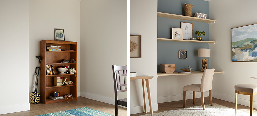
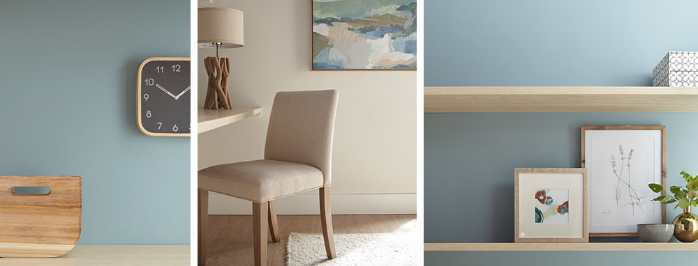
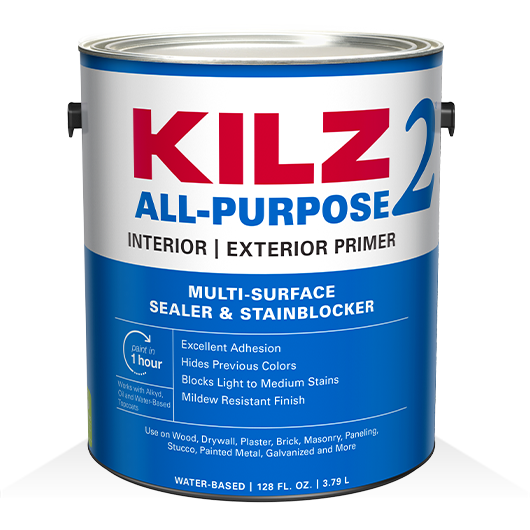
We started with KILZ 2® All-Purpose Primer, which covered up the unsightly scuffs left behind from the old bookshelf and offered added adhesion to ensure the new coat of paint would roll on evenly and easily. For our paint color choices, we opted for a fresh, contemporary office look—casual, light and attractive, with pastel shades that are easy on the eyes. For the back accent wall, we chose Magnolia Home by Joanna Gaines® paint, in Sir Drake, a gentle gray balanced with aqua blue hues. We decided on a more intriguing and deeper shade (rather than a classic sky blue) because it made the wall pop with color, while still generating a calm, soothing vibe. Following a slightly coastal theme, for the sidewalls and bottom accent wall we chose Shiplap – a rich, creamy weathered white also from the Magnolia Home paint line.
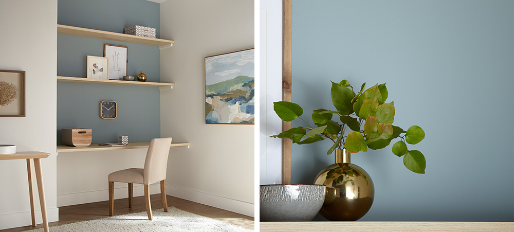
The mix of blue and white, combined with the natural wood shelving, achieved a slightly Scandinavian ambiance that felt just right. We accented the office nook with furnishings and accessories with a minimalistic, Danish-modern feel – a comfortable contemporary office chair in cream, a table in light varnished wood, nature studies in pale wooden frames, and accessories in wood, ceramic and brass, with touches of grey and blue throughout.
From Boring Back Room to A+ Study Area
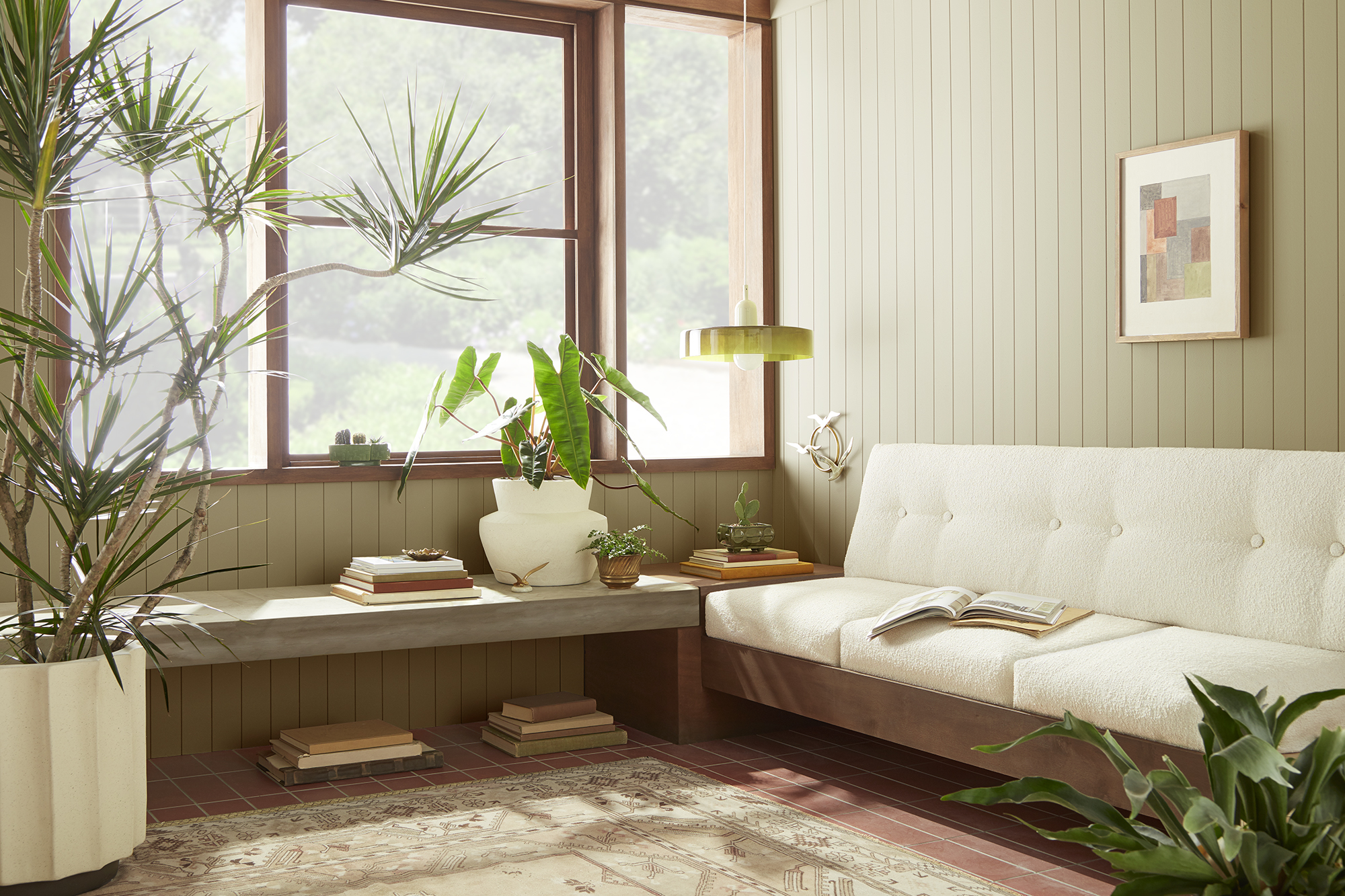
The next transformation took a neglected room off a main living space and turned it into an appealing study space for two older kids. The heavy wood desk wasn’t making the grade and the clutter in the corner had to go. We decided to bring the room back to life with a bit of color to stimulate energy, imagination and creativity.
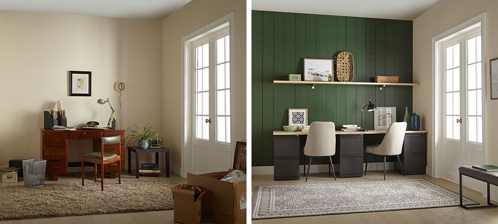
We started our project in a big way, by installing vertical shiplap boards over the back accent wall for instant visual appeal. A timeless and textural addition to any space, shiplap walls give you a designer look while being surprisingly easy and affordable to install – even if you’re a newbie DIYer.
Next, we covered our new shiplap wall with a coat of KILZ 2® All-Purpose Primer — a crucial first step when working with uncoated wallboards, because this multi-surface primer provides excellent adhesion and ensures the new paint glides on effortlessly.
Once the primer dried, it was time to choose the color. We opted for a warm, inviting green – KILZ® Tribute® Paint in American Pine (TB-69). This rich, eye-catching hunter green was perfect for the look we were going for, a modern take on the comfy/cozy traditional farmhouse style.
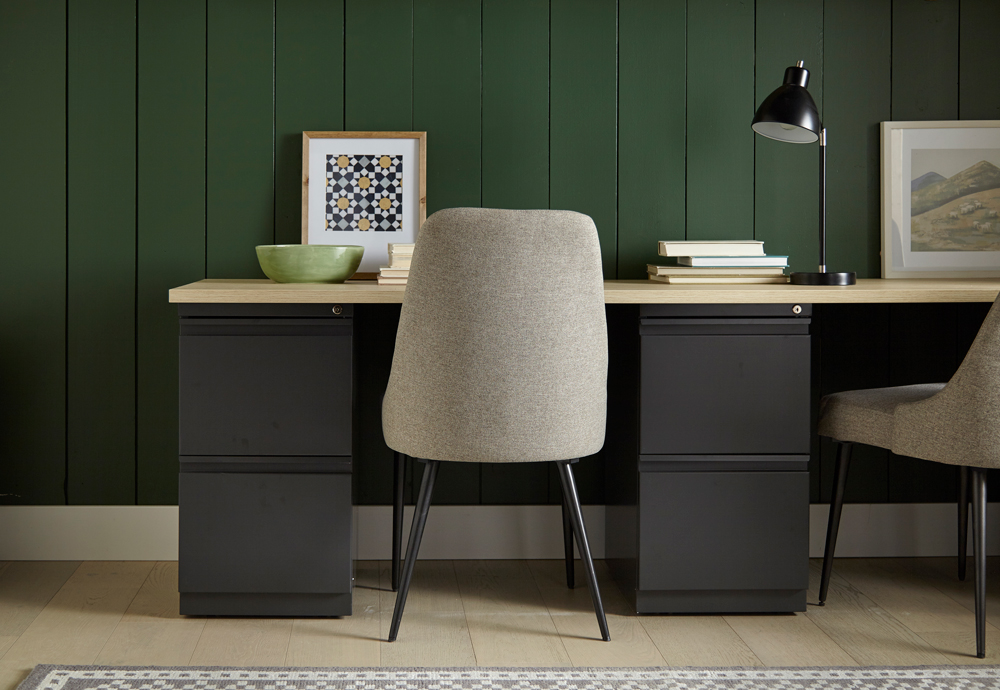
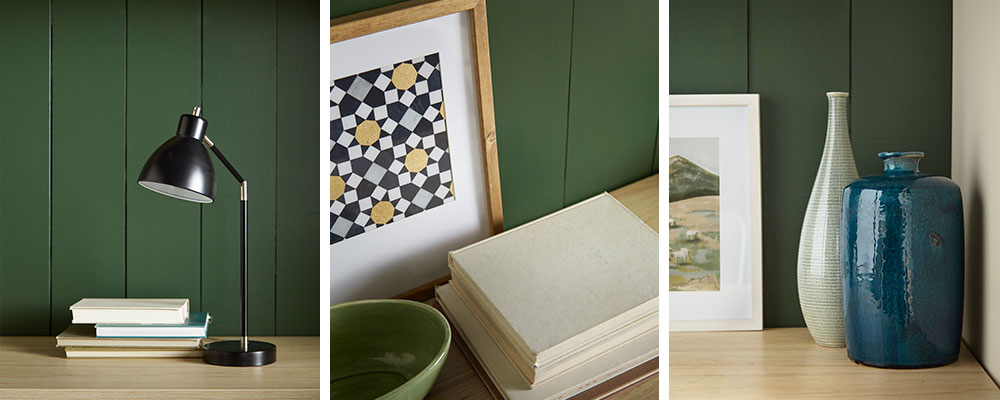
We added a convenient floating shelf for accessories; and, since space wasn’t a huge issue here, we were able to fit in a fantastic double desk, consisting of a simple deep-drawer base topped with pale wood to match the shelving. For added comfort, we replaced the dated desk chair with fully upholstered chairs in neutral shades to tone in with the rest of the room. To go with the woodsy green theme, we added accessories in wicker, nature-themed photos with pine frames and other knick-knacks in sage and blue tints—a bowl here, a vase there—to complete the look.
Always remember to refer to our website kilz.com or product back labels for additional information on which primer is right for your project and detailed instructions on how to apply our products.


join the conversation:
SHARE this post:
COMMENTS: