Tag: Office Makeover
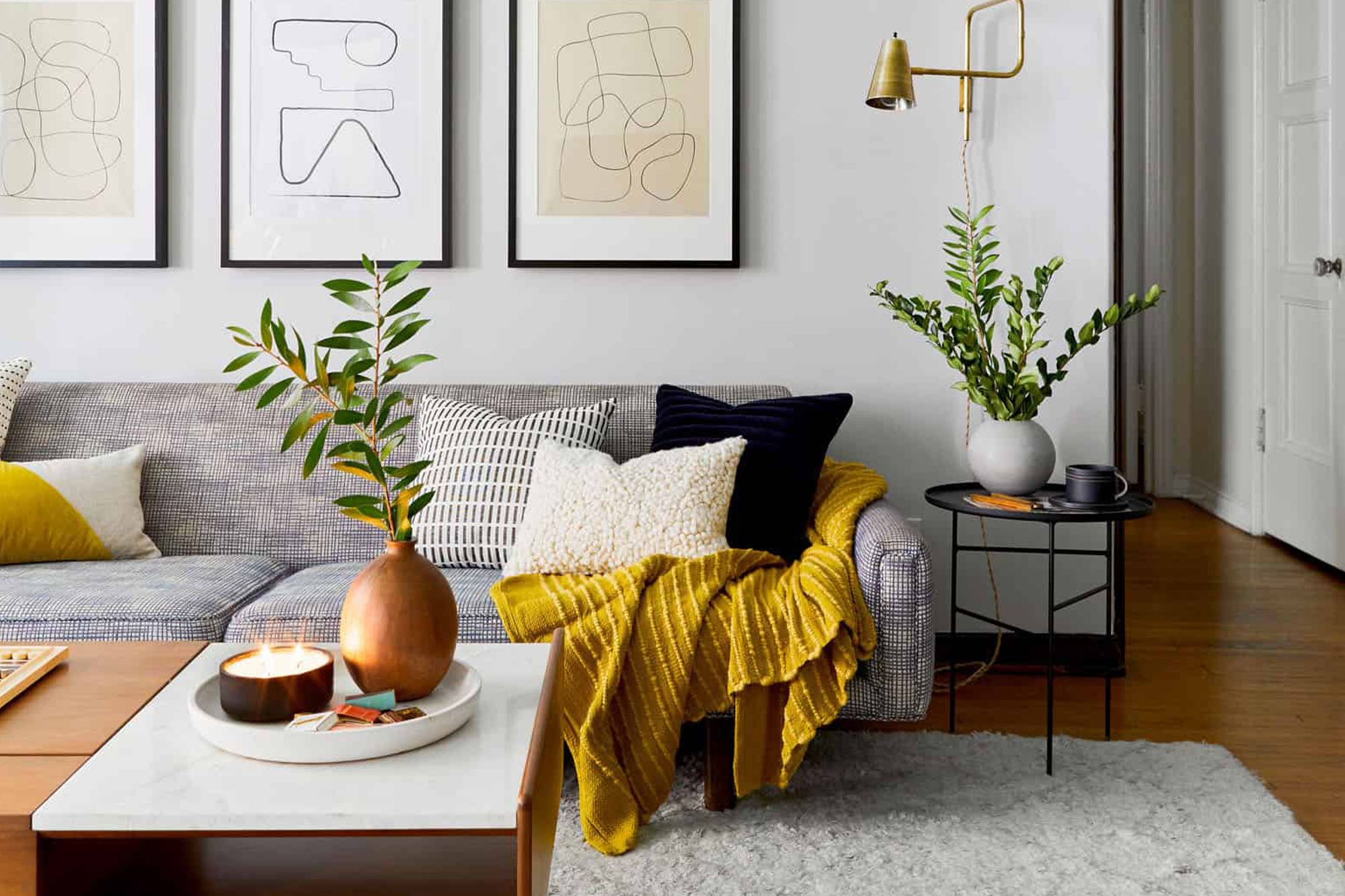
Smart Spaces with Emily Henderson
February 19, 2021One of the biggest design “trends” we’re seeing as we move into this new year is multi-functional spaces. We put “” around the word trends, simply because while we are seeing plenty of beautiful multi-purpose spaces pop-up, the trigger for these transformations is often an essential need. The need for a place to log on to your zoom calls that isn’t your couch or kitchen island, the need for kiddos to have a place to do their schoolwork that doesn’t devour the dining room table, and even the need to have a place for some peace and quiet (meditation corner anyone?) since the local yoga studio is still closed.
Functional spaces are key to thriving in 2021, so why not make them beautiful too! One of our favorite interior designers and great friend of the KILZ® Brand, Emily Henderson, is a true pro when it comes to designing spaces that not only look amazing but work hard to meet her client’s needs. And like any seasoned designer, Emily knows that proper prep work is essential to professional quality results for every project both large and small. We sat down with Emily to get her tips and tricks for creating multi-functional spaces, learn how she properly preps her projects and get a sneak peek at a home office reveal she’s currently overseeing.
Hi Emily! We’re so excited to have you on the blog today. You’ve been a KILZ fan for some time, can you share what you love most about KILZ and why you trust KILZ products for your own projects and for your clients?
Hiya, thank you! A couple things: first – and I think this is the biggest one – it’s just a huge time saver. And it emboldens us to take more risks. And lastly, I guess it’s just a good, functional product. I can elaborate!
I think it’s a pretty commonly shared opinion that painting is the most affordable, most impactful thing you can do to change the look of the space. I agree with that! But if you want to make sure that your paint job actually looks good, you’re going to want a great blank canvas behind it. KILZ is the brand that all of our painting contractors use to prime our spaces, so there was a default level of trust there already – if you’re ever on a construction site before paint goes up, I’m sure you’ll see tubs of KILZ everywhere – but they use it because it makes their lives easier. Walls are smoother, paint sticks better, some of the primers even have mold- or mildew-fighting properties. (We used one of those primers in our windowless basement bathroom.) Instead of schlopping on coat after coat of paint and hoping for even coverage, it’s nice when you can just prime and then roll out two coats.
But also, it’s fun to have KILZ in your back pocket. My team in particular has been able to go crazy with paint in their apartments – you know, like green trim in the bedroom or purple stripes in the bathroom, but done tastefully! – with the knowledge that they’ll be able to change it back easily when they move out without losing their security deposit. We are genuinely big fans.
What’s one project in particular that you couldn’t have completed without KILZ? And which primer did you use?
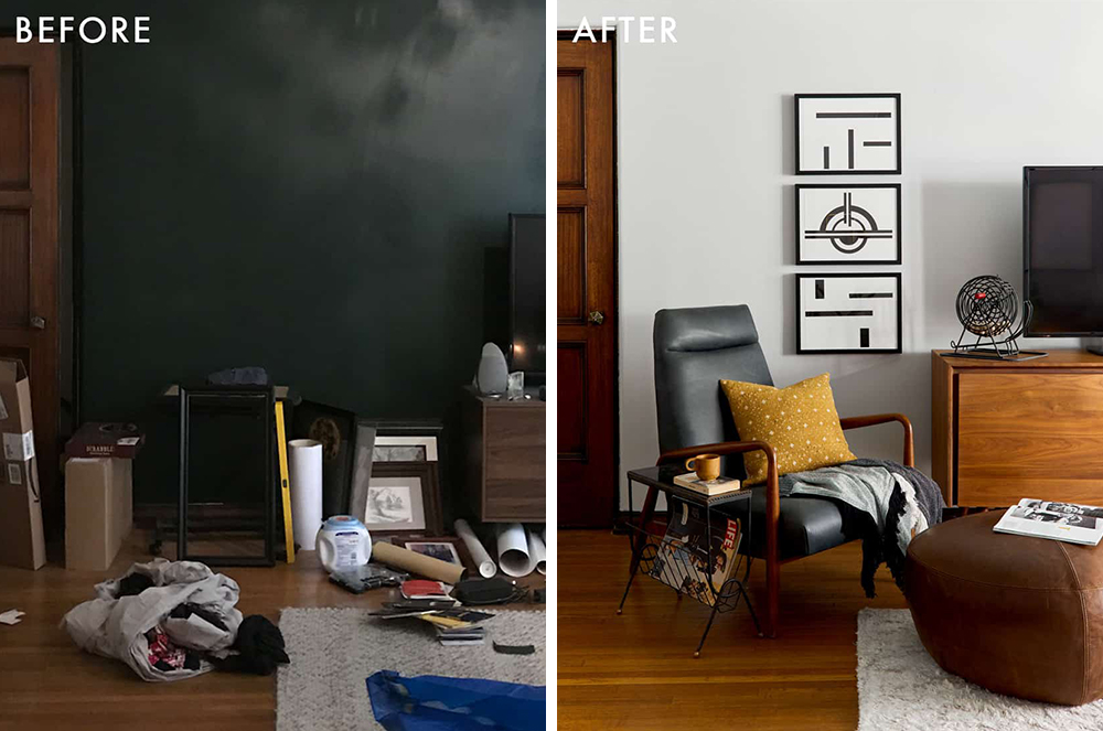
Oh boy, where do I begin? Top of mind would be this living room that my team, lead by Julie Rose, just finished. It was in a historical LA building, right off the first-floor courtyard, and it was dripping with charm…but that black accent wall wasn’t doing any favors. It was just bumming us out. There was only one window in the space, which faced into the heart of the building, and it just made the room feel dark and depressed.
There were a couple problems in the space that we all deal with – not a ton of storage, a pass through layout, you know, the classics – but the main one was really that this wall was overshadowing everything in the space…literally. So we settled on painting the whole space, including the trim, in ‘Chalk Gray,’ brought out our painting contractor and he primed the whole wall in under half an hour – our photographer, Sara Tramp, had popped in to grab progress shots and he had already almost finished by the time she was set up and ready to go.
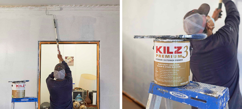
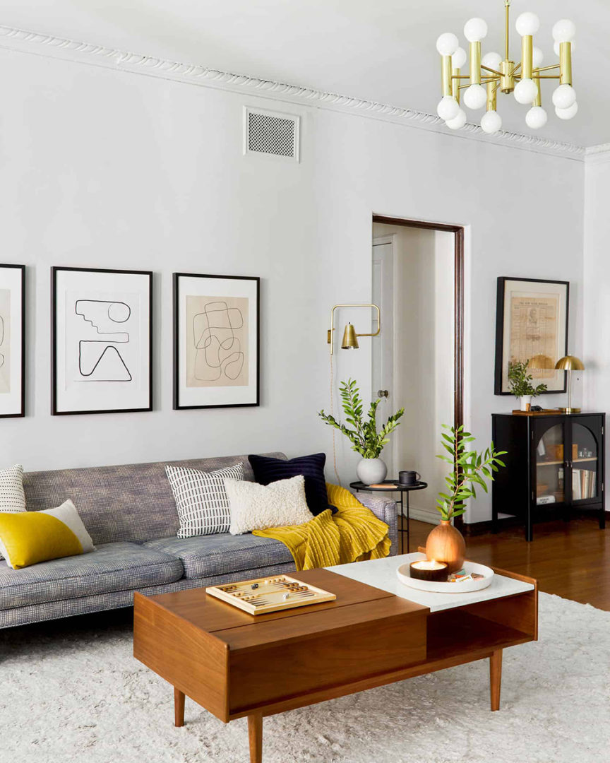
Those photos were taken after one coat. One coat! Do you know how long that would have taken to cover up with just white paint? We ended up priming every wall in the apartment so we’d have a nice, even base and a clean backdrop for our new gray walls and by the time we finished, it was such a beautiful space. The before and afters were staggering. It was like we had breathed new life into the architectural details – once everything had been cleaned up, you could finally see the beautiful moulding and the warm wooden details actually stood out. I’m so proud of how this one turned out.
Now let’s talk about prep. What is your advice for a novice DIYer looking to take on a painting project? How much time should they allocate to prep and what steps should they absolutely not skip?
If you’re painting the whole room, take the time to do it right. Sure, you can change paint, but not in the same way that you can swap out a throw pillow or blanket. Before doing anything else, I’d recommend taking 10 minutes to look around and to find and fill all your tiny nail holes or hairline cracks. If you ignore these things and paint straight over them, your eye is going to be drawn straight to them every time you walk in.
My team is split on the value of painter’s tape – actually, my photographer recently painted all of her closet trim freehand after installing a gorgeous wallpaper, out of fear that any tape would pull it off – so I think that if you have a pretty steady hand and a couple of baby wipes, you should feel free to go proceed without taping. You can also throw down drop cloths and make sure to move all your furniture out or to push it to the middle of the room and cover it!
From there, I’d recommend jumping straight into priming. For an average sized room – let’s say 11’ x 12’ – it should take about an hour or two, plus it’ll save you a ton of time on the back end, since you won’t need to paint as many coats to achieve vibrant coverage. The whole process, from filling holes to moving pieces to priming, shouldn’t take more than half a day and it’s definitely worth it.
Like we mentioned in the intro, you’re a true pro when it comes to designing multi-functional spaces. What are the key things you consider when presented with a project to create a room that will meet various needs?
Wow, thank you! There are three big questions to ask: who is using the space? What are the functional requirements? And how do you want it to feel?
For example, a multi-functional space shared exclusively by children, like a playroom or a homework room, and a multi-functional space that needs to work for the whole family, like a rec room, need to be designed differently. A room for kids will have softer pieces to abate the potential for injuries, more open floor space to encourage play, more nooks for alone time, etc. whereas you may float more pieces in a whole family space to encourage smaller zones for each task at hand.
Once you’ve nailed down who is using the space and what it’s for, the most important thing to figure out is how you want it to feel. Try to pick a few words that describe the vibe you’re going for. On my team, some favorites recently have been “warm grandpa library,” “bright art deco discotec,” and “moody old world restaurant.” Picking how you want it to feel when you walk in will really help dictate pieces, layout, and will remove a layer of design analysis paralysis that I think we all struggle with occasionally.
Home offices are by far one of the most popular spaces we’re seeing people DIY. What is your favorite office project you’ve completed recently? (And did you use primer?!)
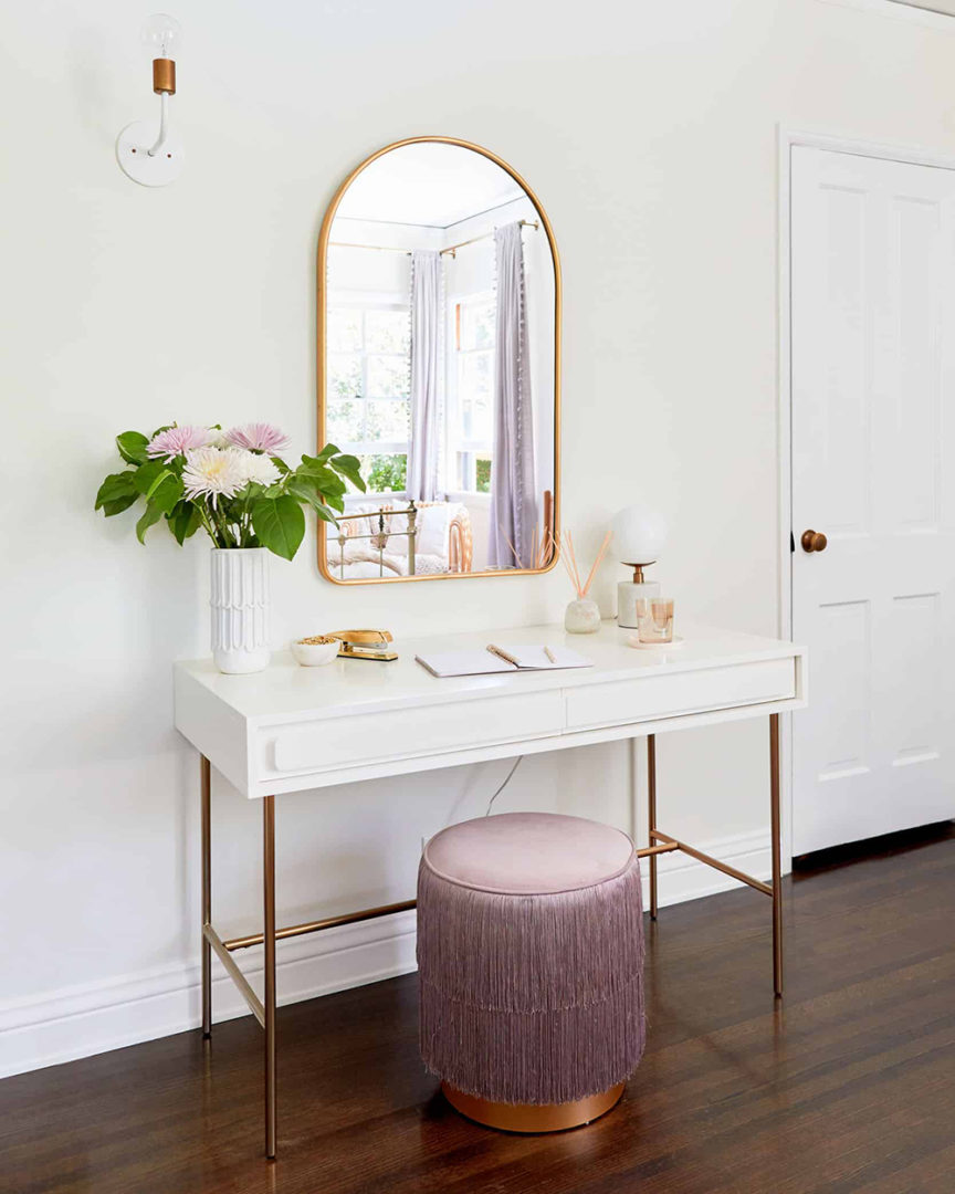
Did we use primer? You jest. Of course we did! My team, again led by Julie Rose, recently finished this teenager’s bedroom makeover, which obviously had to include a multifunctional office space for some homeschooling. I actually designed this space about a decade ago, so it was thrilling to be able to work on its update.
We ended up choosing this vanity in particular because of its size and storage – it wasn’t too heavy for the space and it can pull double duty as the perfect sized desk for a high school student who’s currently just learning from her laptop.
I guess that rolls into my main tips for folks looking to build an office or WFH space. Look for pieces that can serve a few purposes that you’ll still want to look at after you’ve returned to work or school. If you’re able to, try to grab a desk that’s the appropriate scale for your room. This one is a great size for a teen, though I know that some adults will need more space and closed storage. Finally – and the tip I love the most, as a stylist – see how you can accessorize your WFH or homeschooling space to make it feel a little less sterile. The mirror above this desk in question is across from the windows, so in addition to being a great place to get ready in the morning – there’s a cabinet with closed storage in the room, too, in case you’re wondering where the non-school products are kept – it also does a great job of bouncing light around the room.
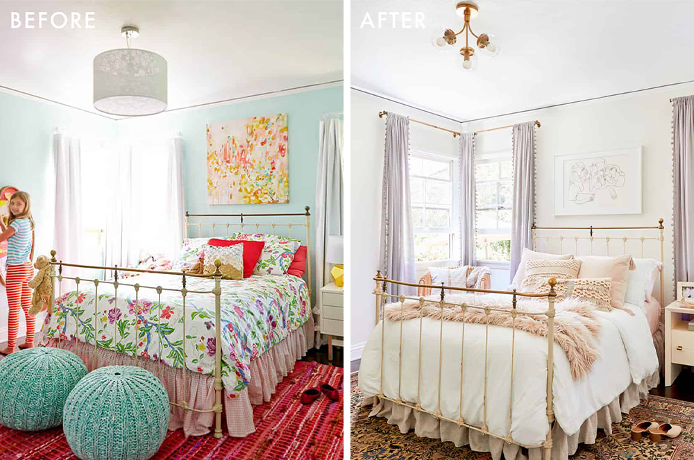
You know I couldn’t leave without a paint transformation photo. Just such a bright, happy, serene bedroom and homeschool space!
One of the biggest woes of a home-office-lacking DIYer is that they just don’t have space for an office. What creative hacks or solutions have you seen to create an office in a small or unique space?
OH BOY. Let me tell you about the project we’re working on right now with one of my favorite new designers, Keyanna Bowen! She’s figured out an incredible way to separate her space and I can’t wait to see it all finished.
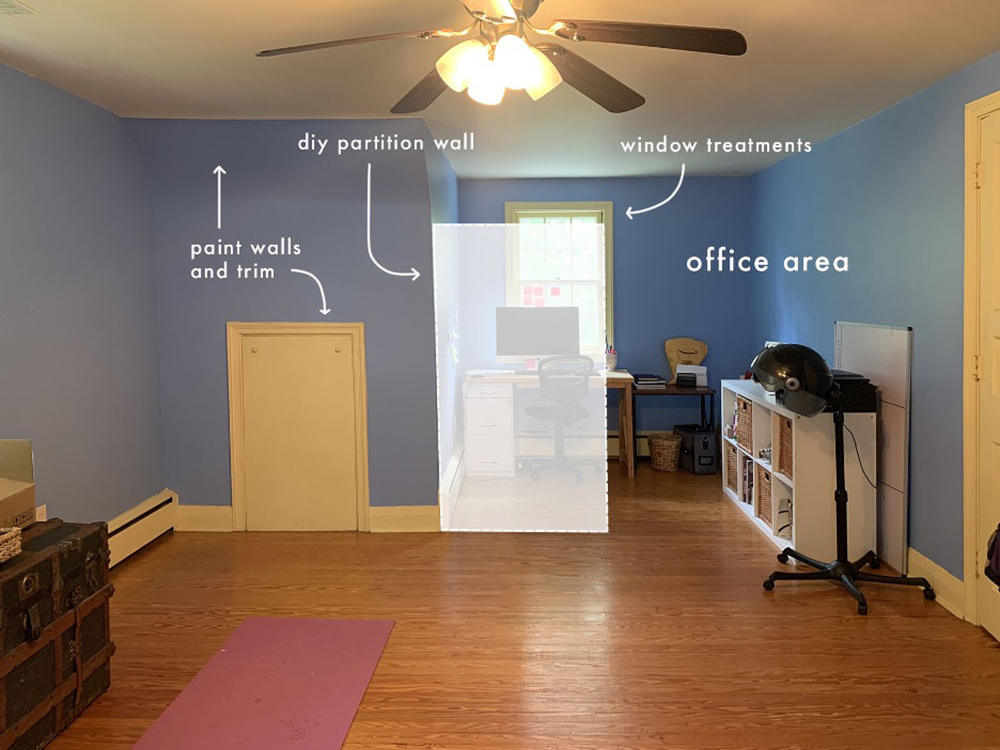
Here’s where we’re starting from. Beautiful! Just kidding – there’s obviously a ton of charm in this room, but it just needs a little bit of a boost. Keyanna wants this space to still serve as a guest room and as a yoga space, so we can’t go all-in on just decking it out as an office. I’m sure that’s a problem most folks at home are familiar with, too! Key’s plan, though, is awesome: she’s planning on building a rope wall partition. A rope wall partition! It’ll hang from the ceiling and it will still let in light while defining the office as its own separate space.
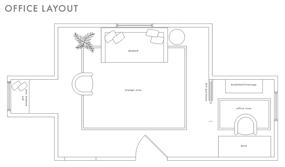
Over the past year, I think my favorite WFH spaces or DIY offices have been the ones where folks have turned their closet into a whole desk setup (long live the cloffice!) or folks who, like Key, have figured out a functional way to use a previously-awkward nook. I’m so inspired! If you aren’t blessed by architecture, though, the idea still stands: is there a way to carve out a corner of your home with privacy screens? Can you hang a similar partition in your living room to give the illusion of a separate workspace? The possibilities are endless.
A word we hear a lot when talking about multi-functional room design is zoning. Can you share what exactly that is and some tips to do it right?
I love a zone! I talked about it a little earlier, but it’s really about figuring out how to clearly define the different functions that take place in each part of a room. The best part: it’s very easy to do! You can set up separate zones in minutes by anchoring areas with different rugs. Key does it beautifully above, with the office and lounge areas both being really clearly defined by their rugs. It makes total sense, because when our brains see different flooring, they think, “oh, different room.”
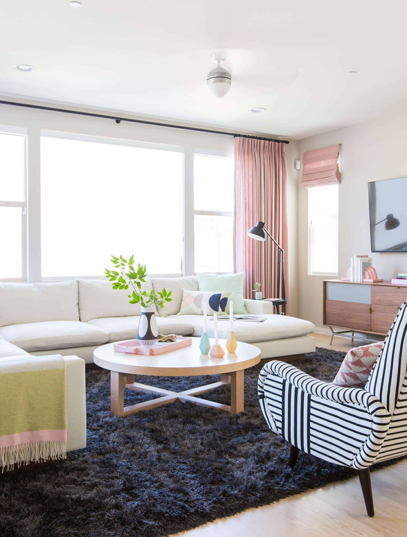
Zoning is really essential for folks with open concept layouts – especially now! So in this project – from 2016, oh my gosh, though it’s still one of my all-time favorites – we created a huge and comfortable family room by flanking this super-soft rug with a huge, u-shaped sectional and two graphic chairs. It’s bright and open, but still definitively its own space.
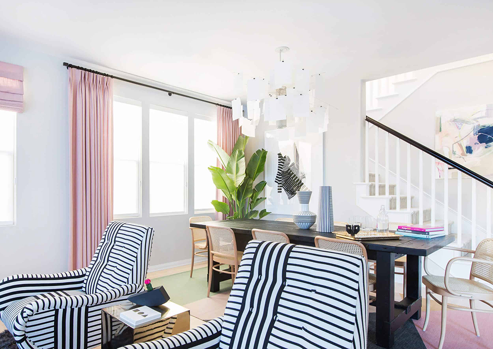
A few feet away, and anchored by a flat, easily-cleanable dhurrie rug, is the dining area. You’ll probably notice a lot of repeating elements: graphic hits of black and white, light woods, and pastels. Keeping a cohesive color palette isn’t always necessary – I am all for exploring, playing, and getting weird – but it does make the design process easier and it’ll make your rooms feel more relaxed and comfortable.
Switching gears to home-school rooms and kid’s study spaces. What was the biggest hurdle in creating a functional space for little ones?
Making spaces so that kids will actually use them! I think that a lot of the time, design-minded people like myself can get really hung-up on the vision. We want to make something beautiful and impressive and worth sharing, but kids don’t necessarily share those same motivations. They just want a fun place to play, learn, and explore.
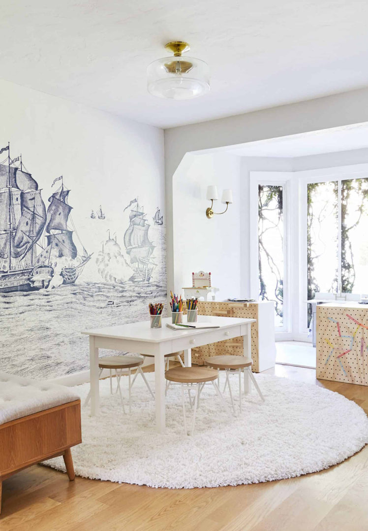
The playroom is actually the space I struggle with most. My kids are still very young – 5 and 7 – so we’re early in the homeschool process, but they love art and playing with legos, so once I chose to design for those two hobbies in particular, it immediately became more functional and the kids used the space way more.
To that end, I’d ask: what do your kids like doing? How does your child actually study or do homework? If they love drawing, give them a space for that and relinquish your dreams of them ever actually wanting to play with the enormous dollhouse you bought in the hopes that you could play with it together. (Speaking to myself, here.) If you build it, with your kids and their specific tastes and interests in mind, they will come.
Can you share a recent personal or client projects you’ve done that included a room for kids? And of course, we want to know how primer came into play!
I’m in love with this room that my team, again led by Julie Rose (are you sensing a theme here?), recently completed for a little girl. We wanted to make a magical bedroom with a specialty art area and I think we really made it sing.
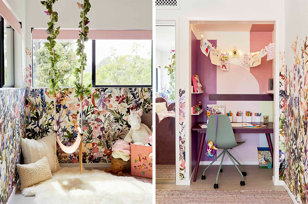
As for how we used primer – it went everywhere! We actually primed underneath the wallpaper, per our installer’s recommendation. It covered up the previous paint and served as a plain backdrop so that the white pieces of wallpaper would appear clean and fresh, but it also worked as a bit of a barrier so that the wallpaper paste didn’t bond with the walls too much. While wallpaper is pretty permanent, priming first can make the removal process a bit less painful in that you won’t need to worry about ripping off chunks of drywall by accident.
We also obviously had to prime that art nook so that all of our magical, fairy-inspired colors would show up. We love the way it turned out and so did the family.
Before we wrap up, let’s talk about the project that we’ve partnered with you on… that also includes your design mentee Key! Can you tell us about her, the project and give us any sneak peeks?
Woops, I guess I already spilled the beans a little bit on this one, but I’d love to talk more about Key! Earlier this year, my team and I decided to take on a mentee – I’ve been so incredibly fortunate to find success in this field and I’m now surrounded by people who are experts in editorial and social and more, so I wanted to share the wealth and hopefully, help more folks find long-term career stability in this weird world of internet design and influencing.
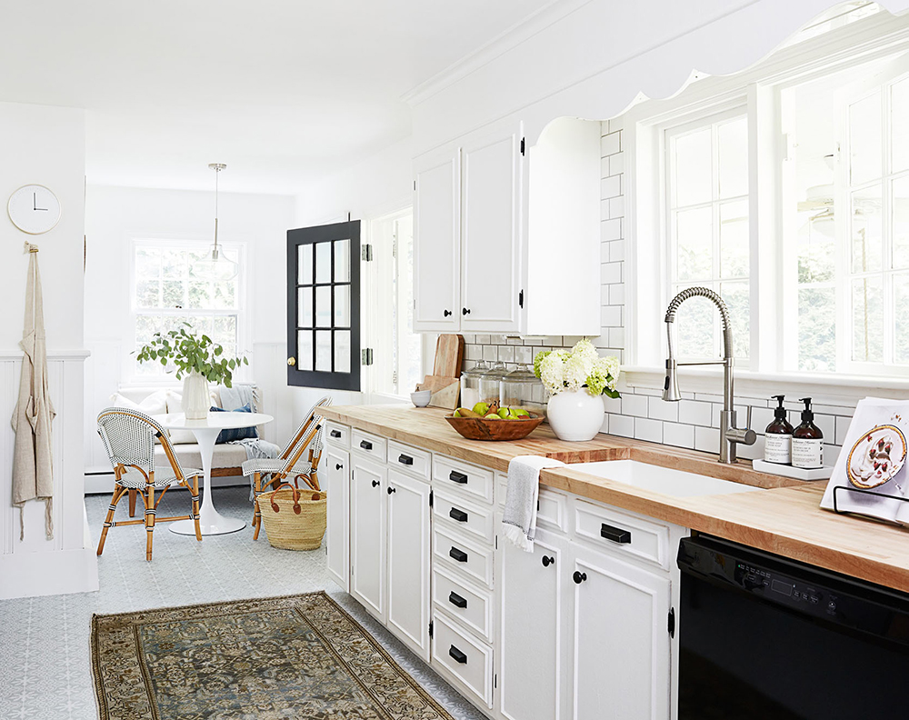
Key was an instant, unanimous pick from the team. She’s an incredible interior photographer in her own right, but we knew once we read her writing and peeked at her own DIY rental renovations – that’s her kitchen above – that she would be the next big thing. She’s warm and creative but she’s also detail-oriented with a perfectionist mindset, which is what it takes to make and shoot and share beautiful spaces for the internet!
We’ll be making her office over – the periwinkle one I shared above – and we’re so excited to work with KILZ because it’s actually covered in oil-based paint, which you can’t cover without using a specialty primer. We’ll have an official update in a few weeks, but I can share the general design direction which is going to knock your socks off…
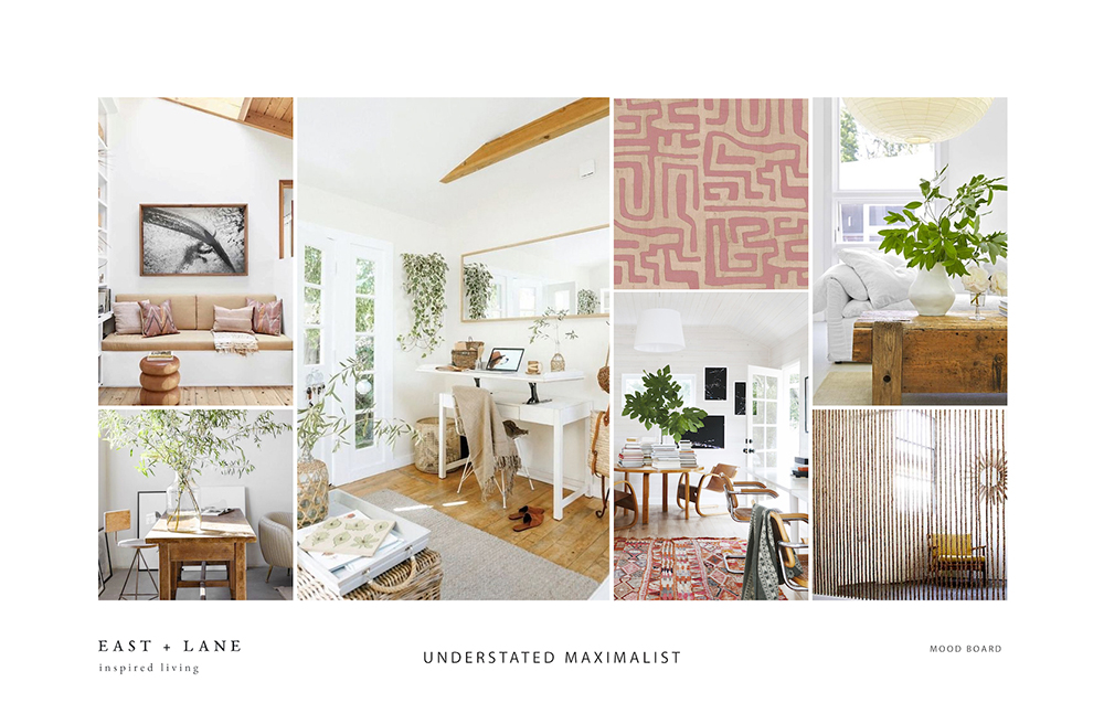
My team and I have been working with Key to secure all the main furniture pieces and BOY, they’re great. (Also, do you see that rope wall partition on the bottom right? It’s so good, isn’t it?) I know it’s only February, but I have a feeling that this is going to be one of our top makeovers of the year. We’re so thrilled to reveal it to you all and so grateful that KILZ has given us the opportunity to work on such a fun project, together. Cheers to beautiful and multifunctional rooms in 2021!
Author is paid sponsor of KILZ Primer. Always remember to refer to our website kilz.com or product back labels for additional information on which primer is right for your project and detailed instructions on how to apply our products.
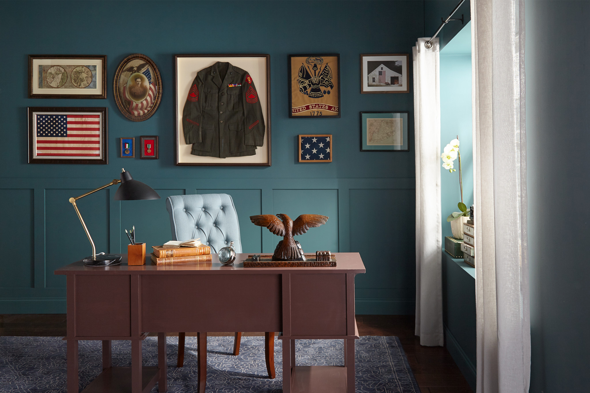
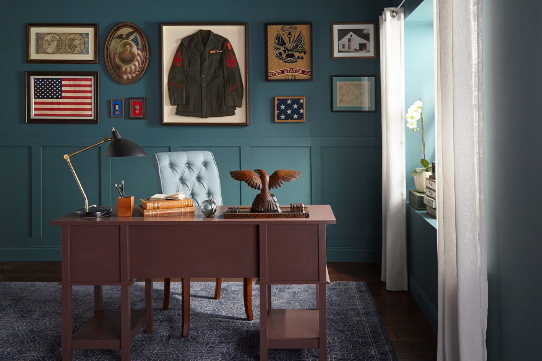
A Military Makeover for Grandpa’s Office
December 17, 2019A grandfather’s military service is honored in this beautiful office makeover.
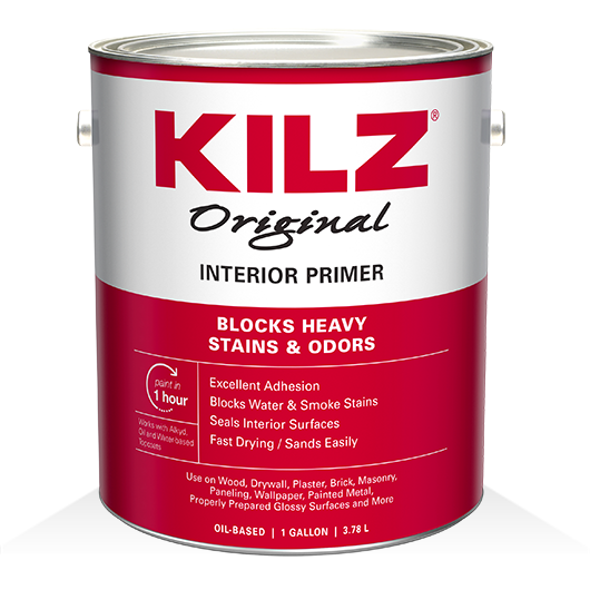
Before painting, smoke-stained walls needed to be addressed and KILZ® Original Primer does the trick. Trusted by pros for over 40 years, the powerful formula blocks most heavy interior stains including water, smoke, tannin, ink, pencil, felt marker, grease, and also seals pet, food and smoke odors. In this surprise room renovation, meaningful memorabilia become the focal point, showcased on dark-hued walls primed with KILZ® Original and painted with KILZ® Tribute® Paint. Want to recreate this look at home for yourself or someone you love? KILZ can show you how!
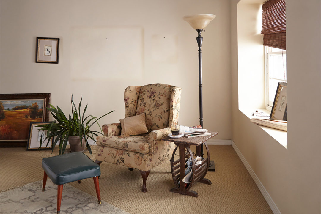
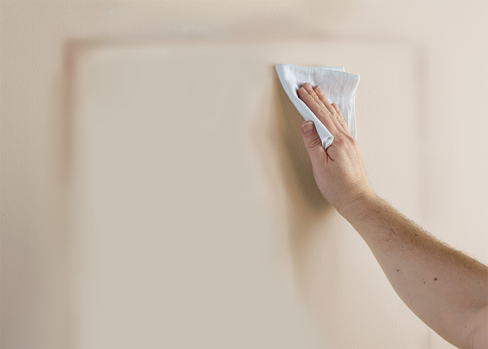
To begin and prepare for priming, wipe down the walls with a damp cloth to ensure they are clean and free of dust and allow to dry.
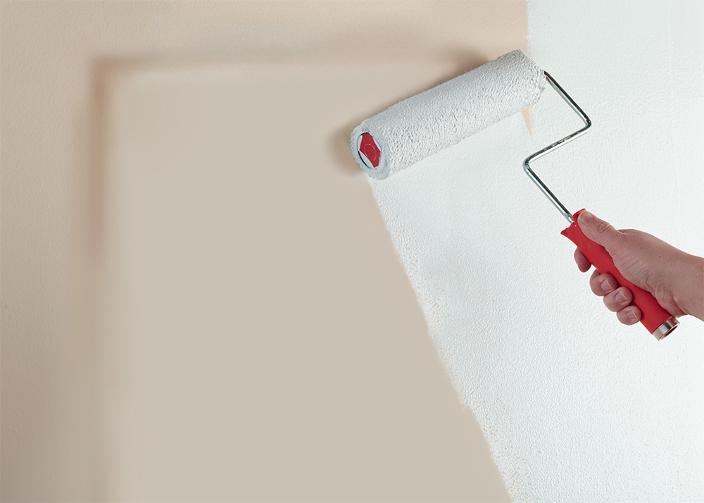
Next, tape around the baseboards, trim and moldings. To seal and block stains and odors, apply KILZ® Original Primer to the walls. Stirring prior to and during use, apply primer using a brush first to “cut in” around the edges, then use a roller to fill in and allow 1 hour of dry time. Once the primer is dry, apply KILZ® Tribute® in Oceans Deep using the same application method as the primer – using a brush first to cut in around the edges 4 to 6 feet at a time, then use a roller to fill in those sections before moving along. Remove tape prior to paint fully drying and admire the stain-free walls.

To complete this surprise room renovation, an old desk is given new life! Primed with KILZ® Original to ensure truer color from the topcoat, the desk is painted with KILZ® Tribute® in Bookmarker – a dark oxblood hue that complements the deep green walls. Want to refurbish a piece of furniture at home? Keep reading the steps below to learn how!
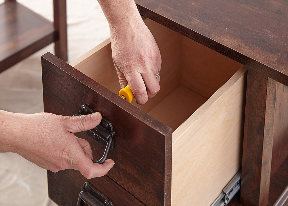
Step 1: Remove drawers and hardware.
*Pro-Tip: Put the screws back into the hardware, then seal the hardware and screws in painter’s tape and label it. It’s always best to put every screw back exactly where it came from. That will put the least amount of stress on the wood.
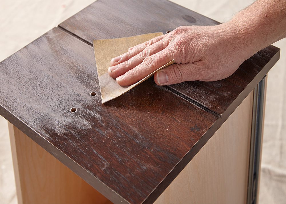
Step 2: Sand the surface; do a first pass with 100-150 grit sandpaper then finish with a second pass of 180-220 grit sandpaper.
Step 3: After sanding, wipe down the surface with a damp cloth to remove any dust or residue and allow the surface to dry before moving on to primer.
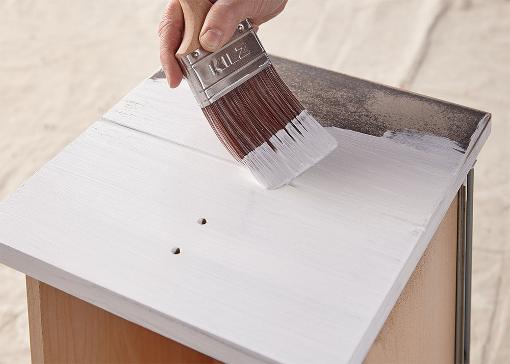
Step 4: Apply KILZ® Original primer to seal the surface, moving in the same direction as the wood grain for best results. Allow primer to dry for 1 hour.
* Pro-Tip: When painting wood furniture, you should always use a primer first. Primer will help protect the wood and will ensure better adhesion and truer color from your paint.
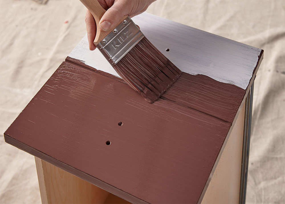
Step 5: Once primer is dry, apply KILZ® Tribute® paint in Bookmarker with a brush, moving in smooth strokes in the same direction as the wood grain.


join the conversation:
SHARE this post: