Tag: KILZ Tribute
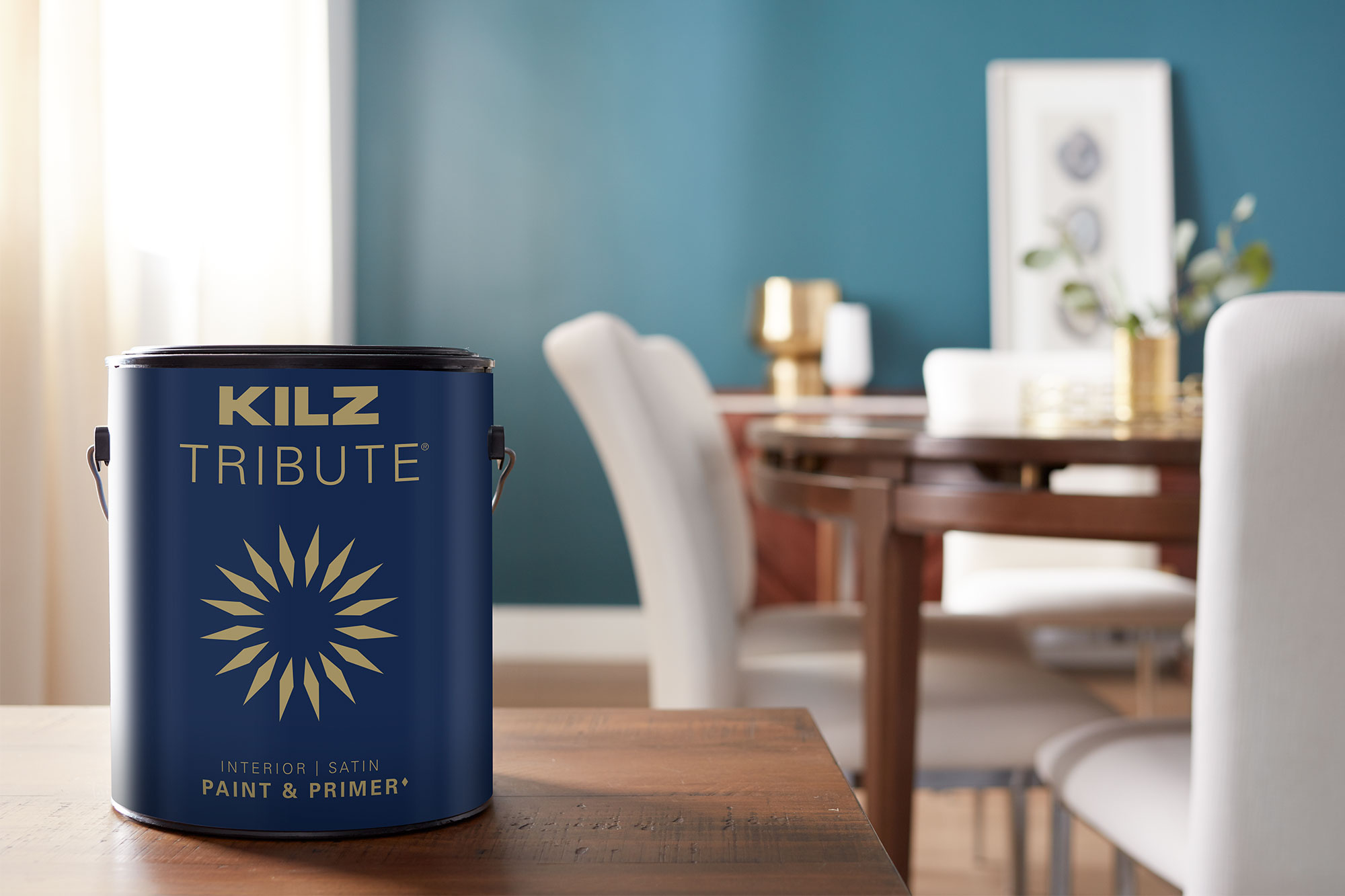
A Dining Room That’s Cozy and Bright
October 10, 2022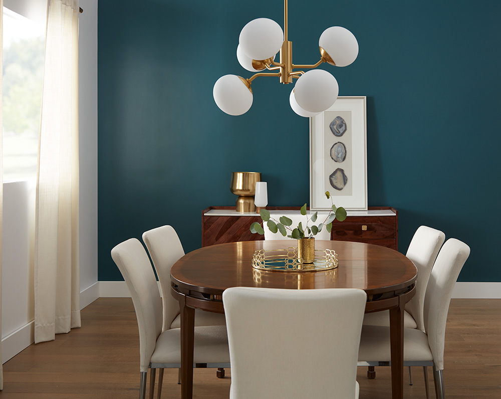
The holidays are right around the corner, and that means your dining room is about to see a lot of traffic. Whether you’re hosting friends, family, or both, your dining room should be a place where everyone feels welcome, cozy, and right at home, and with so many opportunities to use this room at this time of year, why not give it a chance to shine?
Home renovations during the holidays can be stressful, which is why we recommend starting any project a few months ahead of time. Adding an accent wall can really liven up a room and create a focal point within your home that draws people in, and it’s easy to achieve with the right primer. We hope our renovation inspires you to give your dining room a bit more personality and charm.
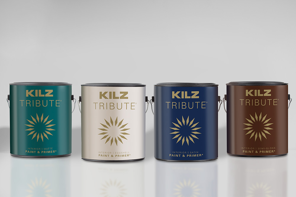
As with any room makeover involving fresh paint, we started by preparing our accent wall. We chose KILZ 2® All-Purpose Primer for this project thanks to its ability to seal surfaces, block stains, and hide previous color. We like that this primer is mildew resistant, as kitchen humidity can sometimes penetrate nearby rooms, such as dining spaces. This multi-surface primer is a favorite for time-sensitive projects you’re hoping to complete before the holidays, because it dries fast, adheres beautifully, and has a very mild odor. While not recommended for flooring,
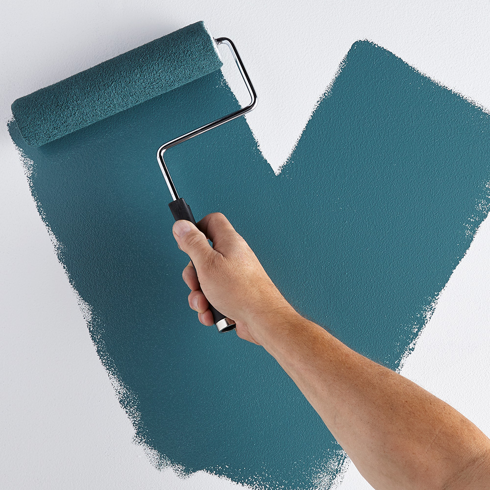
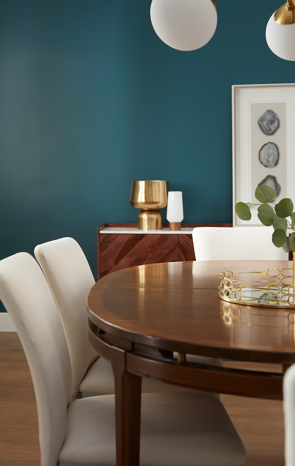
Once primed, we chose a rich, marine blue for our accent wall—Tribute Oceans Deep TB-60—and started painting, taking care to cover the base board below with painter’s tape. Taking a wall from light to dark is a great way to change the tone and feel within a room, which is what we did here. You can highlight desired areas and draw focus away from others. It can be a good idea to place a darker-shade accent wall next to a window to create contrast and play with the effects of the natural light. Again, using a primer before you begin painting is a great way to ensure any color you choose looks its best and brightest, especially if you’re painting over an existing color.
After our paint finished drying, we put the final touches on our dining room. Because this room is a gathering place, we didn’t want to overwhelm the space with too much décor that could get in the way of company or serving food. We opted for gold fixtures and accents, as well as white chairs and drapery to brighten and complement the dark wood of the larger furniture and our lovely accent wall. Overall, we’ve achieved a room that is elegant enough for holiday parties, while still being casual and comfortable enough for nightly dinners with just the family.
If you are choosing to take on a dining room renovation this holiday season, make sure you give yourself plenty of time to complete it—at least a month or so prior. Be sure to research the right primer for the job if painting, and keep it simple when it comes to décor. You can always bring more decorations into the mix for parties, but you want to make sure the space stays cozy and casual enough for year-round meals. Whatever type of domestic sprucing you tackle this year, we hope this project inspires you to create more spaces inside your home for togetherness.
Always remember to refer to our website kilz.com or product back labels for additional information on which primer is right for your project and detailed instructions on how to apply our products. Check out our Coverage Calculator to understand your estimated paint needs for your upcoming project.
Priming Your Bedroom for Rest and Relaxation
March 16, 2022If you’ve been putting off starting a new project, you’re not alone. Winter’s increasingly shorter days can make us feel like there’s never enough time to start something new, let alone finish it. But with the arrival of spring and daylight savings, now’s the time to shift your mindset, pick up that paint brush, and get to work. We’re ready to put an end to putting things off and excited to share with you our professional tips for transforming your primary bedroom into the ultimate oasis.
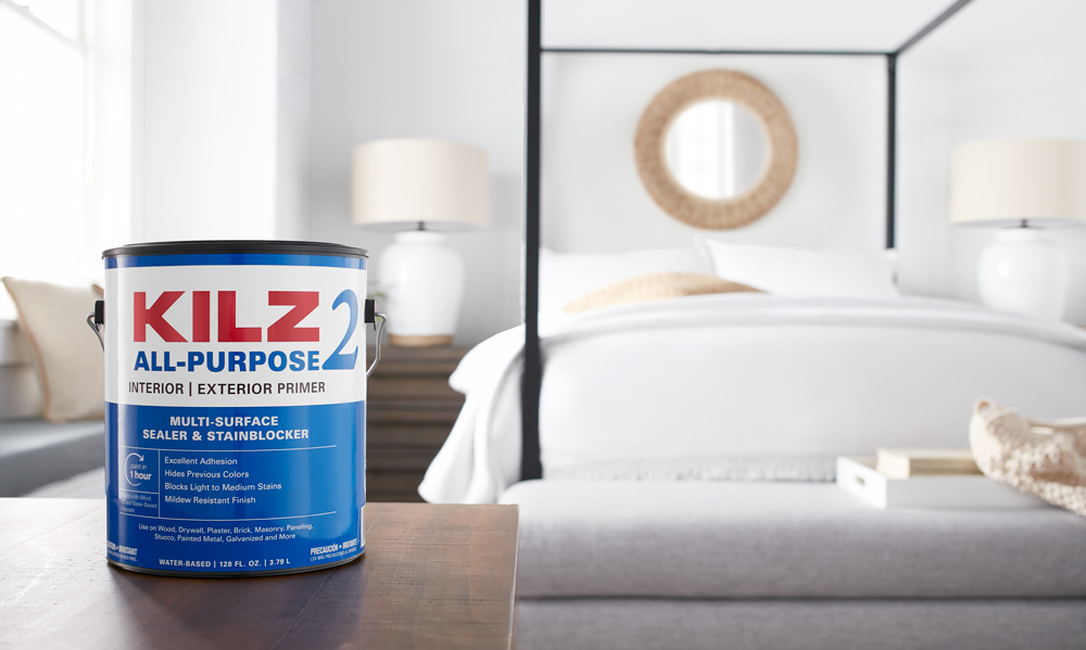
As with any renovation involving a fresh coat of paint, this process starts with a primer best suited to the job. In this instance, we chose KILZ 2® All-Purpose Interior and Exterior Primer for its fast-drying, multi-surface, and stain-blocking technology, as well as its excellent adhesion, mildew resistance—great for humidity-prone homes—and sealing properties. Its ability to hide stains from rust, marker, water, and grease makes it a top choice among DIYers, and an ideal product for painting over any existing color you might have on your walls or cabinets.
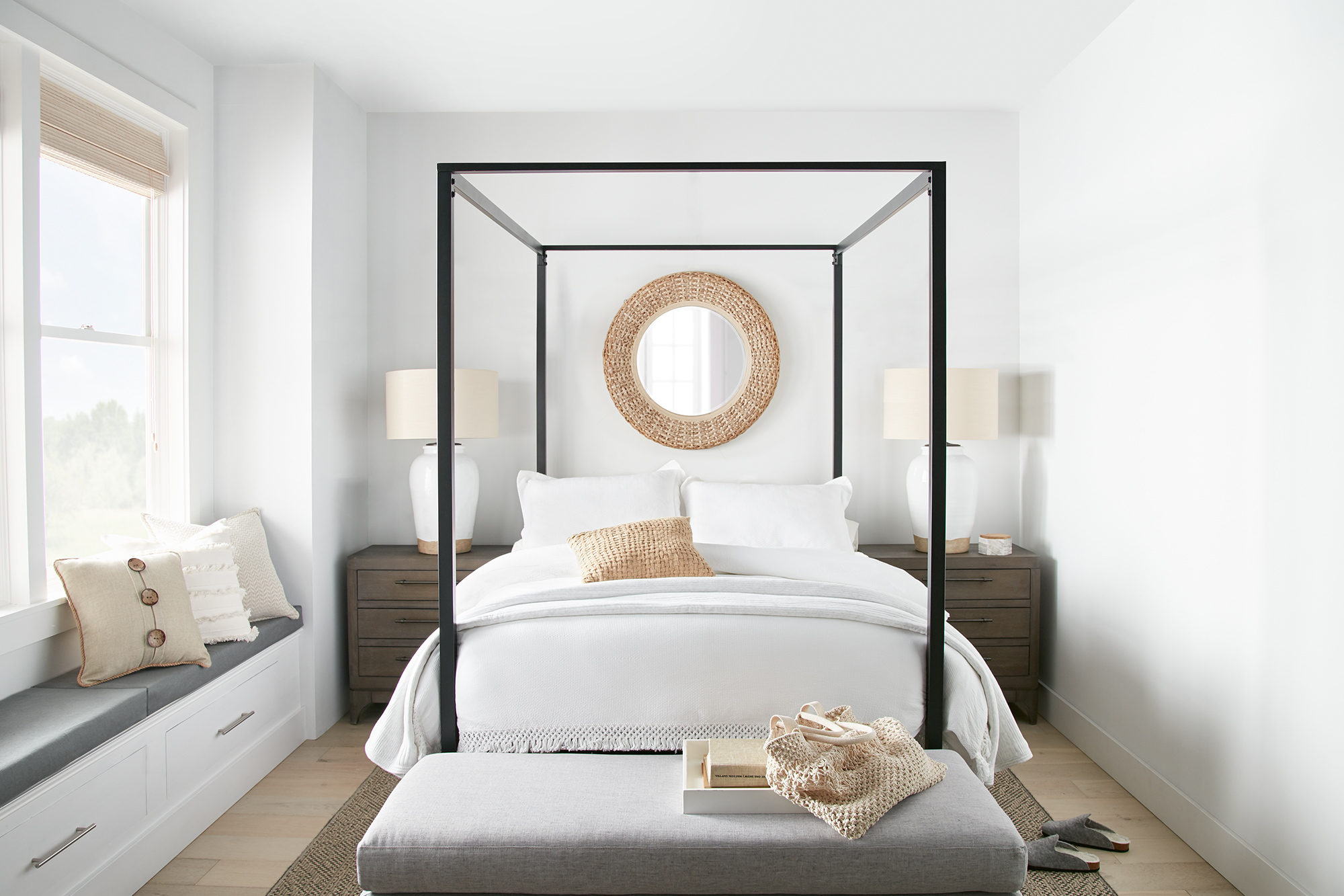
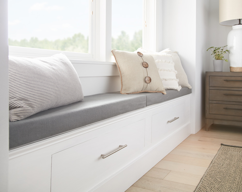
For the theme of our relaxing bedroom makeover, we chose ‘minimalist serenity,’ a purposeful contrast to the chaos often lurking outside our homes. To effectively renew the space, we painted the walls and window seat with Tribute Eggshell Ultra Bright White TB-01. This bright white paint achieves a peaceful elegance that’s, at the same time, cozy and welcoming.
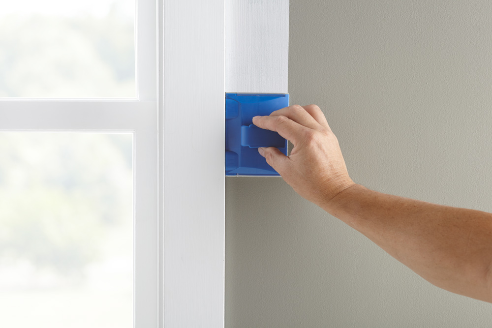
To make the transformation from gray to vibrant white paint as seamless as possible, we were careful to prime thoroughly beforehand, lessening the need for multiple coats and allowing our color to shine its truest. For time and convenience, we chose to use specialty paint applicators for wall corners and window edges.
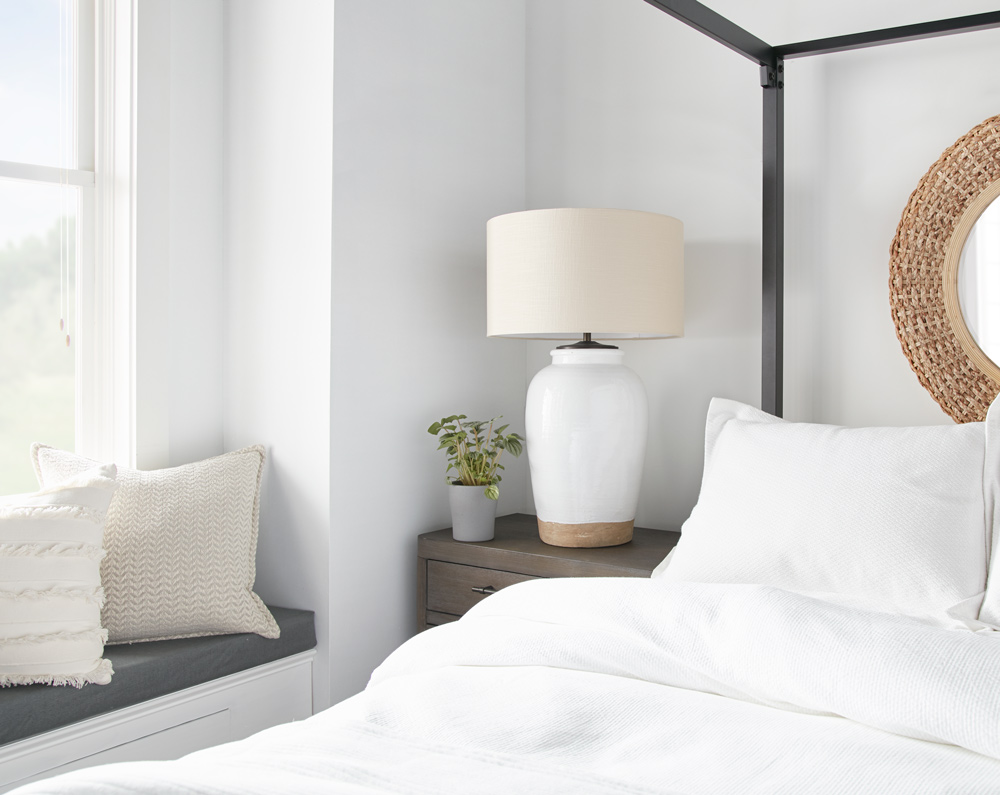
Once our walls were dry, we focused on elements of décor that would elevate the space. Our whimsical interior comes to life with subtle pops of warmth in the throw pillows, blankets, accent mirrors, and lamp bases, as well as neutral-toned furniture, which grounds the space. The black, four-poster, canopy bed frame is a beautiful accent piece and serves as the focal point of the room. An adjacent window seat provides a cozy sitting nook, and a perfect place for unwinding with a book or cup of tea before bedtime.
Transforming an ordinary bedroom into a personal haven is easy to do with the right tools and intention. For a room that feels clean, bright, and tranquil, we recommend neutral tones paired with minimalist décor, but your taste may vary. Gorgeous color that catches your eye and draws you into the space is the first step in achieving a room’s vibe, which is why it is so important to prime up top and cut out any surprises where extra time or money are concerned.
We hope our bedroom renewal motivates you to start on a makeover of your own. Once you see just how simple KILZ 2® All-Purpose Interior and Exterior Primer makes it to lay the foundation for your project, you can have confidence to start and finish quickly. And with that extra time on your hands, you can begin tackling even more things on your to-do list.
Always remember to refer to our website kilz.com or product back labels for additional information on which primer is right for your project and detailed instructions on how to apply our products. Check out our Coverage Calculator to understand your estimated paint needs for your upcoming project.
Inviting Entryway Makeover
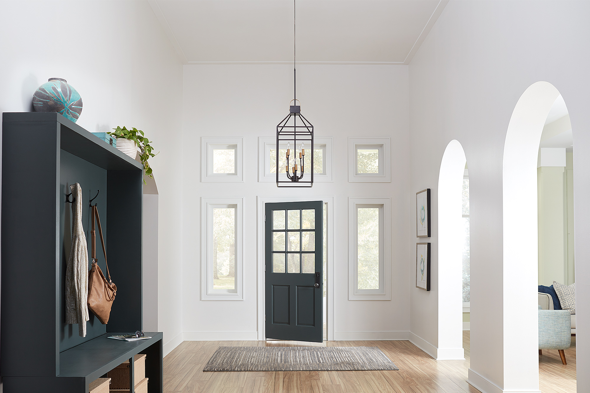
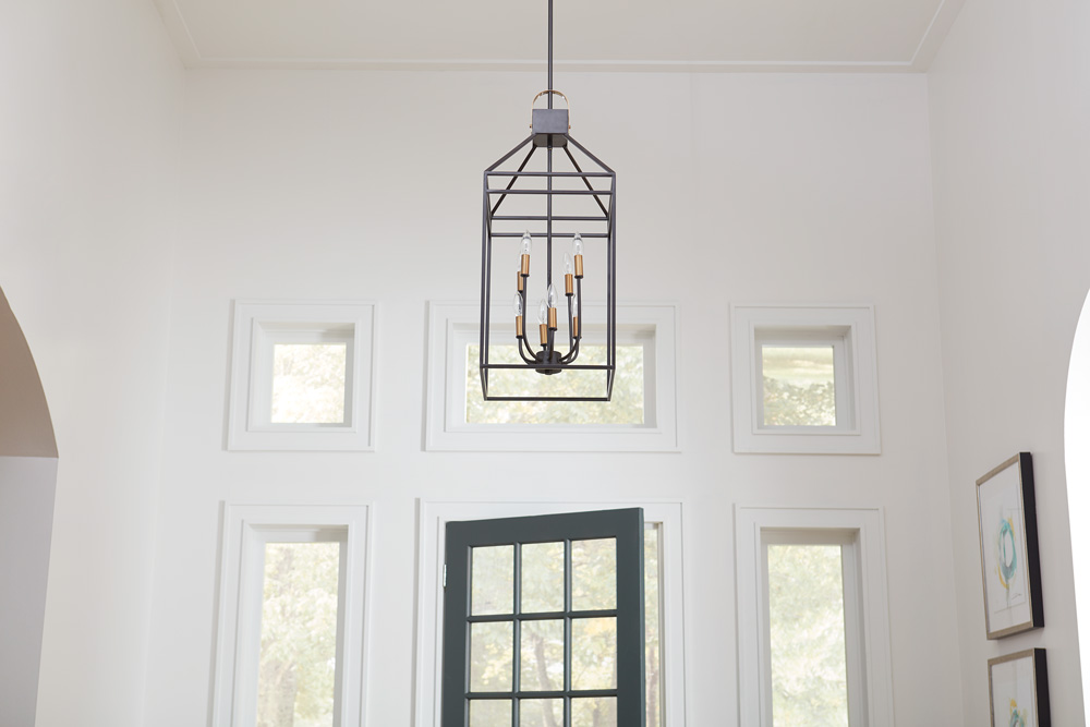
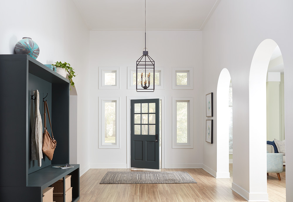
September 20, 2021A drab and functionless entryway transforms into an inviting and inspiring multi-use space in this entryway makeover. Plain, dated, and without focus, the original entryway neither served the homeowner nor did much to accentuate the natural views outside. To brighten up the space and make the area as useful as it is beautiful, we chose a fresh white hue for the walls and created a functional mini-mudroom to add much needed storage and a pop of color that we also tied in with the front door.
DIYers often overlook entryways and hallways when remodeling their homes, thinking of them simply as connectors for other rooms. Yet, these spaces can be among the most important in a property and can impact both how your home feels and functions. Keep reading to find out how we created a minimal yet practical space in this entryway using KILZ® Primer and two different paint colors – a fresh white and a nature-inspired deep green.
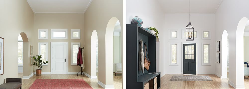
Entryways see some of the greatest foot traffic in a house, and for that reason, it is important to choose a primer that will help your final paint job last for years to come. KILZ 2® All-Purpose Primer was the perfect choice for the paint job’s foundation here, with its stain-blocking properties that help to hide stains and cover the old drab color.
Starting with KILZ 2 as a base for any surface (you can even use it on brick, wood, and drywall), the next step is to choose a color palette that freshens up your space and draws out its best features. Here, we chose KILZ® Tribute® in White Modern for the walls because the color white elicits a sense of calmness, purity, and order. Whether you are heading out for the day or coming back home, a white entryway can help to reset your mind and refocus your attention on whatever is coming next. In our makeover, the white walls act as the perfect canvas for the windows, drawing the eye outside and inviting in the natural colors of branches and leaves as they change throughout each season.
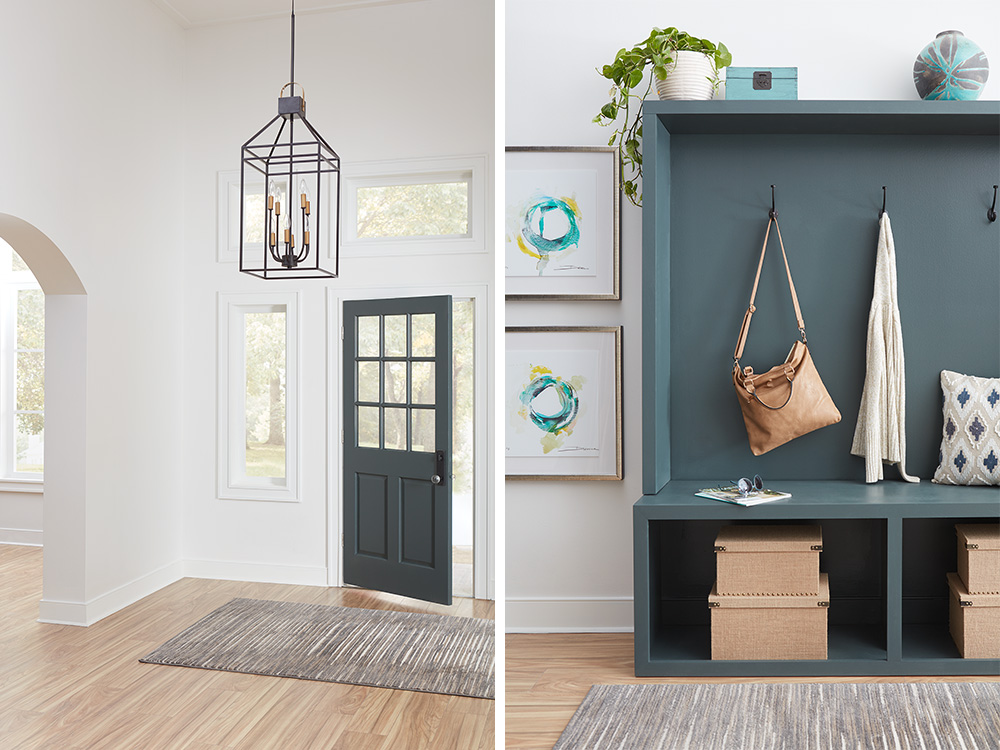
With the white paint providing an airy base tone, and a darker color for the new front door, the mini-mudroom creates a striking yet clean contrast. KILZ® Tribute® in Typewriter is a deep and almost industrial color, yet it has subtle shades of green that add the perfect pop of nature-inspired color.
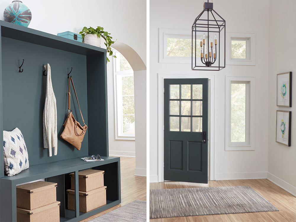
The mini-mudroom unit itself offers plenty of storage space for shoes, coats, and outdoor equipment, making it easy to keep the whole space tidy and organized. Adding storage boxes in the bottom section for shoes also helps to keep mud and dust off your floors, which means no more dirt trailing throughout the house.
Finally, we chose a handful of stylish accessories like a caged light fitting, a potted plant, natural-colored rugs, and contemporary framed artworks to finish the transformation. These small accent pieces work in harmony to ensure warmth and welcome in an otherwise clean and cool space.
If you are considering ways to update your home, a relatively simple entryway transformation project could make all the difference.
Always remember to refer to our website kilz.com or product back labels for additional information on which primer is right for your project and detailed instructions on how to apply our products.
Dining Room Designed for Mindful Living
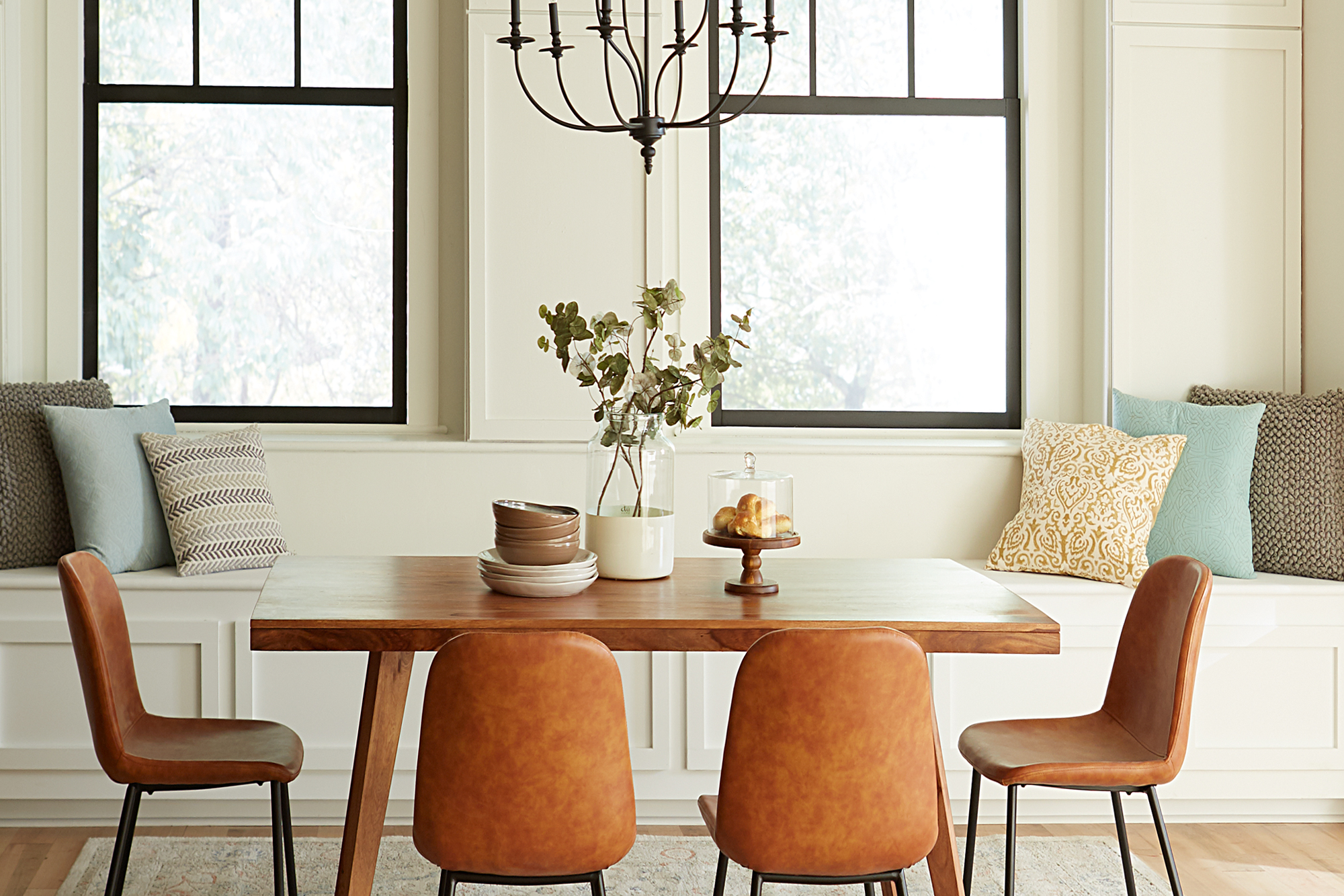
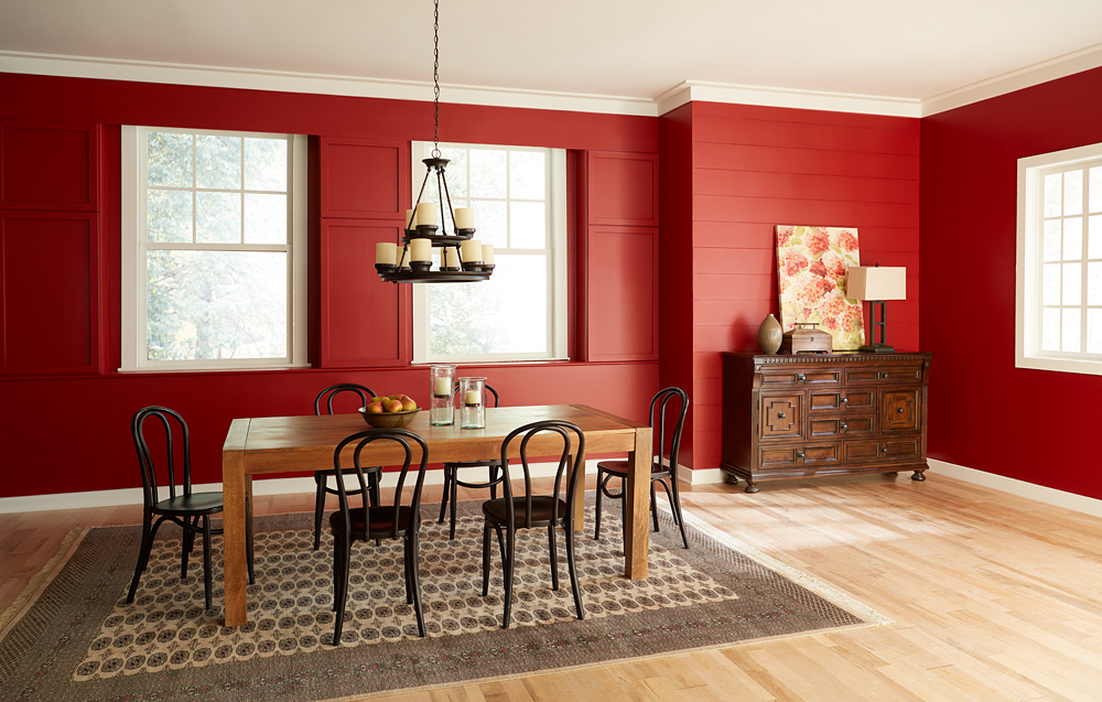
August 11, 2021A component of a balanced lifestyle is being able to slow down and relish each moment, including meals with family and friend. A light and inviting dining room can encourage you to savor the experience of every bite, while conversely a drab or too-intensely colored space can have the opposite effect. This brooding red dining room was decorated in a Mediterranean style, but its heavy atmosphere and dark furniture were uninviting and uninspiring.
Mediterranean design style, however, doesn’t have to mean dark paint colors and heavy furniture. For this dining room makeover, we kept to the existing Mediterranean theme but took in a light and bright direction – drawing inspiration from sunlight sparkling on light blue seawater and the quintessential, white-walled homes blanketing the hills of Greek islands.
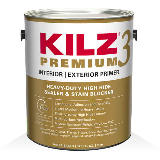
Our first step in creating a sense of tranquil enjoyment was to take the walls from saturated deep red to an airy light neutral that invites you in. In order to do justice to our new paint color, and allow its subtle tone to shine, we had to make sure there would be no shadow from the previous dark red. We used KILZ 3® Premium Primer, because its thick and creamy formula is ideal for hiding dark colors and creating the perfect foundation for new paint. Furthermore, old dining room walls can often have stains, and KILZ 3 covers heavy stains and hides surface imperfections.
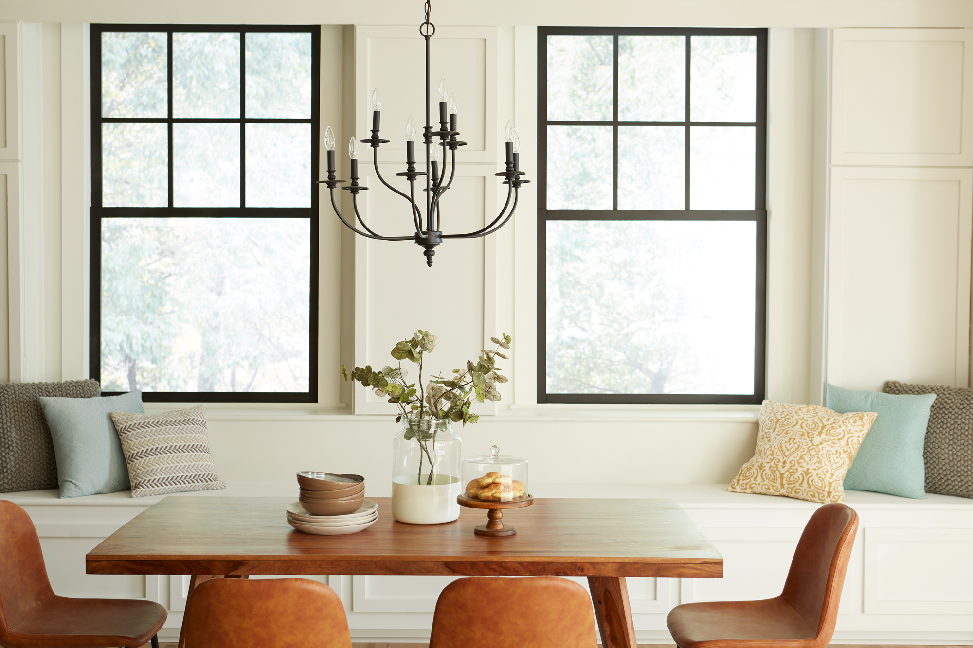
Once we had the dark red completely covered with a coat of primer, we were able to bring in the light with fresh white paint. We chose One Horn White, from Magnolia Home by Joanna Gaines® Paint. This airy, cream color has a beautifully neutral quality, with a slight beige tint added to the warm white base. Pale colors like this one can instantly make your space feel larger.
To enhance the sense of invitation, we added a built-in window seat. By painting the bench in the same color as the walls, we kept the room feeling open and emphasized the connection of the room with the outdoors.
New décor elements were selected to bring a sense of lightness and ease into the space. While darker or more saturated colors tend to downplay textures, the new light walls will bring texture to the forefront. In the new dining room design, we introduced textural elements including pillows and a cream-colored woven rug. Similarly, the darker paint around the windows suddenly draws our attention to them, while in the original room they were almost lost in the dark red.
We also made the room brighter by swapping in a graceful new light fixture and by bringing a sleek, natural-wood buffet to replace the previous heavy, dark cabinet. The fact that our gaze naturally travels underneath the new cabinet, perched on its slender legs, is another small decorating detail that makes the room feel more spacious.
The end result of our makeover is a dining room that draws you in and invites you to linger. In a room that feels welcoming, conversation and eating will mingle, and the experience will naturally be more relaxed.
Always remember to refer to our website kilz.com or product back labels for additional information on which primer is right for your project and detailed instructions on how to apply our products.

Living Room Makeover with Meditation in Mind
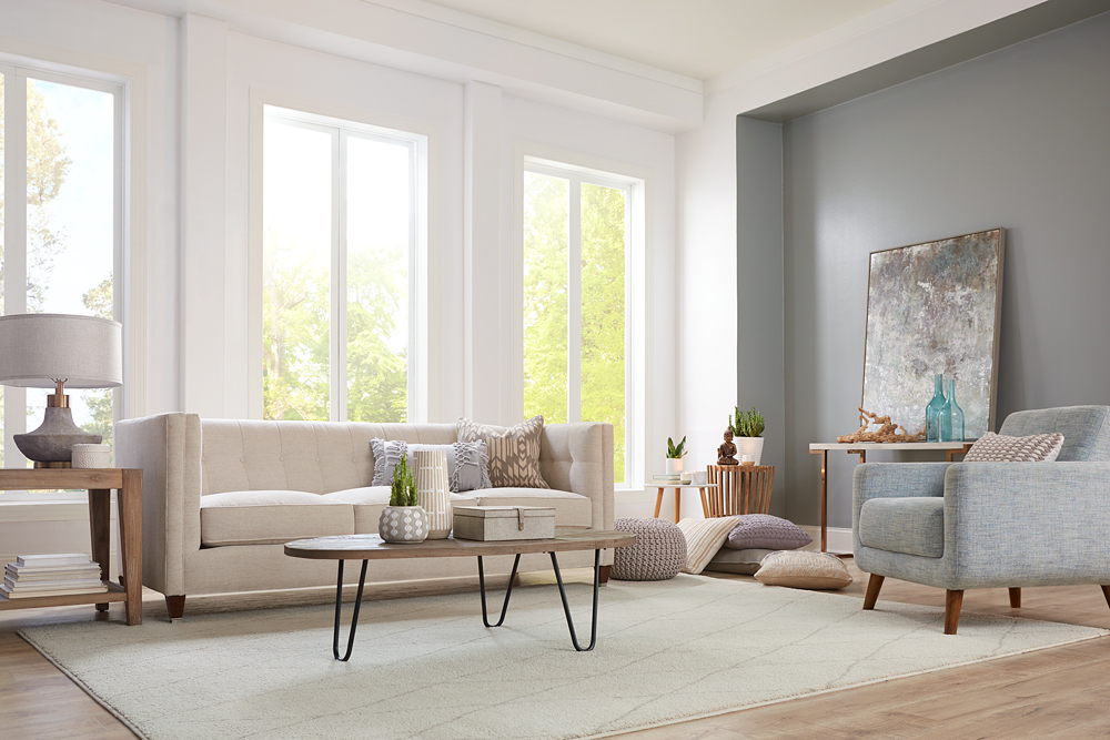
June 21, 2021In this living room makeover, we set out to create a comfortable and functional meditation area that could be stored away when not in use. The living room’s large windows made it a perfect light and airy space to relax in, but the feeling of the room was weighed down by the old paint color and dark, heavy furniture. It was time to say goodbye to dull yellow walls and breathe new life into this living room with primer and a fresh coat of paint in calming colors.
For the primary walls and mullions, we began with a coat of KILZ 2® All-Purpose Primer, a dependable choice for covering up previous paint colors. The pros know that a quality primer acts as the perfect foundation for any paint job; and in this case, KILZ 2® All-Purpose Primer provided coverage to hide the old yellow paint, while its adhesion properties made it a breeze for our new paint colors to glide over the walls effortlessly. KILZ 2 primer also adds amazing longevity and durability to painted walls by working as a sealer and stain blocker.
Once our primer dried, it was time to start painting. Sometimes a too-bright white can seem harsh in a sunny room, so we chose KILZ® Tribute® Paint in Contemporary White (TB-02) for the walls and ceiling. This particular shade of white has a subtle blue undertone that cooled down the brightness just a notch, while providing a gentle, reflective backdrop for the sunlight streaming in.
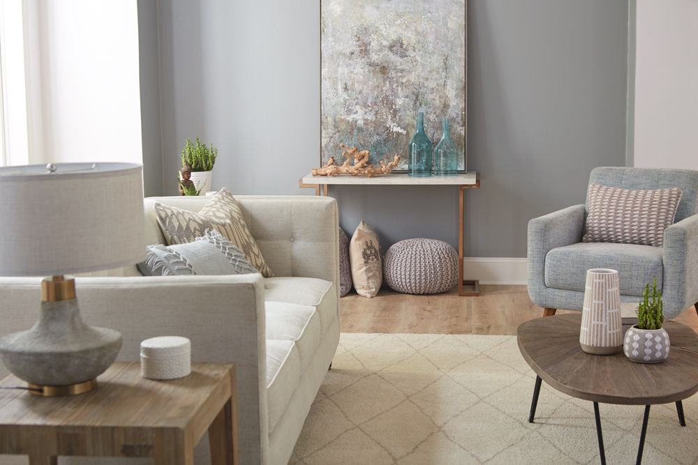
We followed the same steps — primer followed by a coat of paint — for our accent wall, choosing this time a contrasting color: KILZ® Tribute® Paint in Stone Cold (TB-66), a medium-dark gray with subtle pale green undertones. This neutral gray created a calming effect, while toning down the brightness of the white walls and ceiling.
As you can see in the “before” photo, nothing looks duller than a bland expanse of carpet, so it was an easy choice to replace it with luxurious gray hardwood flooring, topped with a plush cream-colored rug quilted in an attractive diamond pattern.
Because we wanted to maintain a light, airy feel, we chose contemporary style furnishings in complementary colors, including an understated, quilted-back sofa with soft plump cushions and a cozy armchair in a fabric that matches our accent wall to perfection. We added a bit of diversity with a natural wood finish coffee table that stylistically hints at Danish Modern, and a simple butcher block end table.
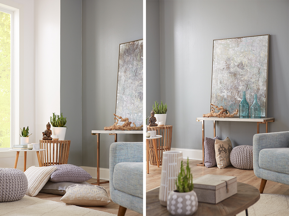
We accessorized with a couple of wood accent tables, including an attractive console table that we used to support a stunning modern painting that reflects both of the room’s primary colors. We upped the comfort level several notches by adding overstuffed pillows in complementary shades.
Given the stresses of this past year, our goal for this room was to create a calm, soothing oasis for rest and relaxation. To accomplish this goal, we used an empty corner space to create a meditation station, complete with comfortable, oversized pillows and a few decorative items. Pillows are ideal for creating an on-the-spot meditation corner in any room, because once you’re done, you can easily remove them and store them away — in this case, under the console table.
Primer and a coat of paint are the two valuable tools you can have for a DIY makeover project. Primer protects and enhances your paint job, while a coat of gleaming paint can transform any space. Once you choose the right colors for your design scheme, you can add to the ambience with a few carefully chosen pieces of furniture and accessories.
Always remember to refer to our website kilz.com or product back labels for additional information on which primer is right for your project and detailed instructions on how to apply our products.
Transforming a Boring Bedroom into a Relaxing Oasis
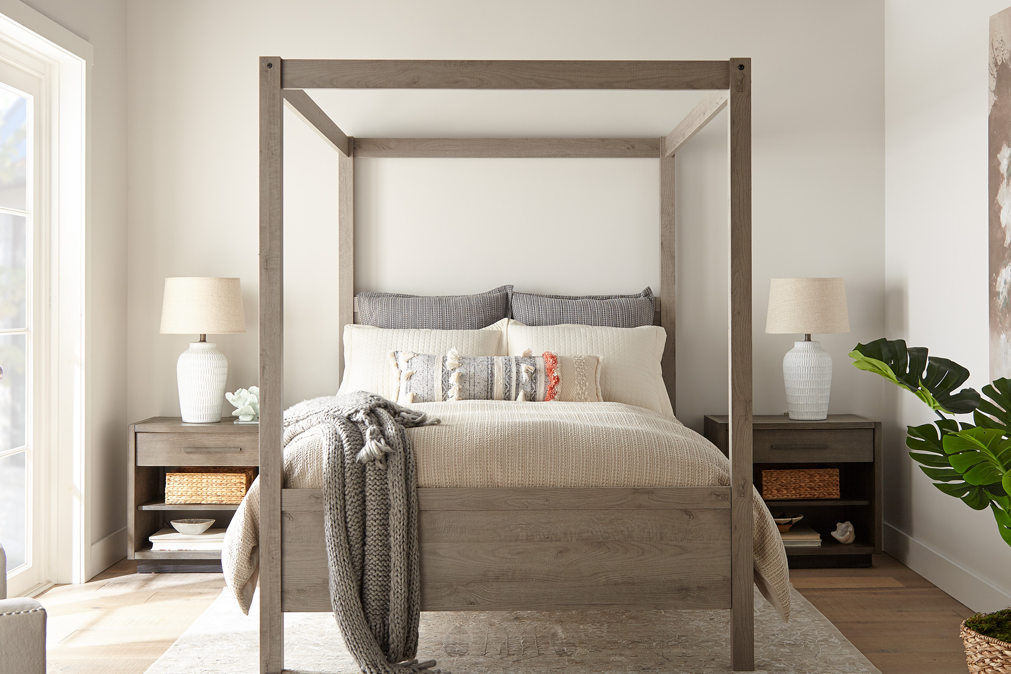
April 8, 2021Nothing dulls the spirits more than a boring, dated bedroom design. That’s why we couldn’t wait to lift the spirits of this depressing bedroom with new colors and textures to make it sparkle with freshness.
Color has a huge impact on mood and energy levels; and especially given the stresses of the past year, it’s more important than ever to promote a healthful, stress-free atmosphere in all areas of your home — and most particularly, your bedroom. That’s why we chose creamy off-white colors that create a soothing atmosphere of calm and relaxation, while opening up the space visually so it doesn’t feel as stuffy and confined.

We began our project with the most valuable tools for any DIY makeover — primer and a coat of paint. For this makeover, we chose KILZ 3® Premium Primer, which did an amazing job of covering the old, drab olive-green paint and creating the perfect foundation for the new fresh white paint. KILZ 3 Premium Primer offers excellent adhesion and durability, allowing the new paint to glide on smoothly and adding to the longevity of your paint job.
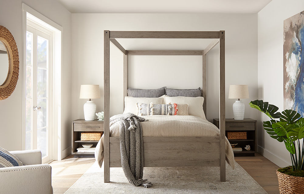
Next, we added a coat of KILZ® Tribute® Paint in Collector’s White (TB-31). This is a creamy, barely-there white with subtle undertones of greige (gray/beige) to take the brightness down a notch, making it ideal for reflecting the sunlight filtering in from the glass doors in this master bedroom. Because of its cool undertones, we were able to use Collector’s White throughout the entire bedroom, creating a soothing, gently glimmering sparkle without a hint of harshness.
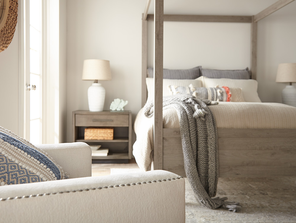
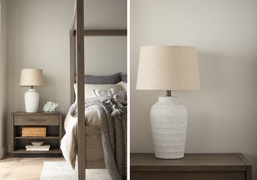
Our keynotes for this makeover were airy, simple, calm and relaxing, and we accomplished these with a streamlined Contemporary Swedish-Meets-Coastal California theme. For the focal point, we chose a modern four-poster bed in gray-toned brown natural wood. We added matching lacquered wood bedtables in a similar brown/gray shade, styled in keeping with our Scandinavian/Danish Modern theme.
We kept the attractive, natural hardwood floor, but added a cozy off-white rug. Other furnishings and accessories — including an armchair, lamps and bedding — were chosen to reflect the creamy white of the walls.
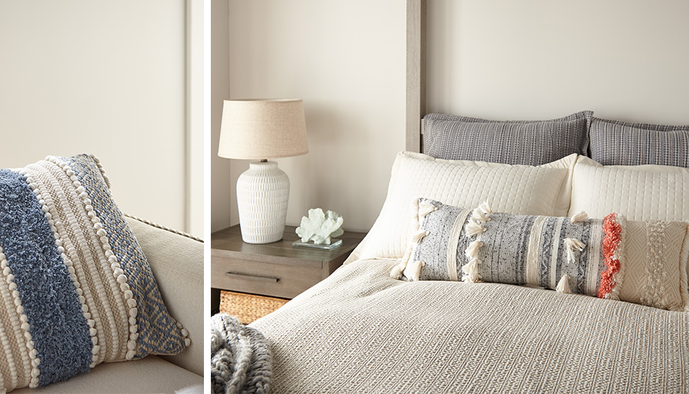
One interior designer’s tip: Pillows and other textiles are a great, affordable way to underscore your design scheme. We choose plump, oversized woven natural-fiber pillows in shades to tone in with the rest of the room, with handcrafted touches such as pom-poms and fringe. We finished the look with two attractive white ceramic lamps, styled in the Danish Modern tradition and topped with pale ecru linen shades.
The overall look is one of natural textures — crisp linens and woven cottons — giving this master bedroom a clean, fresh, inviting look of soothing freshness. When coupled with the bright sunlight filtering in from the glass doors, the impression is of a gleaming, glistening oasis for rest and relaxation — the kind of ambience you would look for in a luxury spa or hotel. And with quality primer and paint, the good news is that this pristine, fresh clean look can be easy to maintain as well.
Anyone can achieve a room transformation like this at an affordable price. The key is to choose colors that reflect the mood and ambience you want to create — whether it’s light and airy or warm and nostalgic. That’s why paint and primer are your greatest tools in any DIY makeover. They’re not only affordable, but they’re also so easy to apply that even a newbie can do it without any help, and with spectacular results.
With primer and a coat of paint, you can transform a dull, outdated room into a showplace. The primer will enhance all your painted surfaces, while protecting them from household dust, dirt and mildew. Likewise, a fresh coat of paint will lift a room into a new dimension of beauty and vibrancy. Just add a few pieces of furniture and accessories within your budget — and voila! You’ve created an affordable, elegant room makeover that will stimulate your sense of color and beauty, while relaxing your mind and spirits.
Always remember to refer to our website kilz.com or product back labels for additional information on which primer is right for your project and detailed instructions on how to apply our products.
Fun & Functional Home Gym Makeover
March 23, 2021The way we live has changed in the last year and we are doing more at home than ever before. Instead of time spent at yoga studios and gyms, many are streaming workout classes online and rolling out their yoga mats on the living room floor. Not everyone has an extra room waiting to be transformed into a boutique fitness studio, but if you do have an unused guest room, why not convert it into a custom home gym? That’s what we decided to do with this unused bedroom, and the results are stunning. The secret to our success was our quick and easy wall transformation — executed with a layer of primer followed by a vibrant coat of paint in an energizing color. It’s yet another example of how primer and interior paint can make a big impact and transform just about any space.
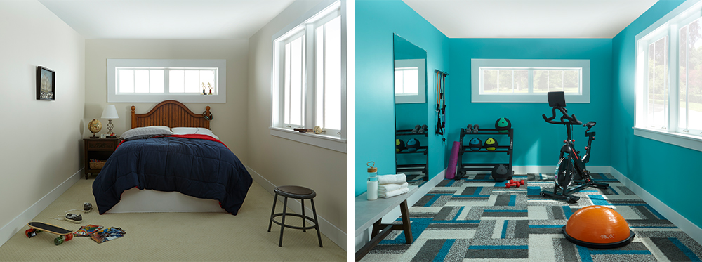
Here’s a look at exactly how we revamped this dull-looking bedroom into a sparkling home gym, using only primer, a coat of paint, a fun square of carpet and a few essential pieces of equipment. First, we tackled the walls, starting off with a coat of KILZ 2® All-Purpose Primer, which was especially ideal for our project because it created a perfect base layer to ensure the new topcoat color would be vibrant and vivid. This all-purpose primer is known for its durability, so you can trust that your paint job will last longer.
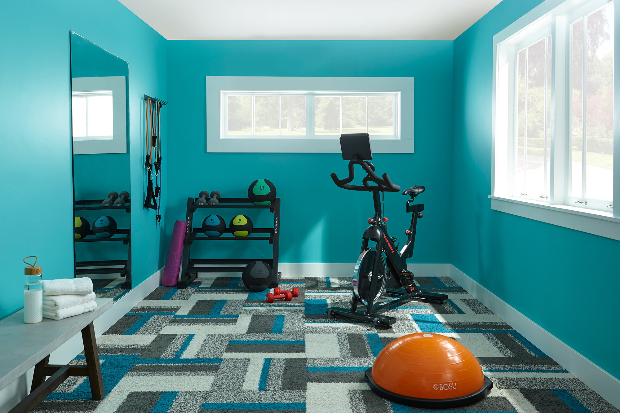
Next came the fun part — choosing a color. We opted for something invigorating, encouraging you to go for that extra 20 minutes on the bike or treadmill. A bold and bright aqua, KILZ® Tribute® Paint in Tropical Escape (TB-56) is so vivid, it almost has a neon vibe. It was the perfect shade to wake up our gym space. As we layered it over our KILZ® Primer, we noticed immediately that the color seemed to pop from the walls, giving an amazing vibe of energy and vitality.
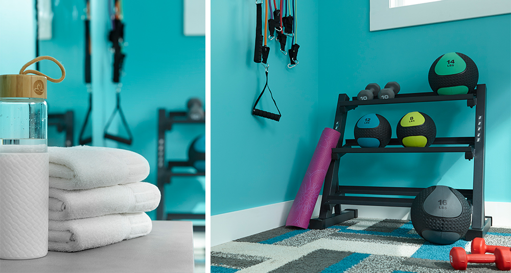
With a color like this, we knew that the flooring had to be something special. This bold geometric pattern caught our eye, and best of all, the colors matched our beautiful paint to perfection, proving that no matter how exotic your paint choices, there’s always going to be a bit of gorgeous flooring out there to match. We think that the combination of patterns and colors really adds a lot of character to the room — something you don’t always think of when creating a gym, but why not make your exercise space as attractive and appealing as the rest of your home? (Hint: The nicer it is, the more time you’ll want to spend there, which might even mean that you’ll exercise more). Another advantage to this carpet is its durability. For a home gym — or any type of space that gets a lot of physical impacts or foot traffic — it’s best to choose a durable, short-pile carpet that’s specially treated to resist stains, odors and moisture.
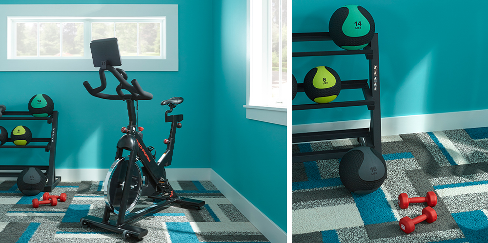
When renovating a room, you’ll want to first look for its advantages and figure out how to make the most of them. We recognized immediately that this room’s biggest assets were its two rectangular windows, so we made them into focal points by refreshing them with a coat of durable primer, followed by a coat of white paint. A good primer will give you that extra added adhesion you need for superior coverage when you’re painting — always a plus when you’re working with light colors because superior coverage will prevent the old colors from seeping through.
Nothing opens up a narrow space better than a full-length mirror (always a great accessory for any home gym), and we found one that added the perfect amount of depth to the room.
As for equipment, we kept it simple with just an exercise bike, along with a balance trainer ball and a few hand weights. The beauty of a bedroom-sized gym is there’s enough space for several pieces of equipment, so you’ll have enough space to add more items later on. We streamlined things even more by adding space-saving floor and wall racks (for equipment, helmets, and shoes) and a versatile gym bench for extra seating as well as storage.
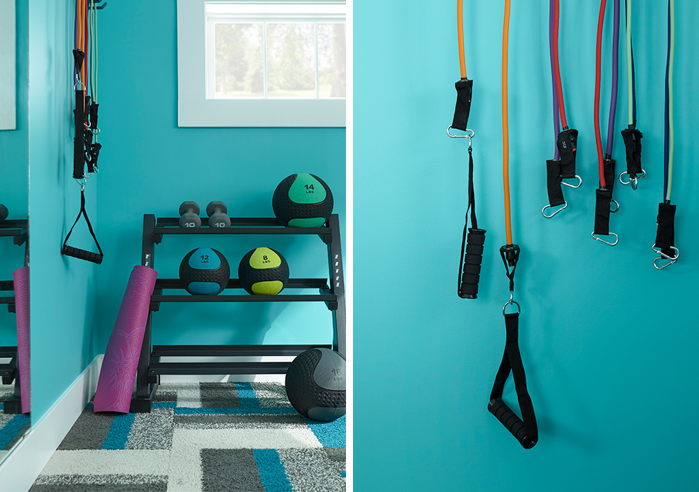
Once we were finished, we decided hands-down that the paint color made all the difference and was the real winner here, proving once again a layer of primer and coat of paint can transform a room from a dull dud into a sizzling firecracker.
Always remember to refer to our website kilz.com or product back labels for additional information on which primer is right for your project and detailed instructions on how to apply our products.
Creative Ways to Carve Out Functional Spaces
March 23, 2021The home office is becoming as standard as the laundry room. With more people working from home than ever before, often alongside children who are distance learning, people have been forced to get creative with their living/working/study spaces. Rather than trading in your dining table for a desk, try one of these ideas that empower multifunctional spaces and add some design flair to your home at the same time.
Here’s how you can fit everything in your life comfortably into your home.
Carving Out Office Nooks
The “corner office” has taken on new meaning. If you feel like your office is quite literally crammed into the first corner made available in your home, it’s time to take a look around and see if you can give yourself an upgrade.
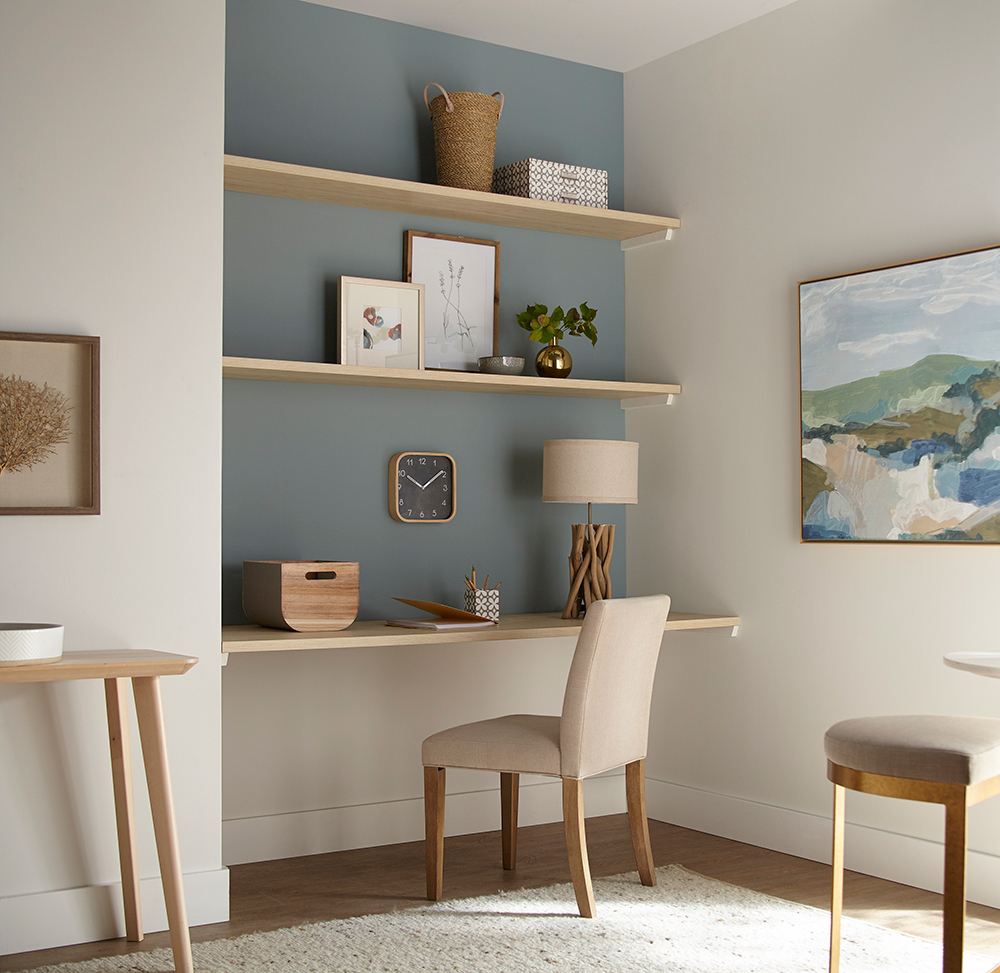
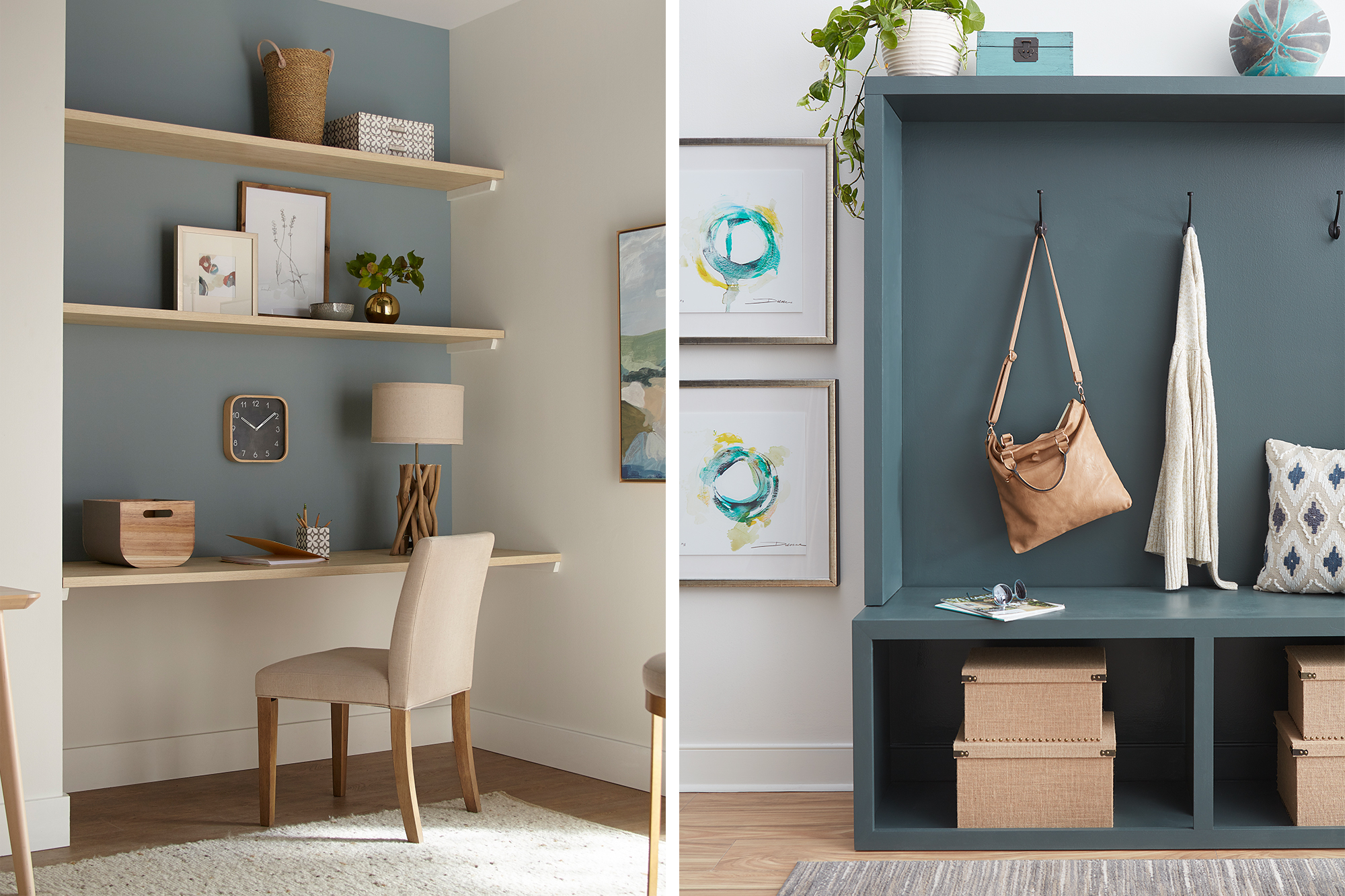
For some households, having a workspace in the main living area isn’t a big deal — especially if you have a laptop that you can easily fold away to make room for other things when work is over. However, if you need more room to spread, out or you just work better at an actual desk, there are creative ways to fit it in and make it look great. Take this small-space office nook for example – with KILZ 2® All-Purpose Primer, a fresh coat of paint and built-in shelves, we converted a neglected nook into a pretty WFH space. See the full transformation here.
Building in Organization
Building organization into your house is essential for reducing all clutter that inevitably comes with spending more time at home. When things have a place at the end of each day, they’ll be out of your way. You might decide to relocate things around the house as you find new storage spaces, whether it’s under-the-bed, behind the couch, on top of the kitchen cabinets, or in the hall closet. The key to avoiding the look and feel of clutter is to have some rhyme and reason behind what you put where.
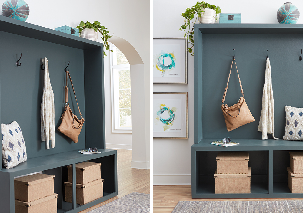
Adding some storage to your entryway or mudroom is a practical (and pretty!) way to keep the mess at bay. For this entryway storage center, KILZ Primer was the essential first step in transforming a boring wood bench into a statement piece. After priming the bare wood with KILZ 2® All-Purpose Primer, a fresh coat of pretty gray-green paint (KILZ Tribute® in Typewriter TB-70), completed the look.
Pretty baskets and bins, like the boxes in our entryway project, keep things aesthetically pleasing. Consider going the extra mile with labels to help everything find its way back to its rightful place.
Visually Divide Multipurpose Spaces
If you’ve found yourself using words like “multifunctional” more than you ever thought you would, you’re not alone. Putting up walls and partitions may be infeasible and is less than preferable. So, when it comes to squeezing more living (and working) out of the living space you already have, there’s a trick: divide them visually instead of physically.
One of the best tricks to keep things pleasing to the eye and mentally in their place is to visually divide your spaces with the use of intentionally placed paint colors. These can be in the form of a full accent wall or a smaller arch or geometric design. The visual definition from a pop of color helps you define a space a within a space.
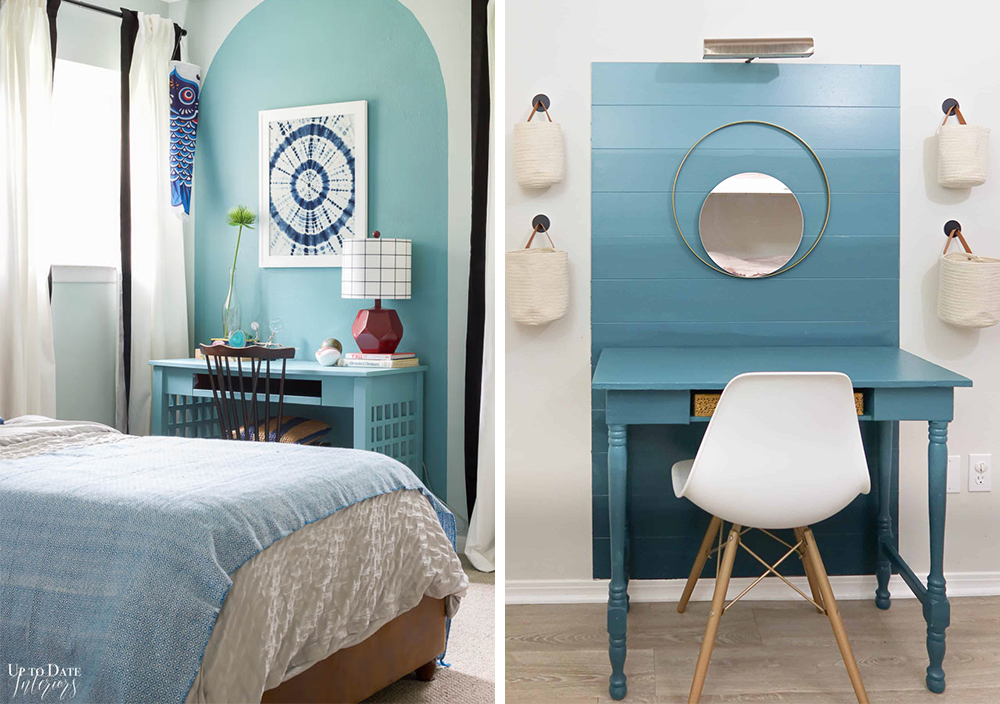
We’ve partnered with a few design savvy influencers in recent months who used primer and a coat of paint used to define their workspaces, and they are sure to inspire. Kathryn, from the blog Up to Date Interiors, used KILZ 2® All-Purpose Primer and KILZ® Paint to create a soothing blue arch behind her desk. Another fun and functional workspace came from Lindsey at Repurpose and UpCycle. Her ombre accent wall/desk combo came to life with the help of KILZ 3® Premium Primer and KILZ® Paint.
These visual dividers are pleasing to the eye and can even make your home feel larger when done right. Plus, it’s something you can do yourself. With primer and a coat of paint, KILZ can help you get more out of your home and make use of the space you already have.
Always remember to refer to our website kilz.com or product back labels for additional information on which primer is right for your project and detailed instructions on how to apply our products.
WFH Spaces that Inspire Great Work
February 12, 2021In the last year our homes have become more multi-functional than ever, becoming the spaces many people work and even go to school. Creating a space that can serve as an office or study area can be a challenge – especially if you don’t have an extra room just sitting empty and waiting for a makeover. But with a little creativity and the power of primer, you can create a gorgeous WFH (or study at home) area in just about any size space. Read on to see how we took two drab, uninspiring spaces and transformed them into attractive, design-forward offices and study areas that would motivate anyone to do their best work.
The key to our success? A layer of KILZ® Primer and a coat of fresh paint — once again proving that hard-working primer and quality paint are cost-effective tools in any type of interior makeover. Along the way, we added on-trend and functional furniture and a few eye-catching accessories. Here’s exactly what we did, and how we achieved these much-needed transformations.
From a Neglected Nook to a Happy Home Office
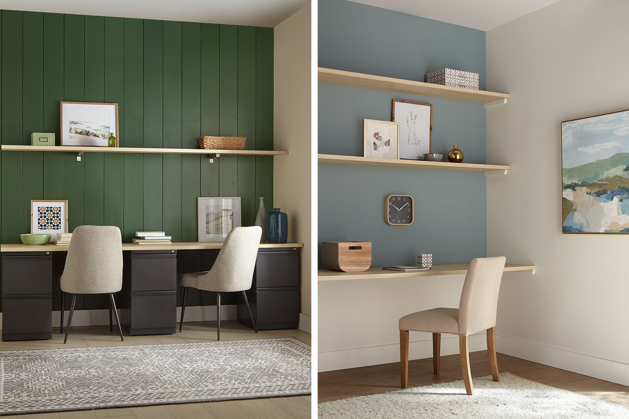
For our first transformation, a peaceful office was converted from an unused corner in a larger room. Given the limited dimensions, the space called for colors that would visually enlarge the area. Our first job was to open it up so you could feel like you’re working in a pleasant room, not a closet. Toward that end, we opted for light, airy shades that would add a subtle touch of color, while opening up the room to make it feel less confining. We also resorted to a tried-and-true designer’s trick—installing wall-to-wall shelving to create a space-saving recessed work area.
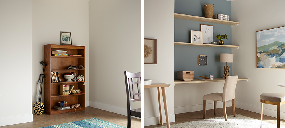
We started with KILZ 2® All-Purpose Primer, which covered up the unsightly scuffs left behind from the old bookshelf and offered added adhesion to ensure the new coat of paint would roll on evenly and easily. For our paint color choices, we opted for a fresh, contemporary office look—casual, light and attractive, with pastel shades that are easy on the eyes. For the back accent wall, we chose Magnolia Home by Joanna Gaines® paint, in Sir Drake, a gentle gray balanced with aqua blue hues. We decided on a more intriguing and deeper shade (rather than a classic sky blue) because it made the wall pop with color, while still generating a calm, soothing vibe. Following a slightly coastal theme, for the sidewalls and bottom accent wall we chose Shiplap – a rich, creamy weathered white also from the Magnolia Home paint line.
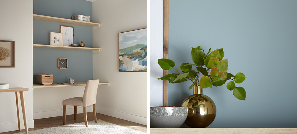
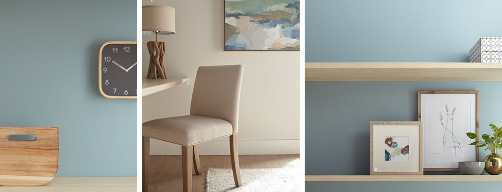
The mix of blue and white, combined with the natural wood shelving, achieved a slightly Scandinavian ambiance that felt just right. We accented the office nook with furnishings and accessories with a minimalistic, Danish-modern feel – a comfortable contemporary office chair in cream, a table in light varnished wood, nature studies in pale wooden frames, and accessories in wood, ceramic and brass, with touches of grey and blue throughout.
From Boring Back Room to A+ Study Area
The next transformation took a neglected room off a main living space and turned it into an appealing study space for two older kids. The heavy wood desk wasn’t making the grade and the clutter in the corner had to go. We decided to bring the room back to life with a bit of color to stimulate energy, imagination and creativity.
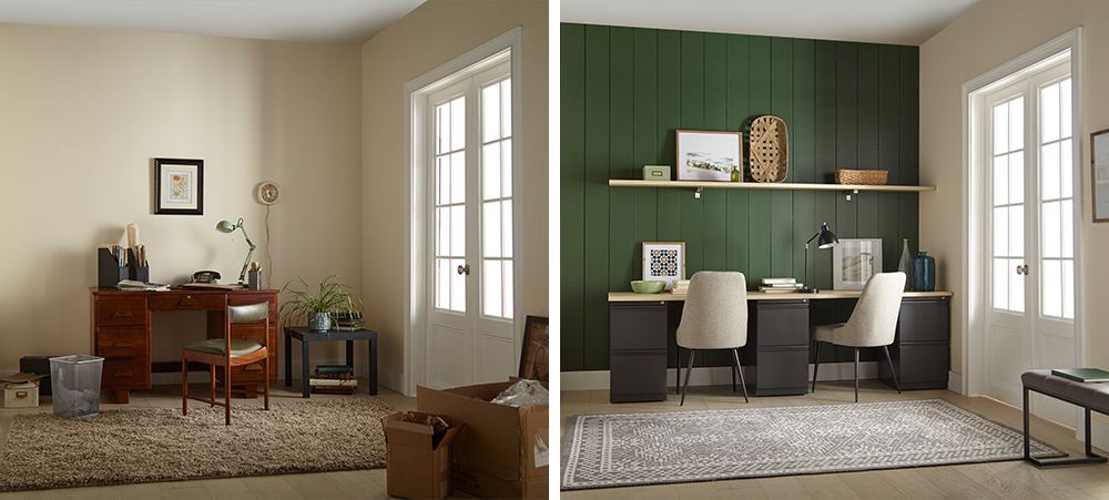
We started our project in a big way, by installing vertical shiplap boards over the back accent wall for instant visual appeal. A timeless and textural addition to any space, shiplap walls give you a designer look while being surprisingly easy and affordable to install – even if you’re a newbie DIYer.
Next, we covered our new shiplap wall with a coat of KILZ 2® All-Purpose Primer — a crucial first step when working with uncoated wallboards, because this multi-surface primer provides excellent adhesion and ensures the new paint glides on effortlessly.
Once the primer dried, it was time to choose the color. We opted for a warm, inviting green – KILZ® Tribute® Paint in American Pine (TB-69). This rich, eye-catching hunter green was perfect for the look we were going for, a modern take on the comfy/cozy traditional farmhouse style.
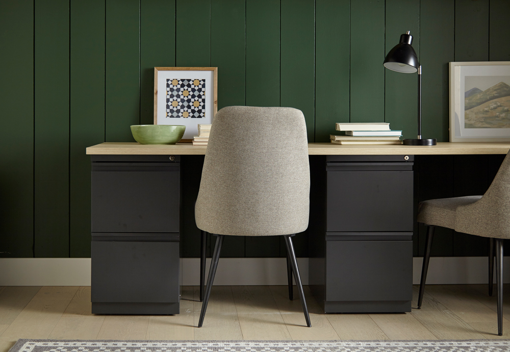
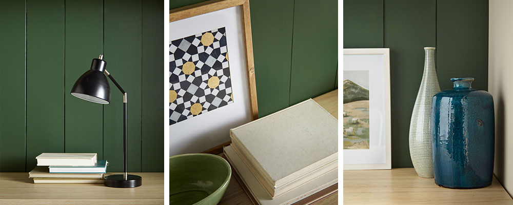
We added a convenient floating shelf for accessories; and, since space wasn’t a huge issue here, we were able to fit in a fantastic double desk, consisting of a simple deep-drawer base topped with pale wood to match the shelving. For added comfort, we replaced the dated desk chair with fully upholstered chairs in neutral shades to tone in with the rest of the room. To go with the woodsy green theme, we added accessories in wicker, nature-themed photos with pine frames and other knick-knacks in sage and blue tints—a bowl here, a vase there—to complete the look.
Always remember to refer to our website kilz.com or product back labels for additional information on which primer is right for your project and detailed instructions on how to apply our products.







join the conversation:
SHARE this post: