Tag: Gray
Pro Tips for Painting Over a Dark or Light Wall
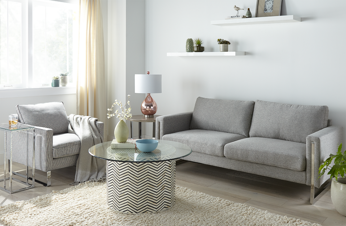
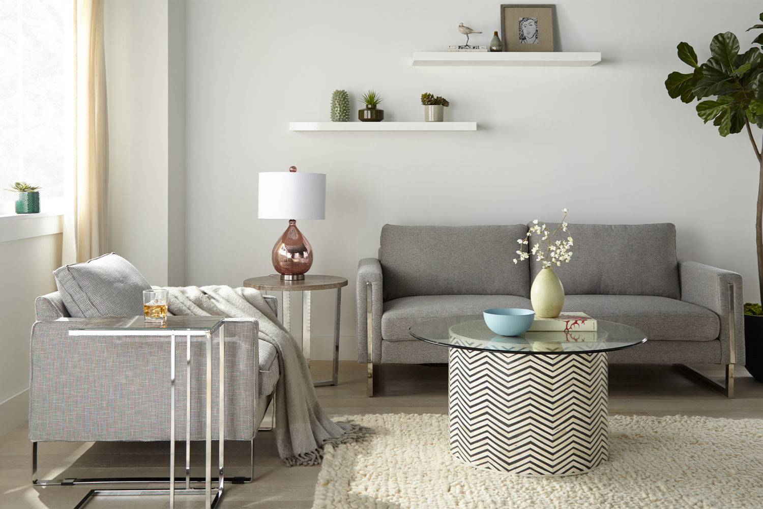
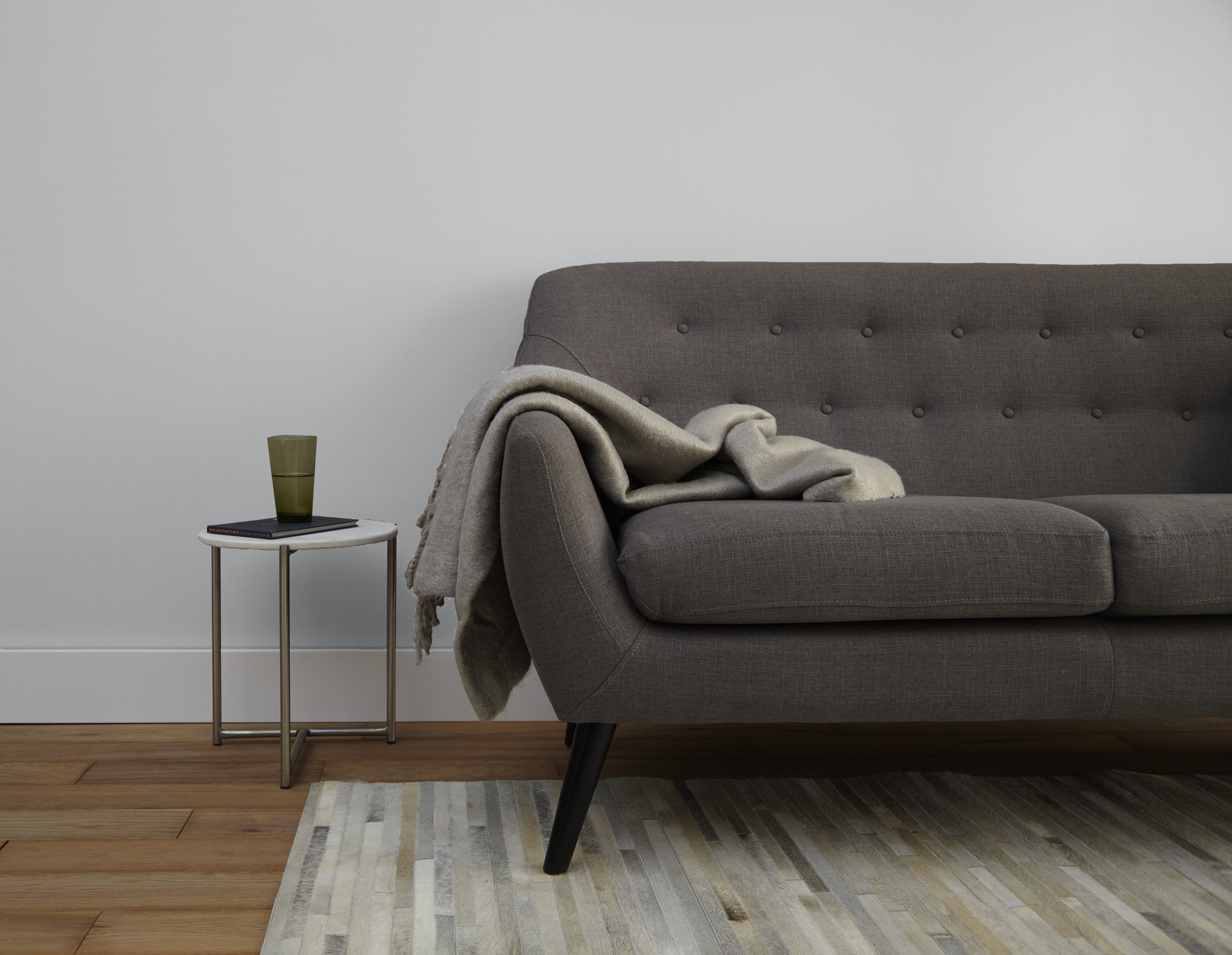
December 6, 2019A fresh coat of paint can go a long way in changing the look and feel of your space, and the last thing you want after meticulously selecting your perfect shade of white is for the old, unattractive color to seep through! One of our favorite neutrals is KILZ® Tribute® paint in Alaskan Mist and it was the perfect color to lighten up this living room.
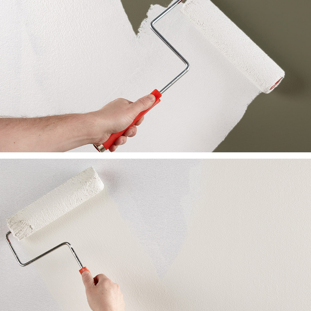
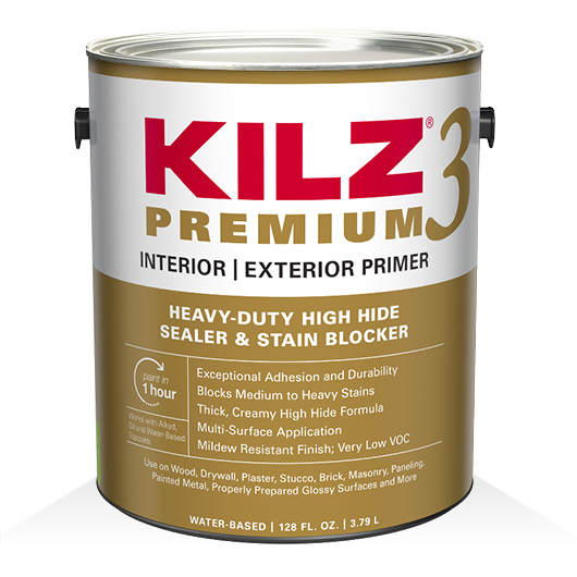
Taking the heavy olive-green walls to a bright white could have posed a challenge, including a need for excess coats of paint which we definitely wanted to avoid. It was time to prime! We chose KILZ 3™ Premium primer for its thicker, high hiding formula. This water-based primer hides surface imperfections and reduces the need for multiple coats of paint to allow a truer, richer color from the topcoat. A coat of KILZ 3™ Premium primer on the unpleasant green walls followed by paint in Alaskan Mist, and the color change was complete!
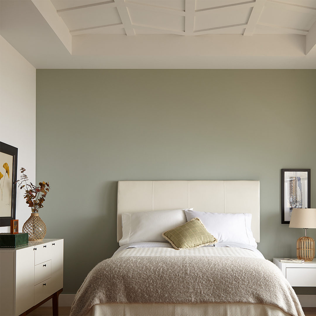
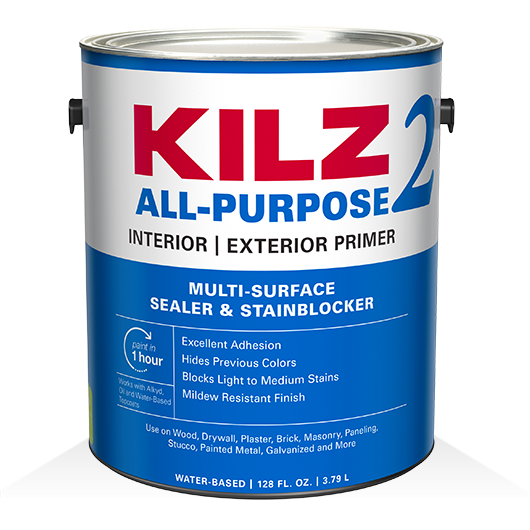
If dark paint colors are what you’re after, we have professional primer tips for a light to dark color change as well. It might seem like a dark color like BEHR® paint in Nocturne Blue can easily cover a lighter one in this bedroom refresh, so why prime? However, if you want that deep gray with dark blue undertones to look just right, we would suggest priming first with KILZ 2® All-Purpose primer. This water-based primer offers enhanced hiding, making it ideal for changing colors and helping to lessen the number of coats of paint required.
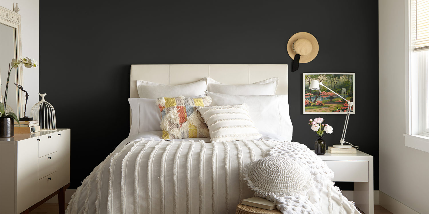
When painting to hide a previous color, KILZ® Primer reduces the need for multiple coats of paint to allow truer, richer color from your topcoat.
Styled by Color – One Kitchen, Three Ways
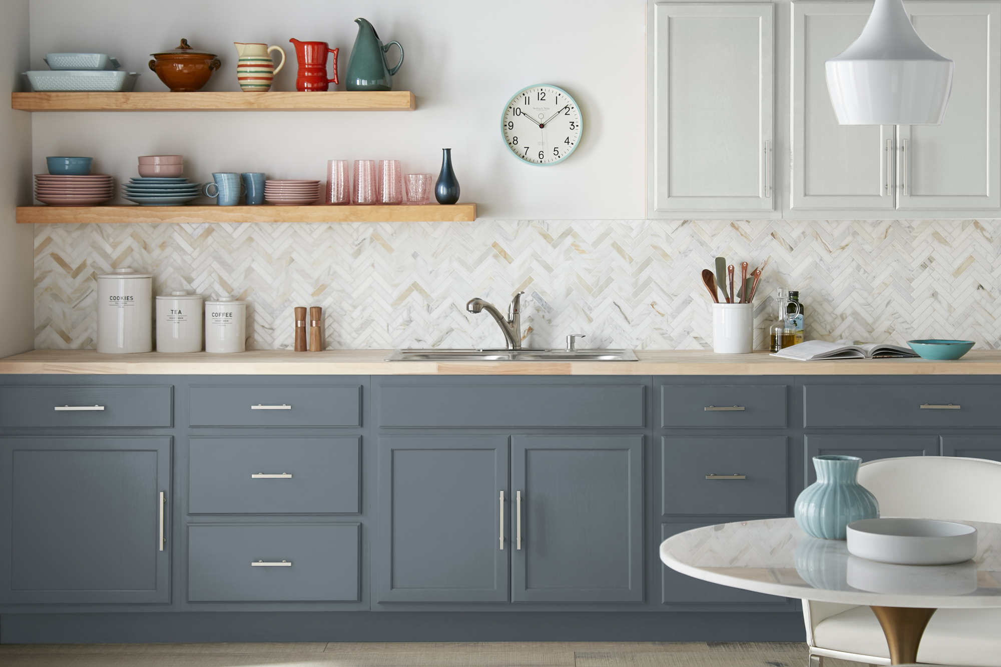
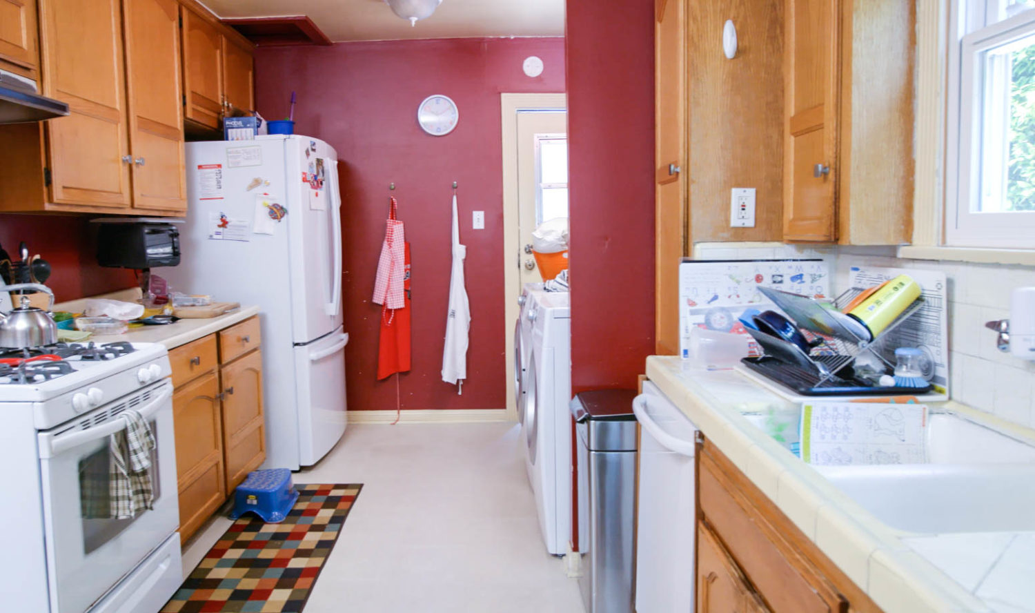
September 18, 2019One of the most searched for and sought-after room makeovers is the kitchen – and we’re not surprised! The heart of the home and a typical gathering, hosting and everyday living area, the kitchen is a space people typically spend a lot of time. If your kitchen is crying for a makeover, one simple and fairly low cost change you can make in a weekend is painting the cabinets. A fresh coat of primer and paint can completely transform your kitchen, whether you want an airy and light feel or an intimate and stylish look.
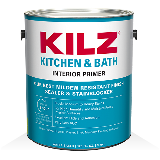
The first place to start when refreshing your kitchen cabinets is with proper prep work. Primer is key in a kitchen painting project, and the professionals often use a mildew resistant primer like KILZ® Kitchen & Bath or KILZ® 3 Premium. Once you’ve prepped and primed, it’s time for color! Kitchen cabinets are a great canvas for a wide range of colors, from light to dark neutrals to pops of color like blues and greens. With so many options it was a challenge to narrow down our top picks, but we landed on three different color combinations that are a winning recipe for a beautiful kitchen cabinet makeover.
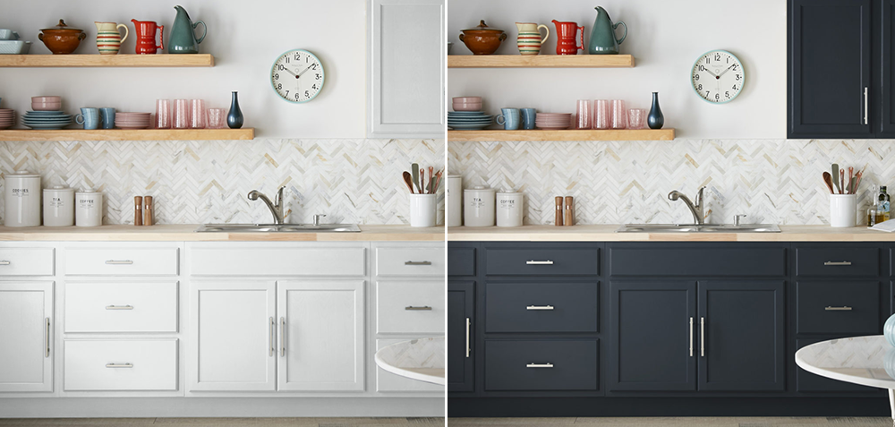
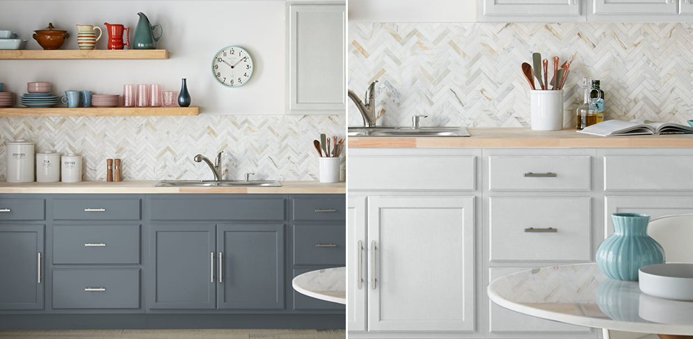
Our first pick is a timeless neutral, Contemporary White. A white with a hint of gray undertone, Contemporary White can appear as the color of fresh winter snow depending on the light and time of day. It is classic kitchen cabinet color, and makes the space feel bright and open.
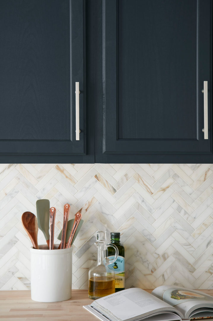
On the other end of the color spectrum, we picked an almost-black color that adds sophistication and subtle drama to a kitchen. Behr’s Nocturne Blue is a deep gray with a dark blue undertone and is consistently one of our favorite color picks. In some lighting it will appear as black, but with a softer feel.
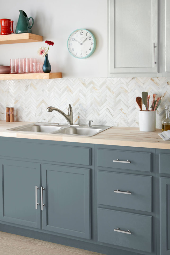
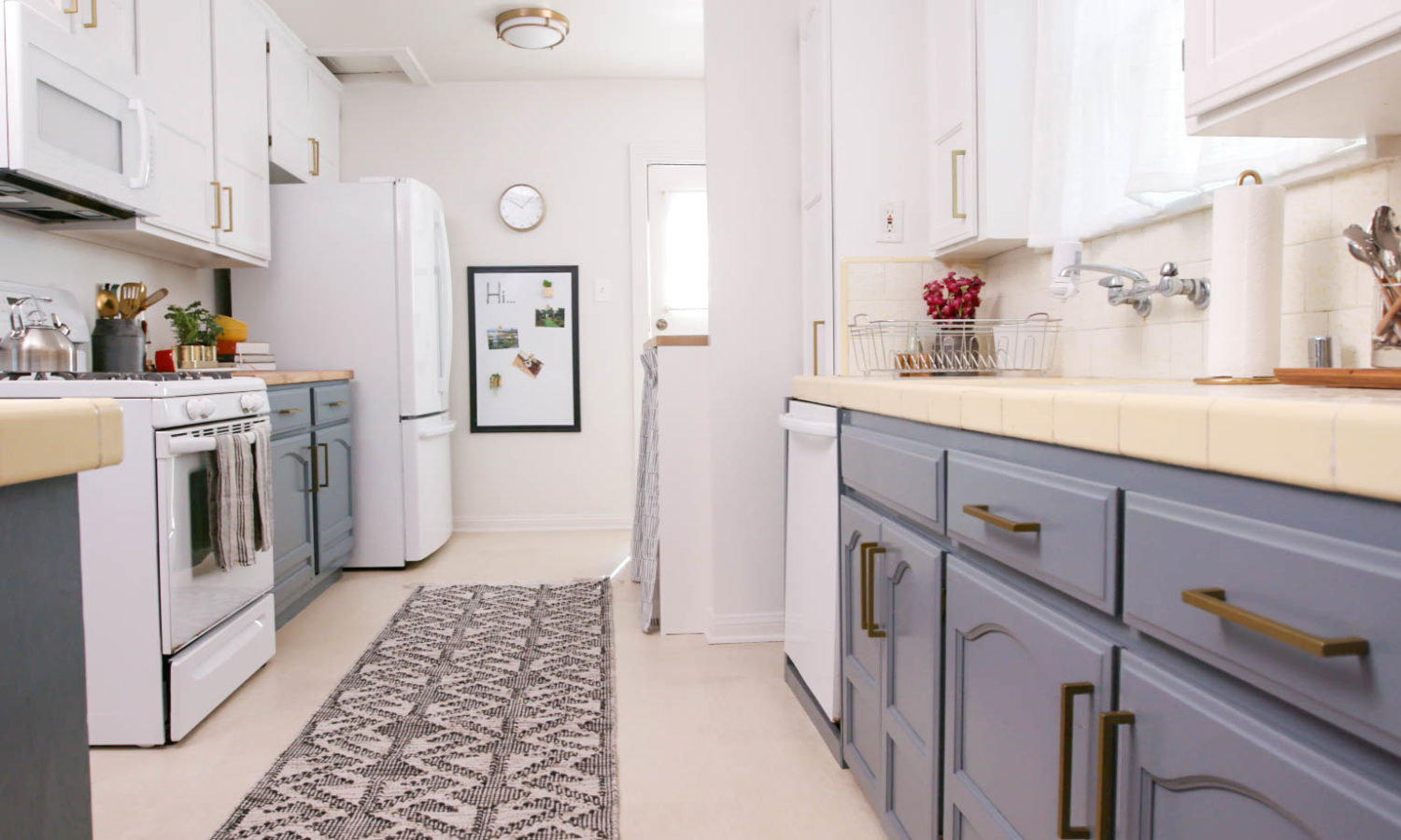
If you can’t choose between classic white or another color, why not use both! We chose two colors for our last pick to showcase stylish two-toned kitchen cabinets. For the uppers, Alaskan Mist, a bright white with soft green undertones, brought a perfect airiness to the space. We grounded the kitchen with December Nights, a stormy blue-gray, on the lower cabinets.
Contemporary White
Behr’s Nocturne Blue
Alaskan Mist
December Nights
Whether you prefer kitchen cabinets in crisp white, moody black or something in between, this home renovation project is one that makes a big impact in a short amount of time.
A fresh coat of primer and paint can completely transform your kitchen, whether you want an airy and light feel or an intimate and stylish look.
Styled by Color – Fresh Front Doors
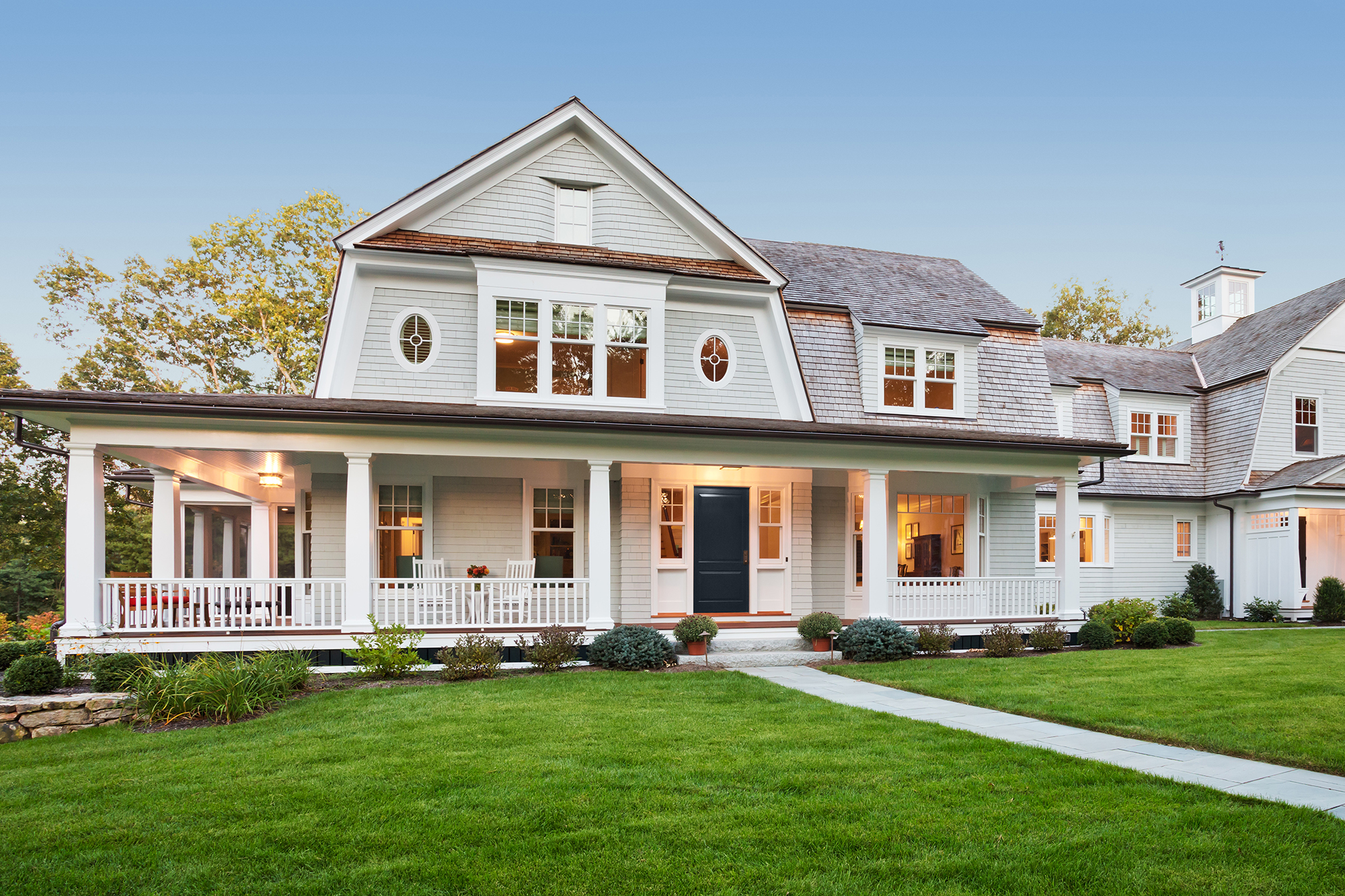
July 22, 2019This month we’re taking our trending colors outside for an easy way to elevate your curb appeal. A bold hue applied to your front door can instantly breathe new life into a tired exterior and the color choices are virtually endless! The front door is a perfect size to play with a bright or bold color that might otherwise overwhelm the entire exterior, which made it that much harder for us to choose just a few top picks. While a tomato red or sunshine yellow hue would surely punch up your porch, we found ourselves drawn this month to shades of blue, green and black as cool summer picks for a front door makeover.
If you’re ready to add a bold color to your front door but you typically prefer more neutral shades, BEHR’s Nocturne Blue might be the color for you. A deep gray with a dark blue undertone it can appear almost black in some lights, but with the subtle interest of its underlying hues. Nocturne Blue works great as a front door color against a lighter exterior paint color, like a nearly-white grey or a sandy tan.
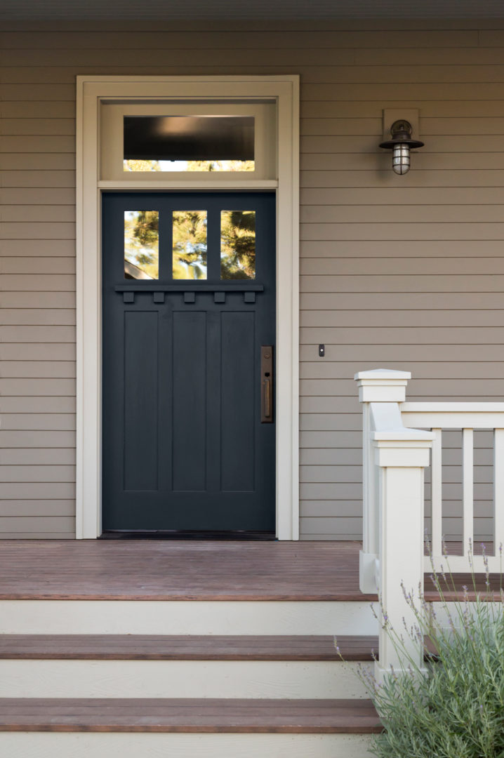
Looking for a shade with a bit more brightness? Then you’ll love our next pick, Oceans Deep. The dark bluish green with gray tones is a refined yet fun front door color choice. We love how it pops against a true white door frame and light wood exterior.
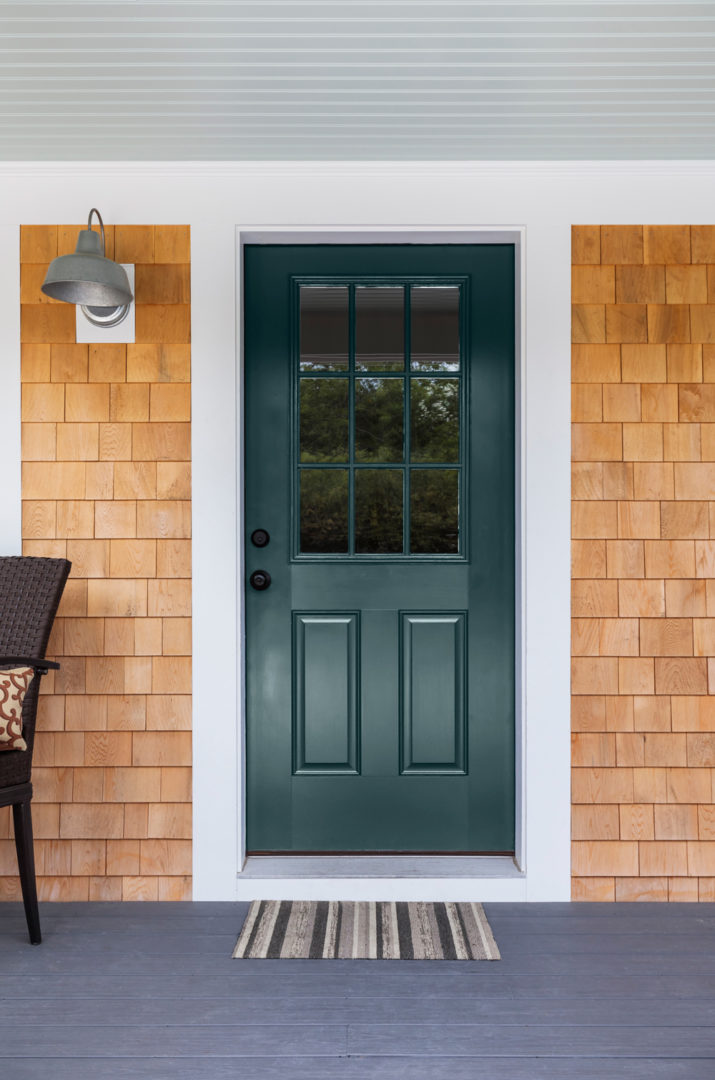
And if you’re ready to go all in with a lighter and brighter shade, Oceanic is a light green with a yellow undertone that evokes the color of a natural prasiolite quartz. A front door painted in Oceanic perfectly pops against a home with an all-black exterior.
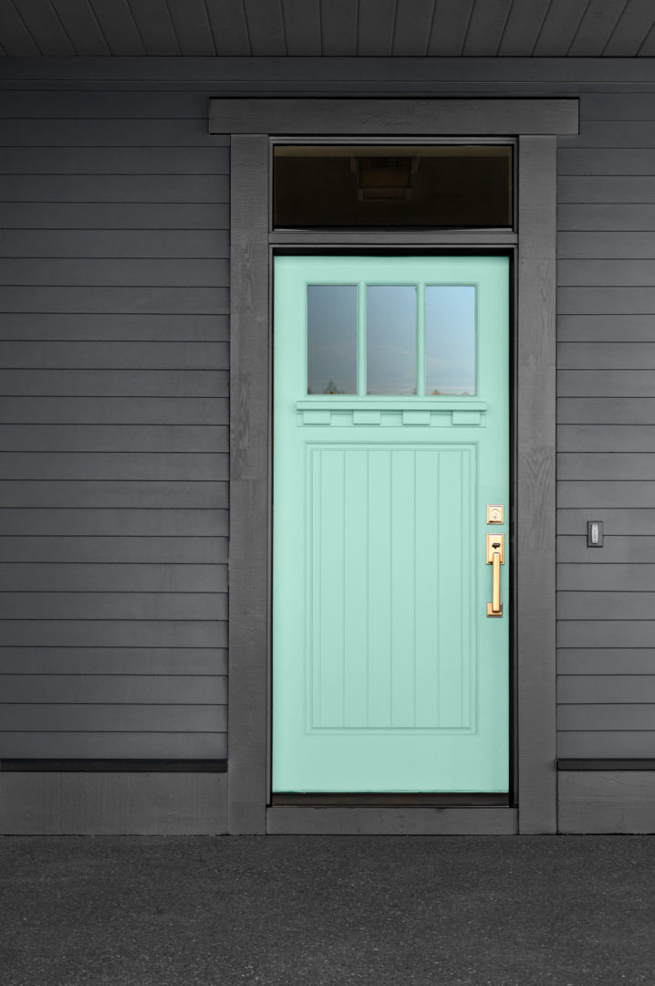
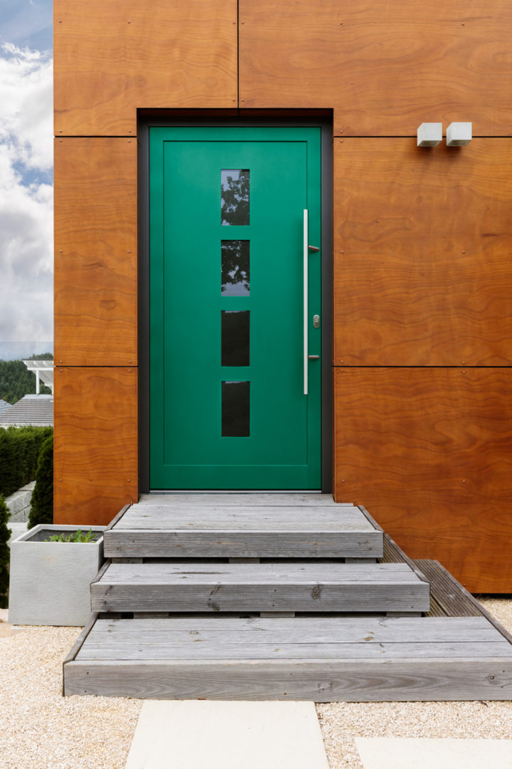
For our last pick, we went for a bold shade that is a real showstopper on a front door. A bright green with a yellow undertone, BEHR’s Celtic Queen finds its perfect partner in a sleek black doorframe on this modern wood paneled home.
Nocturne Blue
Oceans Deep
Oceanic
Celtic Queen
A front door makeover is a minimal investment with a big return on your overall curb appeal and with summer entertaining season underway, there’s no better time to freshen up the first thing guests see when they arrive.
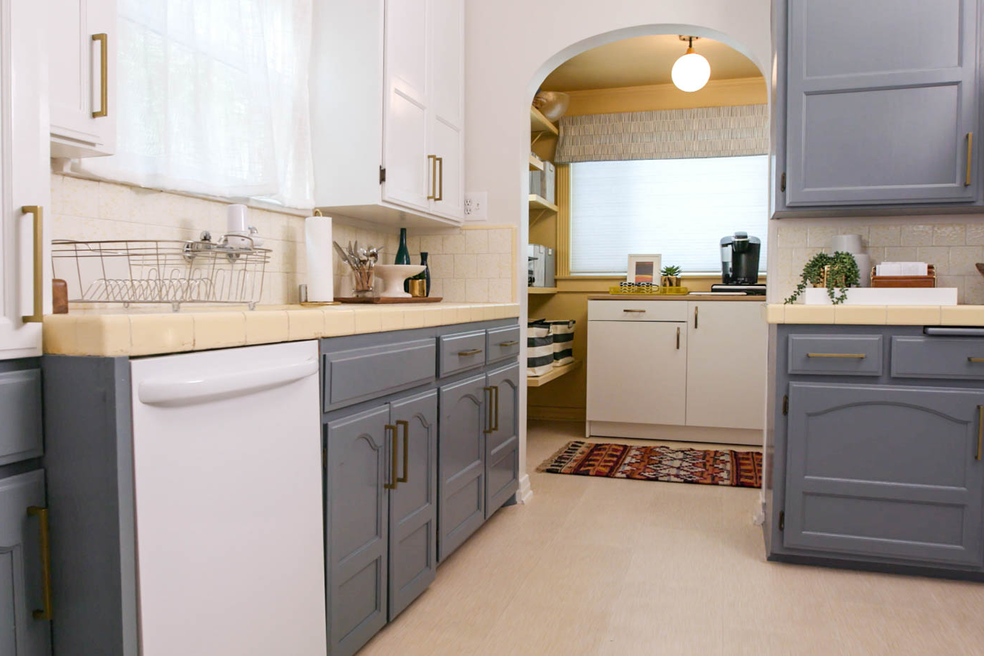
Trendy Two-Toned Kitchen Cabinet Refresh
September 4, 2018Once the space is cleared, remove the cabinet drawers and doors for sanding. Applying a coat of KILZ® 2 Latex primer achieves two important goals: it blocks out stains and provides the ideal surface for new paint colors to adhere to the wooden drawers. Perform the same prep steps on kitchen walls.
When painting cabinetry, choose a strong, semi-gloss latex paint that holds up to the rigors of daily use in a high traffic area. Since we’re going for a lively, two-toned look, we’ve chosen KILZ® TRIBUTE® in a periwinkle blue called Old Lamppost and contrasted it with KILZ® TRIBUTE® in Contemporary White.
Add some additional color punch with wild, graphic patterns on curtains or linens and suddenly your kitchen is a fun, inviting space perfect for entertaining. New knobs and pulls breathe new life into the cabinets once they’re replaced, and a simple pair of curtains cleverly camouflages the laundry appliances. An inexpensive set of new accessories tops off our slick new kitchen look, and the finished product is now cozy, clean and welcoming.
Old Lamppost
Contemporary White
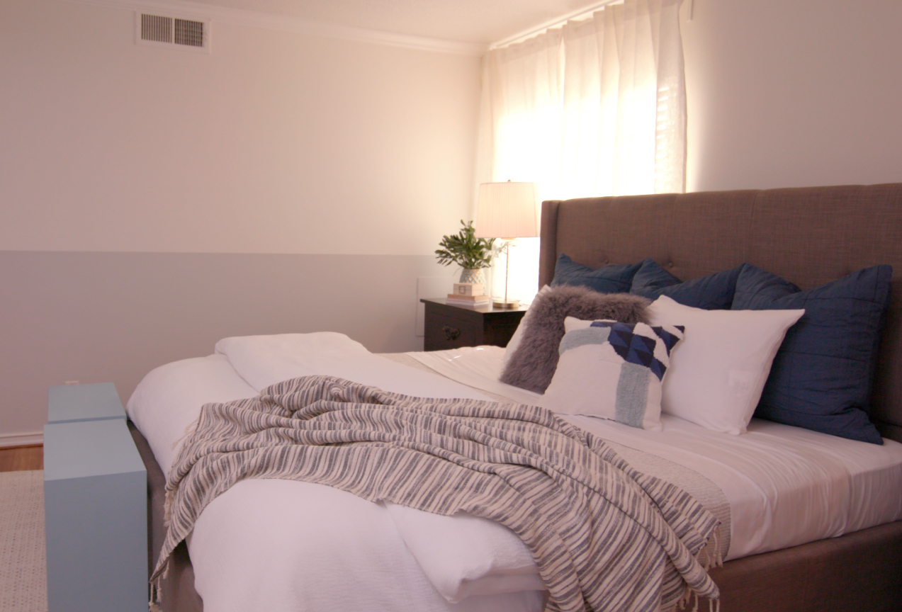
Master Bedroom Refresh
August 14, 2018A ready-to-use neutral creates the ideal base for your transformation. In this case, a coat of KILZ TRIBUTE® Paint and Primer properties in One—we’ve used a color called Architectural White here—leaves little guesswork and effort because it covers all four walls with one coat. After that, the magic happens.
To add a pop of contrast and sophistication, we’ve elected to paint the bottom half of the walls in a slightly contrasting neutral—another KILZ TRIBUTE® hue called Flying Dove. This combined neutral palette creates the effect that the ceilings are higher than they are, opening up the bedroom and making it feel more spacious.
But our weekend bedroom transformation isn’t apparent only on the walls; a furniture refresh is in order, too. KILZ® CHALK STYLE PAINT upcycles fixtures with a soft finish, creating the perfect accent piece for our tranquil, welcoming bedroom refresh.
Architectural White
Flying Dove
Pale Emerald
This combined neutral palette creates the effect that the ceilings are higher than they are, opening up the bedroom and making it feel more spacious.
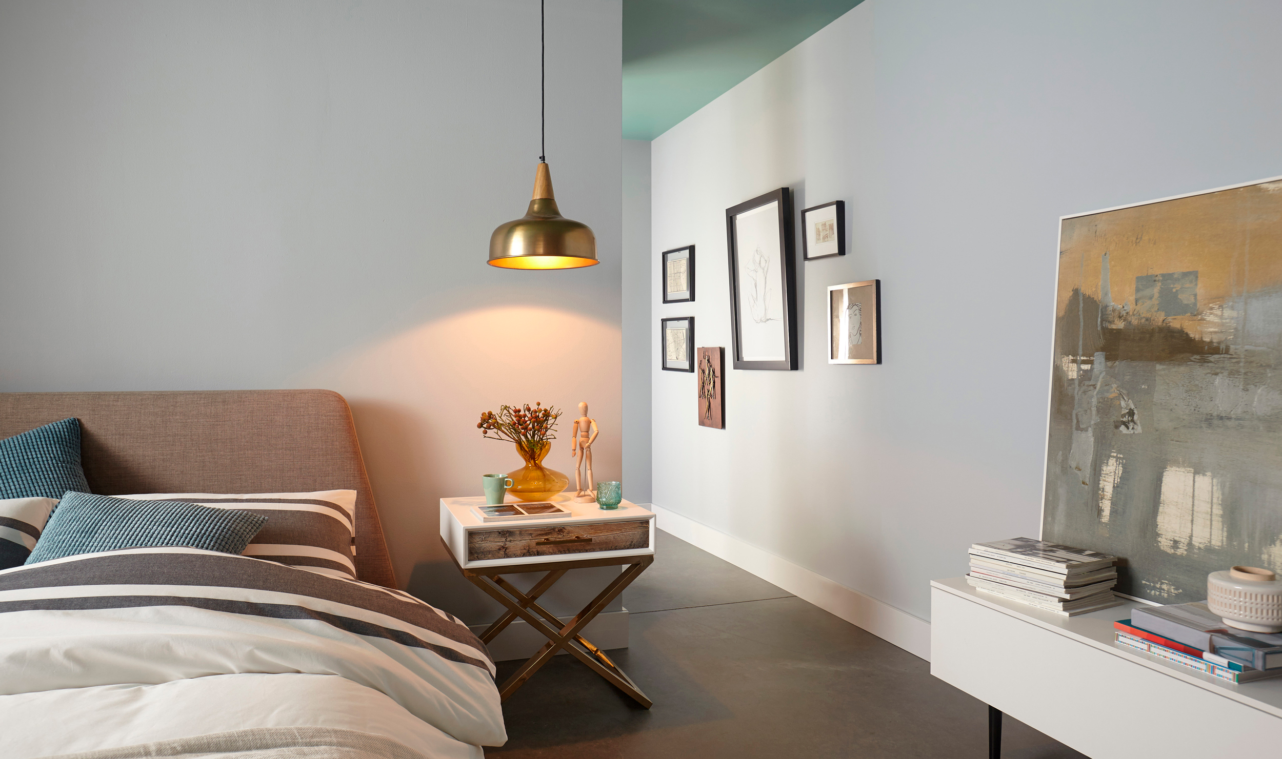
Winchester Green
July 2, 2018Weeping Willow TB-77 is a saturated lake green with a shaded undertone. Weeping Willow cabinets add healthy energy while Bay Fog adds a simple and clean look. This combination will enhance your sense of peace and comfort that will allow a true escape after a long day. Transform your home to achieve a serene ceiling, calming coolness and tranquil escape. Click here to try a sample of this color today!
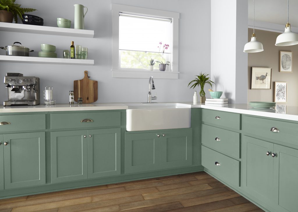
Another beautiful tone that compliments this month’s color is, Bay Fog, a calming cool gray with a slight dusty blue undertone. This color adds tranquility and simplicity to a room making it the perfect backdrop. Use Cool Fog with Weeping Willow to add a serene touch of color.
Weeping Willow
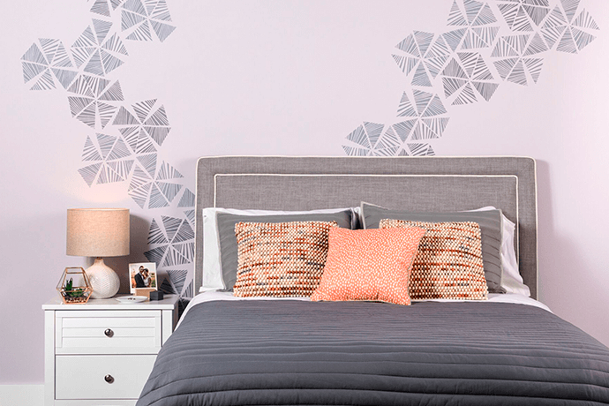
Stencil Wall Accents
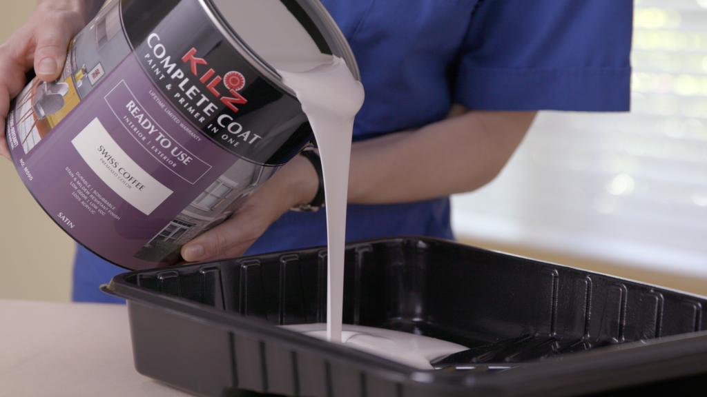
December 8, 2017For this project we used our KILZ COMPLETE COAT® Paint and Primer in One in neutral based colors to transform this plain master bedroom wall into the perfect statement. Although we chose more muted colors for this specific space, you could always go bolder, repeating more (or less) of the stencil patterns to accomplish a louder more extroverted look. The great news is that the stencils come in all types of styles leaving the opportunities virtually endless when it comes to which type of look you want to create.
Mix and match! Using the stencil patterns behind or above furniture pieces is a nice way to really make them feel custom to the room. You could also pull stencils in order to frame artwork or simply add extra dimensions to your décor. The color of the stencil here subtly pulls from other colors in the room. In this case, the tone of the stencil ties in with the bedding and comforter set. We could have also opted for an orange tone to really make the accent pillows pop. This could be a nice effect in a living room space, or even in a dining room above a serving unit.
This project is simple! See below for a full tutorial about how you can achieve this look in your space. Loving it? Explore our full KILZ COMPLETE COAT® palette here.
Project Checklist:
- KILZ COMPLETE COAT® Paint and Primer in One
- Stencil
- Stencil Brush
- Painter’s Tape or Spray Adhesive
- Paper Towels
- Can Key
- Drop Cloth
- Stir Stick
Step 1:
Determine location of pattern to be stenciled on wall.
Step 2:
Stir paint to make sure it is mixed.
Step 3:
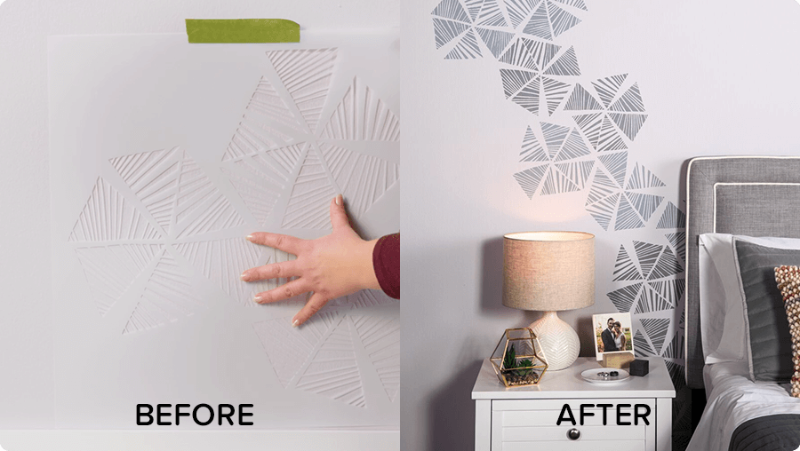
Spray stencil with adhesive or secure stencil with painters tape.
Step 4:
Level and then secure your stencil on the top middle of the wall with painter’s tape.
Step 5:
Stencil the pattern by lightly dabbing the paint until the areas are fully covered.
Step 6:
Move on to the second repeat of the pattern by following the registrations that are included in the stencil. These registration marks help you move and place the stencil along the wall perfectly every time!
Step 7:
Allow 2 hours dry time. Then call your best friend and invite them over for coffee because you’re all done.
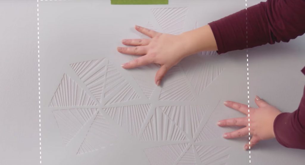 Pro-tip: Make sure the stencil is secure before you add paint.
 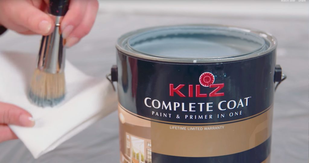 Pro-tip: Load your brush with paint and off-load most of the paint onto a paper towel. Using too much paint when stenciling is the number one reason for bleeding, so make sure to off-load excess paint before starting on the wall.
Mix and match! Using the stencil patterns behind or above furniture pieces is a nice way to really make them feel custom to the room.
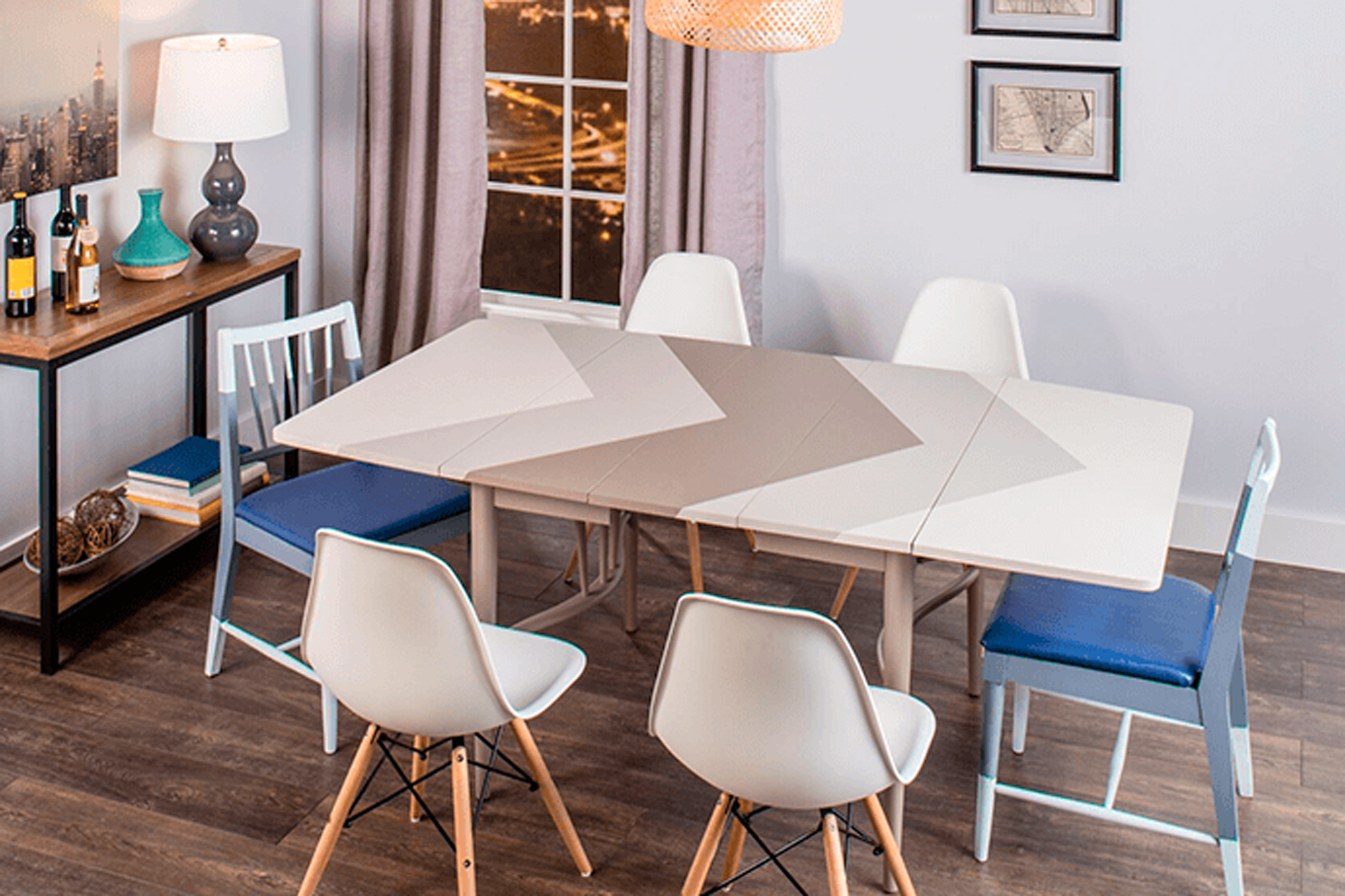
Table & Chairs Makeover
January 12, 2017Project Checklist:
- KILZ COMPLETE COAT® Paint and Primer in One
- 100-150 Grit Sandpaper
- Painter’s Tape
- Paint Brush
- Measuring Tape
- Chairs
- Table
- 3/8”-1/2” Synthetic Roller
Step 1:
For best results start with a properly prepared and previously painted or primed surfaces. Remove any loose or peeling paint and wash off dirt or grease with a non-soapy detergent or a TSP substitute. Rinse well and allow surface to dry.
Pro-tip: For glossy surfaces, scuff sand with the appropriate sandpaper prior to coating.
Step 2:
Tape off areas to be painted. To achieve a geometric pattern we recommend using measuring tape to evenly space tape.
Step 3:
Stir paint before and during application to make sure it is mixed.
Step 4:
Remove the painters tape when the paint is wet, or have a razor to cut the film if you’ve let the paint dry.
Step 5:
Allow to dry. The product dries to touch in 2 hours (at 77° F and 50% relative humidity) or longer in cooler temperatures and/or higher humidity.
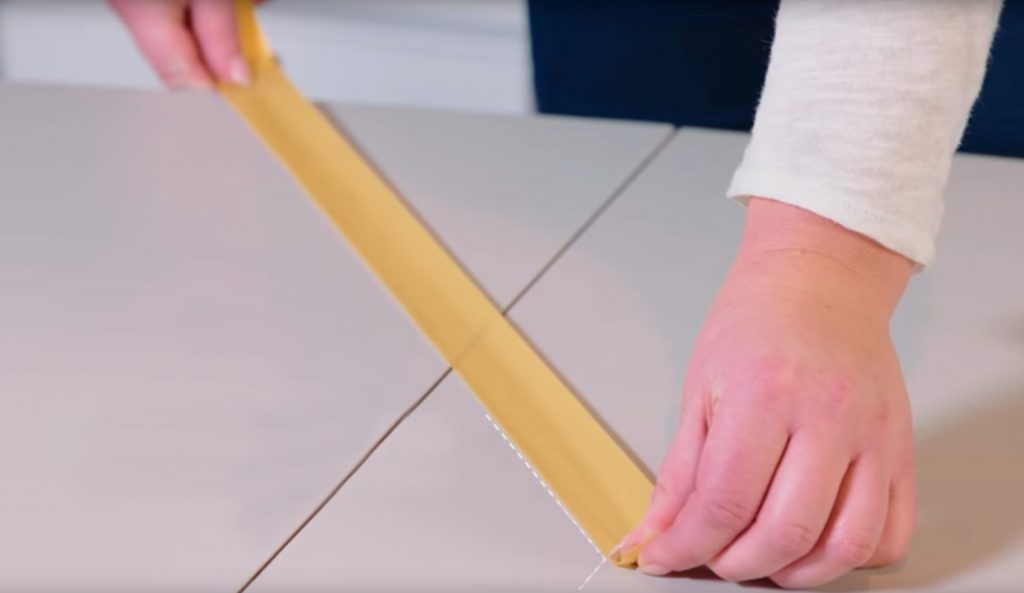
Pro-tip: Measure peak to peak, as well as the distance between the points along the side of the table.
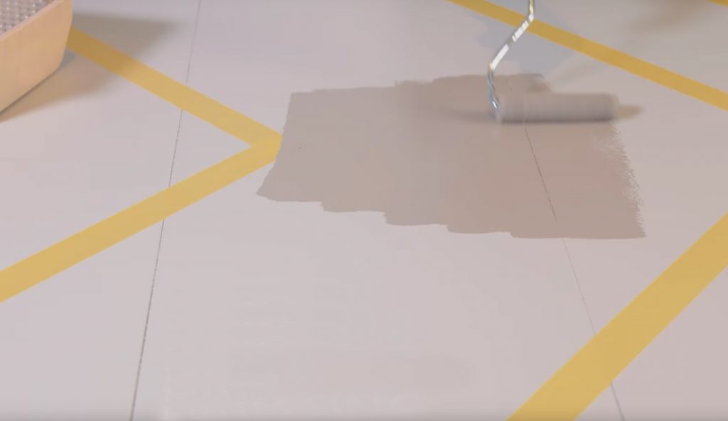
Pro-tip: Use a high quality synthetic brush or 3/8”-1/2” synthetic roller for the application. When painting a horizontal surface, like a tabletop, apply thin coats.
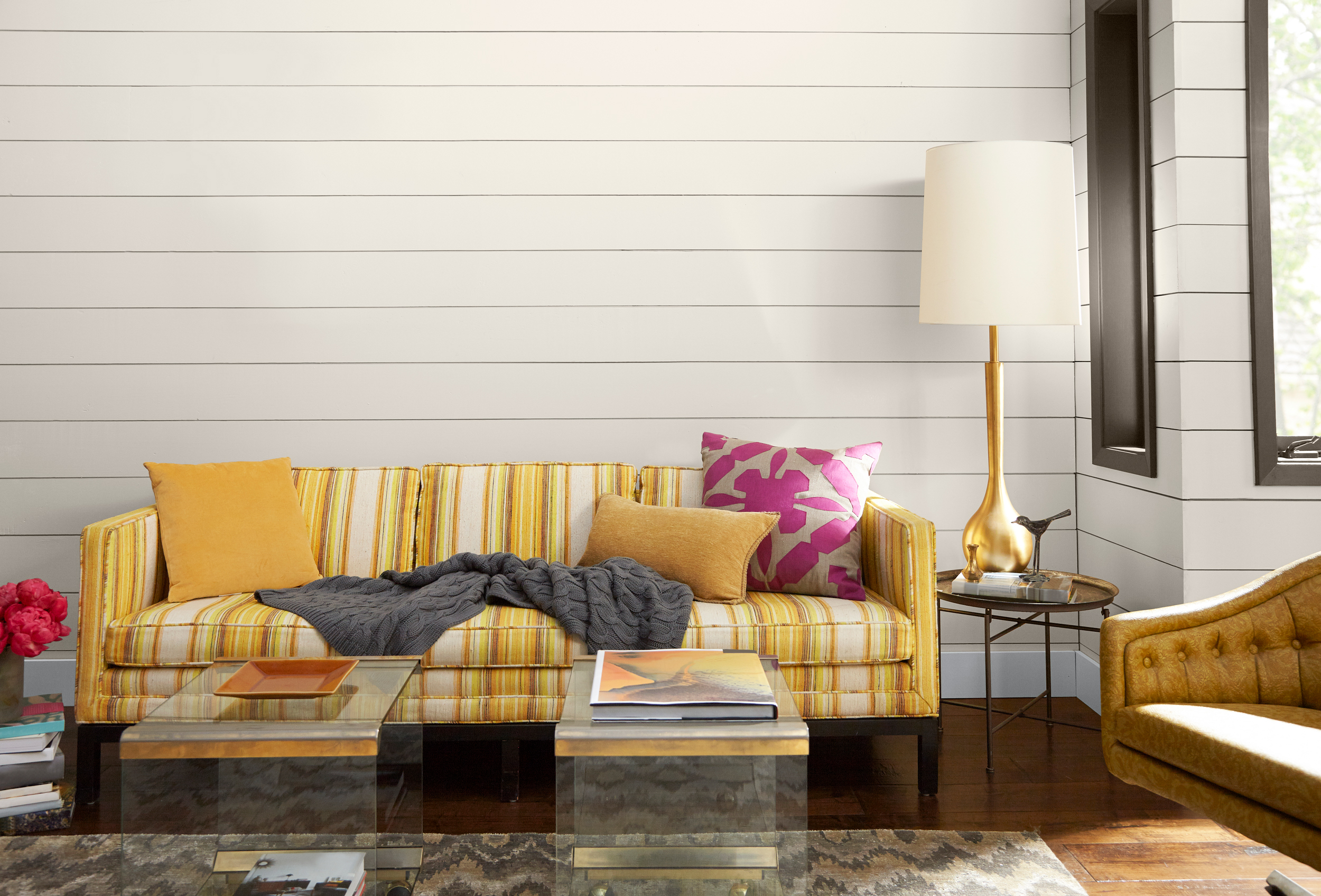
Role of Color In A Mid-Century Modern Look
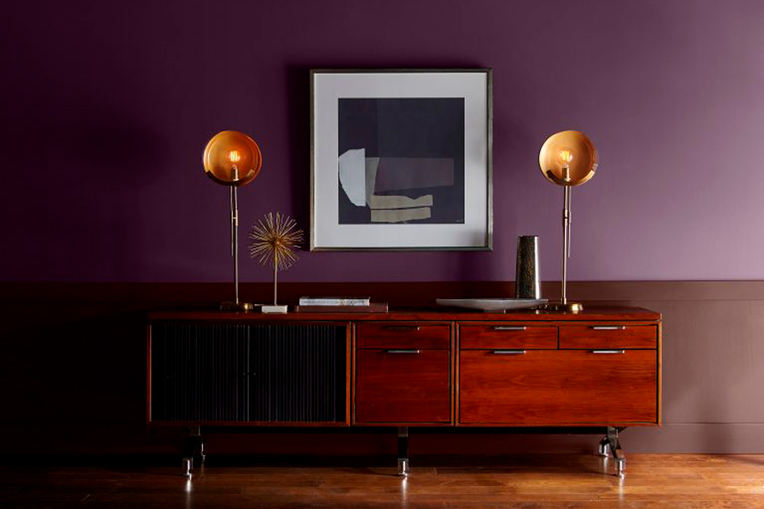
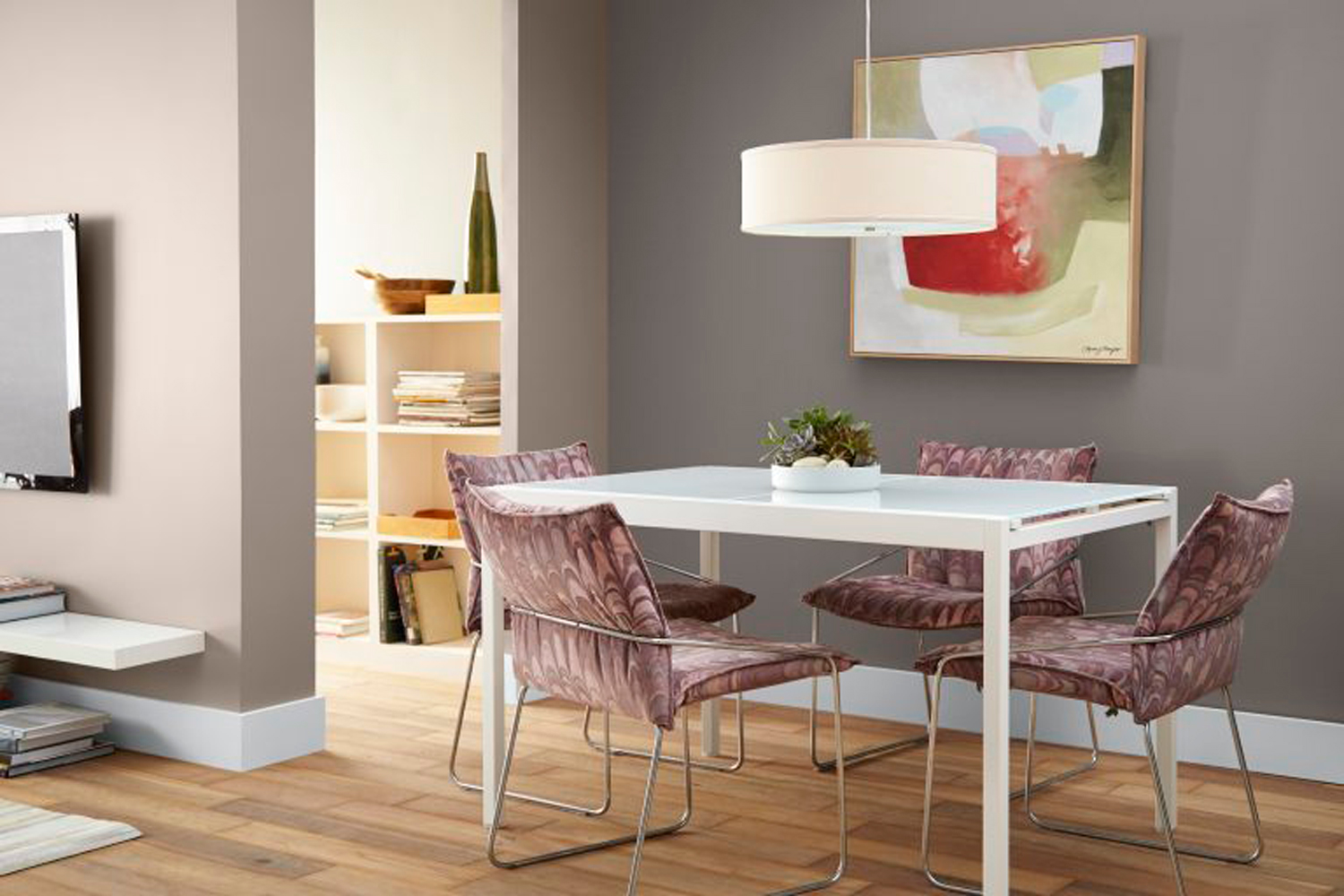
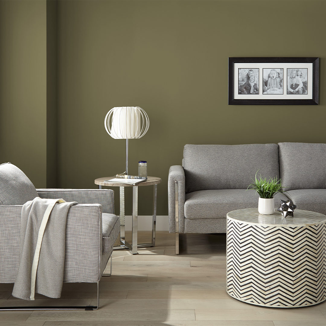
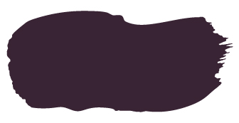
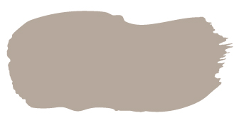
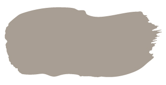
January 11, 2017With the right colors and décor, it’s relatively easy to bring this timeless vibe into the home. Our color experts have recommended these colors from the KILZ® TRIBUTE® paint collection as inspiration for a Mid-Century Modern look: Art Museum, Brushed Metal, Fawn Doe, Northern Sky, Oceanic, Beetroot Purple.
All of these colors complement the vintage look of yesterday without feeling dated. If you’re going for a bolder look, don’t be afraid to explore contrasting materials and colors, such as wood and metal, or a pastel paired with a saturated hue on your ceiling.
BRUSHED METAL
NORTHERN SKY
OCEANIC
BEETROOT PURPLE
FAWN DOE
ART MUSEUM












join the conversation:
SHARE this post: