Tag: Dining Room Makeover
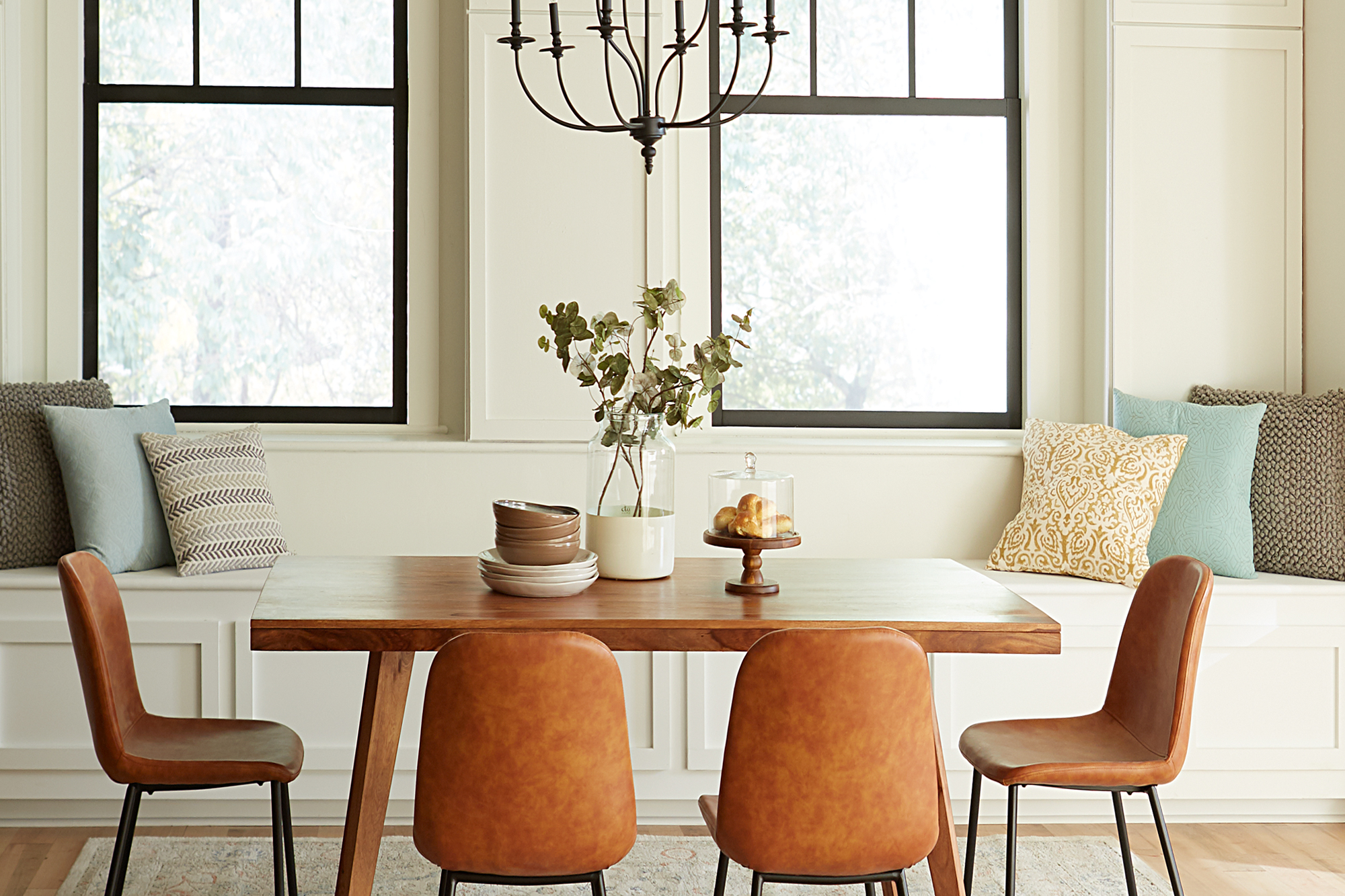
Dining Room Designed for Mindful Living
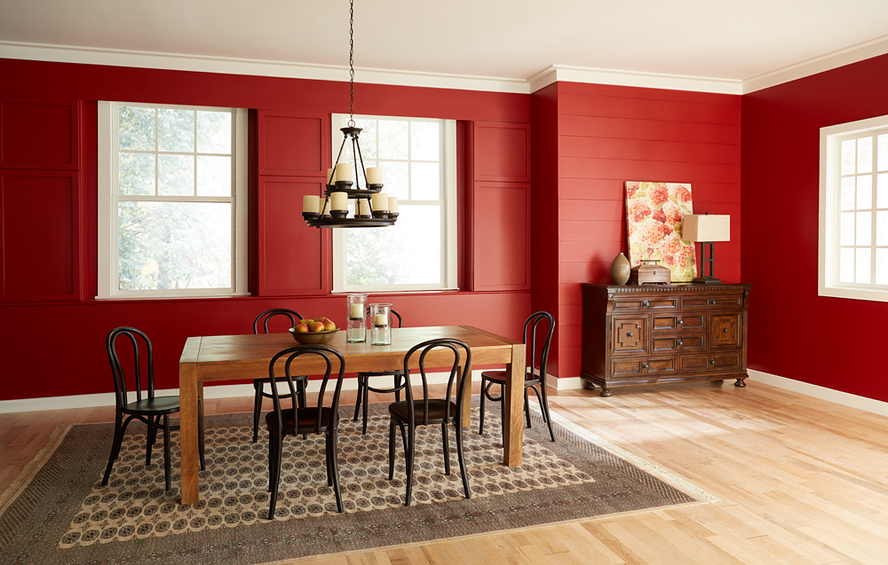
August 11, 2021A component of a balanced lifestyle is being able to slow down and relish each moment, including meals with family and friend. A light and inviting dining room can encourage you to savor the experience of every bite, while conversely a drab or too-intensely colored space can have the opposite effect. This brooding red dining room was decorated in a Mediterranean style, but its heavy atmosphere and dark furniture were uninviting and uninspiring.
Mediterranean design style, however, doesn’t have to mean dark paint colors and heavy furniture. For this dining room makeover, we kept to the existing Mediterranean theme but took in a light and bright direction – drawing inspiration from sunlight sparkling on light blue seawater and the quintessential, white-walled homes blanketing the hills of Greek islands.
Our first step in creating a sense of tranquil enjoyment was to take the walls from saturated deep red to an airy light neutral that invites you in. In order to do justice to our new paint color, and allow its subtle tone to shine, we had to make sure there would be no shadow from the previous dark red. We used KILZ 3® Premium Primer, because its thick and creamy formula is ideal for hiding dark colors and creating the perfect foundation for new paint. Furthermore, old dining room walls can often have stains, and KILZ 3 covers heavy stains and hides surface imperfections.
Once we had the dark red completely covered with a coat of primer, we were able to bring in the light with fresh white paint. We chose One Horn White, from Magnolia Home by Joanna Gaines® Paint. This airy, cream color has a beautifully neutral quality, with a slight beige tint added to the warm white base. Pale colors like this one can instantly make your space feel larger.
To enhance the sense of invitation, we added a built-in window seat. By painting the bench in the same color as the walls, we kept the room feeling open and emphasized the connection of the room with the outdoors.
New décor elements were selected to bring a sense of lightness and ease into the space. While darker or more saturated colors tend to downplay textures, the new light walls will bring texture to the forefront. In the new dining room design, we introduced textural elements including pillows and a cream-colored woven rug. Similarly, the darker paint around the windows suddenly draws our attention to them, while in the original room they were almost lost in the dark red.
We also made the room brighter by swapping in a graceful new light fixture and by bringing a sleek, natural-wood buffet to replace the previous heavy, dark cabinet. The fact that our gaze naturally travels underneath the new cabinet, perched on its slender legs, is another small decorating detail that makes the room feel more spacious.
The end result of our makeover is a dining room that draws you in and invites you to linger. In a room that feels welcoming, conversation and eating will mingle, and the experience will naturally be more relaxed.
Always remember to refer to our website kilz.com or product back labels for additional information on which primer is right for your project and detailed instructions on how to apply our products.
Dining Room Debate: Light or Bright?
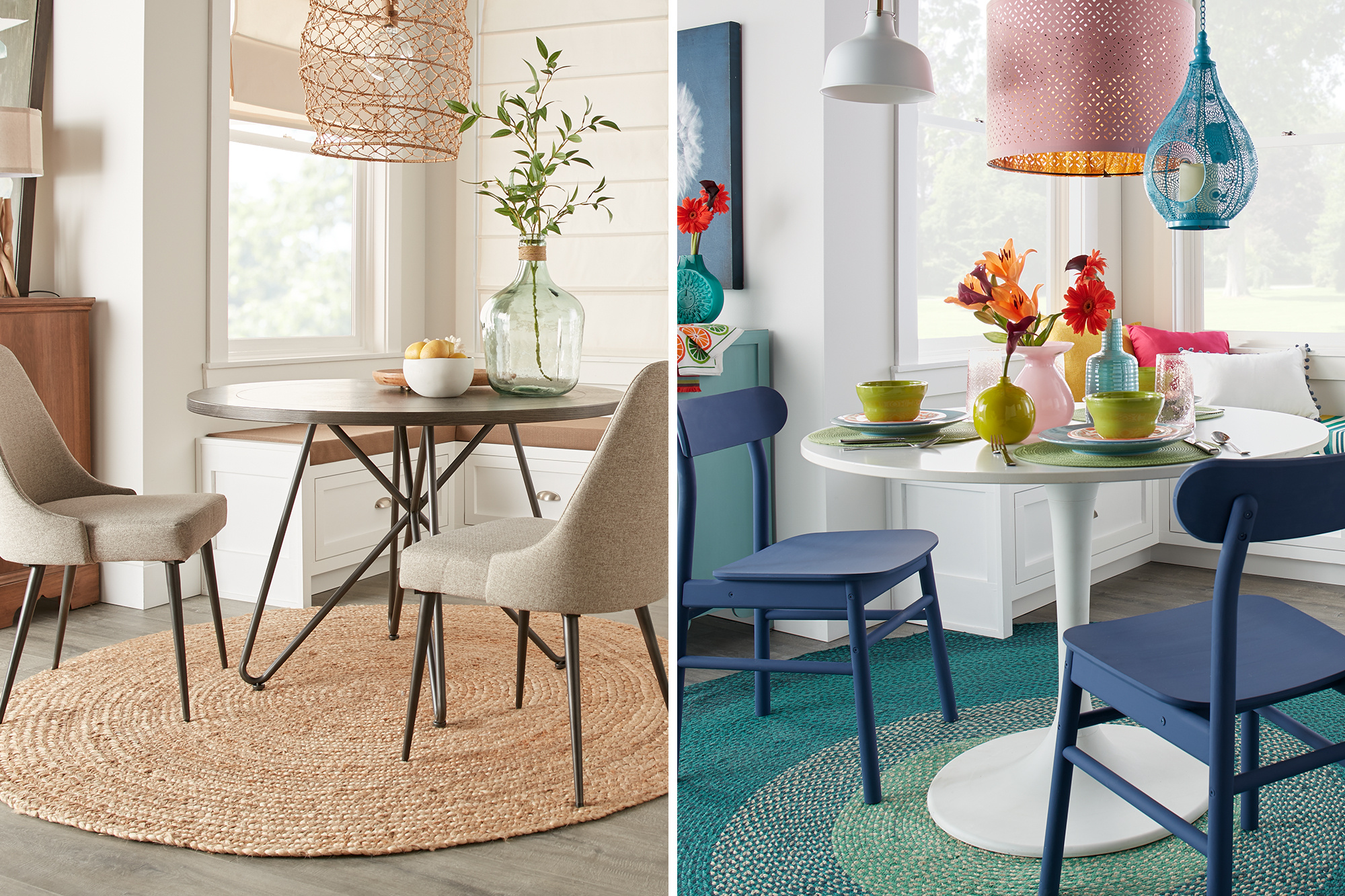
August 11, 2020Is your dream dining room serving up pops of bright color, fun fabrics and fixtures? Or perhaps neutral tones and coastal inspired textures are your preferred dining room design menu? That is the question of this post, as we look at dining rooms styles from light to bright. No matter your style, we’re pretty sure there is one you will love!
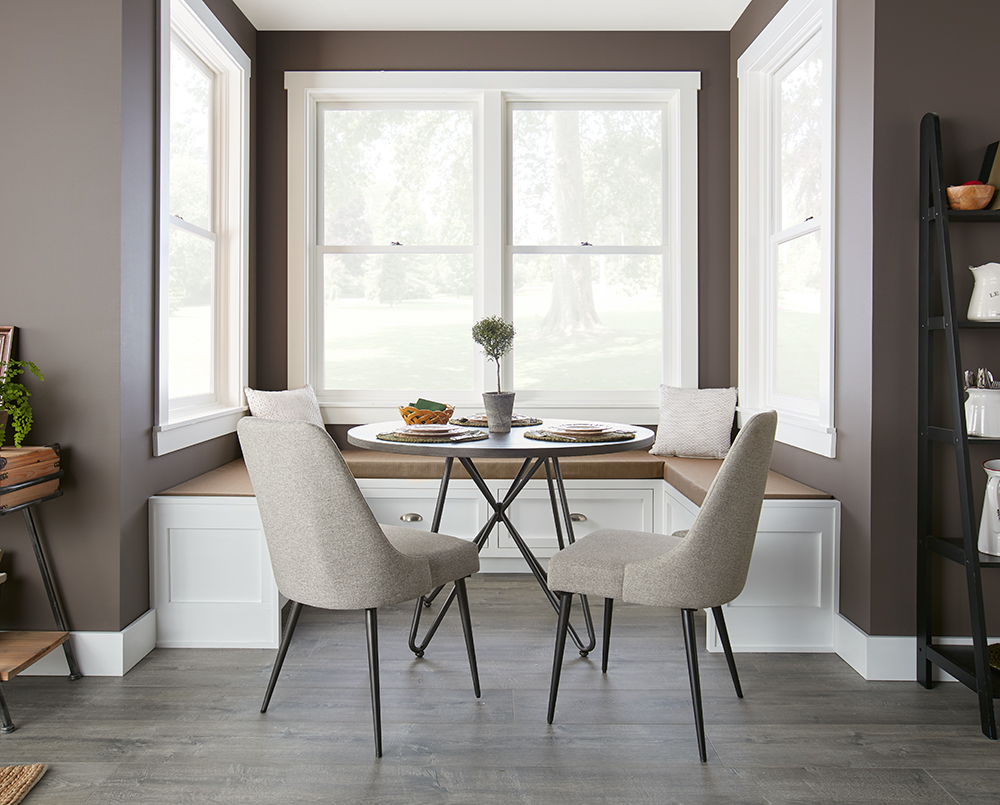
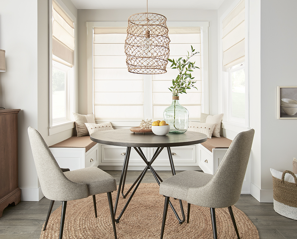
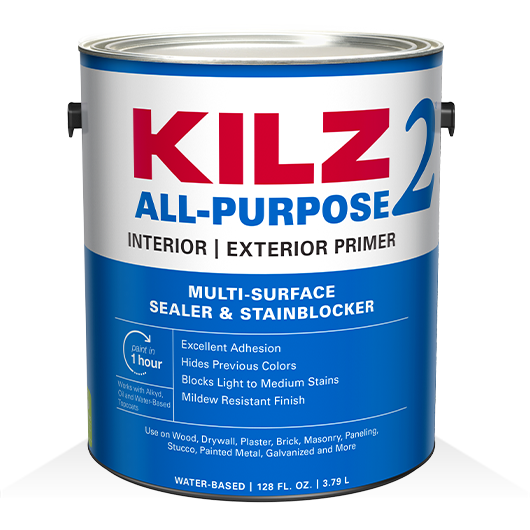
Our dining room debate arose as we started a project to refresh an adorable dining nook. We knew we wanted to take the walls from the current dirty brown shade to an airy white hue, so first it was time to prime. To cover the light brown paint color, we chose KILZ 2® All-Purpose primer. This water-based primer offers excellent adhesion and easily covers light to medium colors. After properly priming the walls (and allowing them to dry!), we top coated with KILZ Tribute® Paint in Architectural White. This sugar white shade has a cotton underdone and appears as a soft white in most light. For full step-by-step directions on covering both light and dark paint colors head over to our post Pro Tips for Painting Over a Dark or Light Wall.
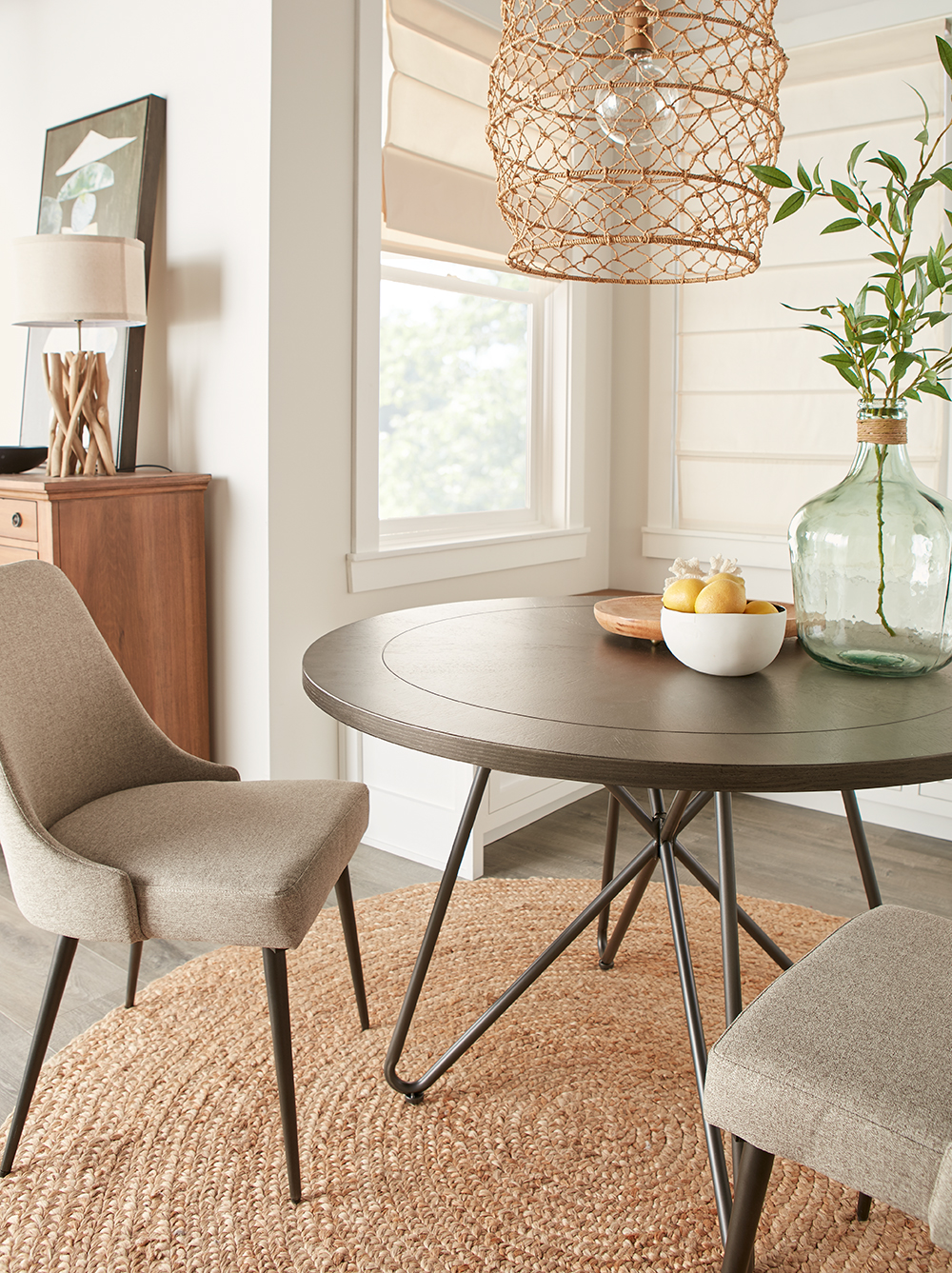
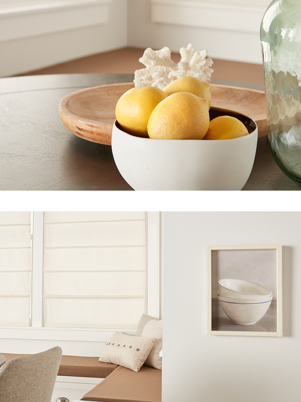
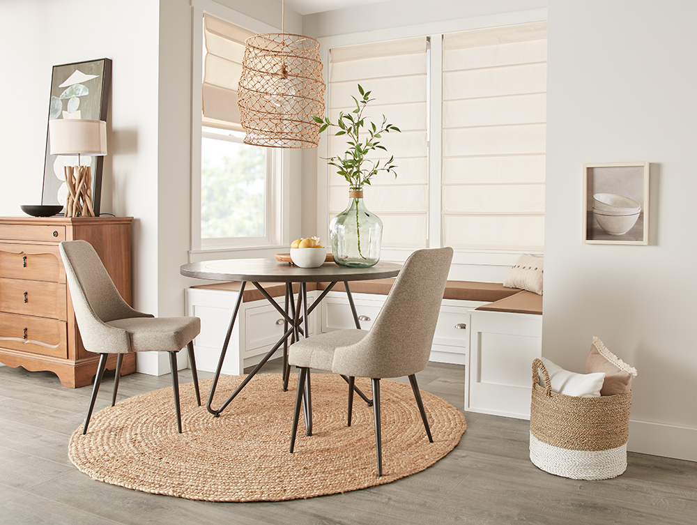
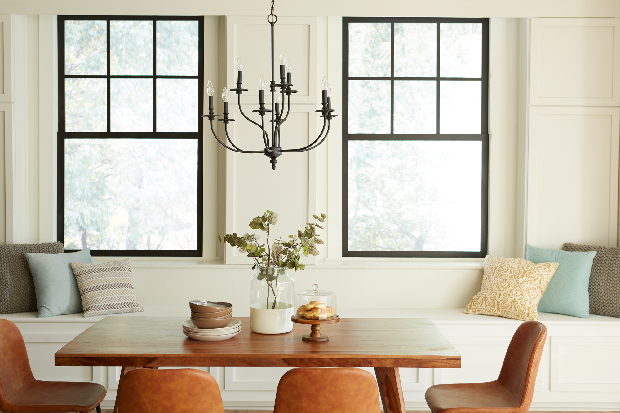
The fresh white walls created a perfect blank canvas that could easily be the backdrop for a variety of color palettes. Inspired by the existing table and chairs, we started with a California Casual design style and played with neutral tones and textures. A new jute rug under the table anchored the space, while a fun basket-weave chandelier, sea-glass colored vase and ocean-inspired accessories completed the look.
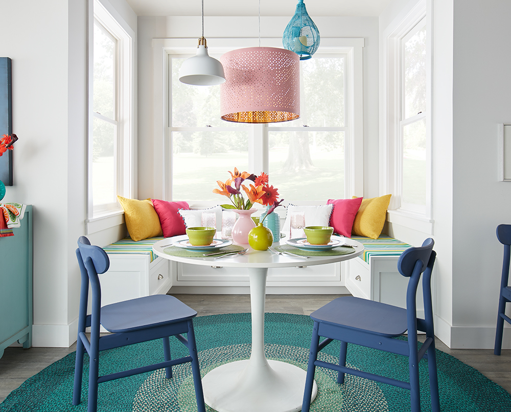
Next up, it was time to turn this style on its head and go from light to bright! We brought in a bright white table and chalk-painted blue wooden chairs and an over-sized teal rug. Striped cushions and colorful brightened up the dining bench, while an array of three playful chandeliers came together to create a fun statement chandelier.
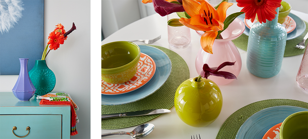
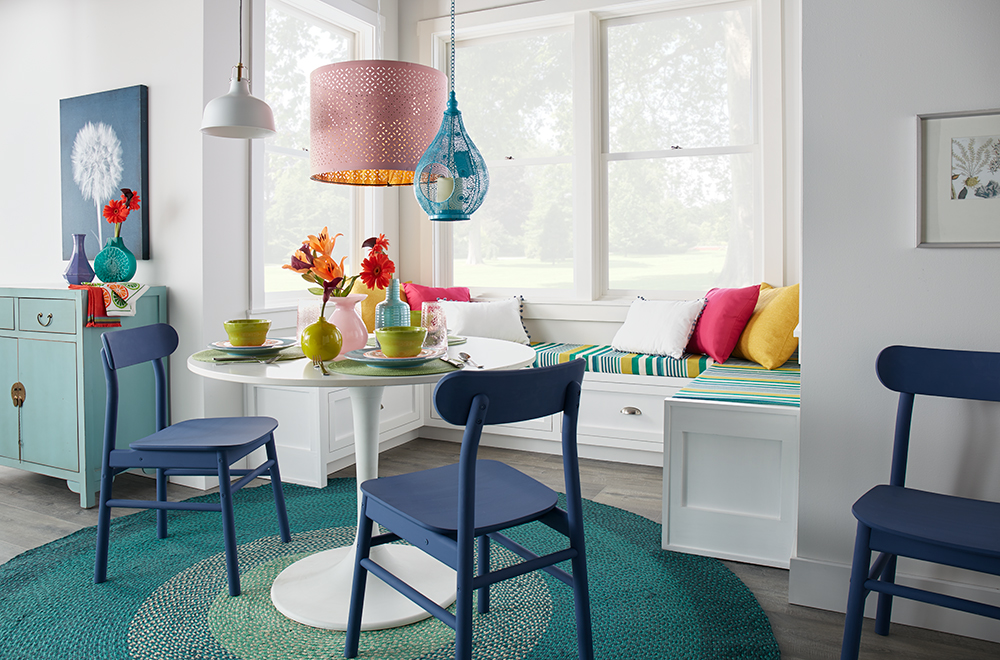
The newly primed and painted walls were the perfect backdrop for these two design styles, proving that white walls are far from boring. From bold and colorful, to sophisticated and neutral, the right white shade on your walls can open up a space to a myriad of design possibilities. Which style spoke to you?
Always remember to refer to our website kilz.com or product back labels for additional information on which primer is right for your project and detailed instructions on how to apply our products.





join the conversation:
SHARE this post: